DASSAULT FALCON JET
TRANSFORMING AEROSPACE COMPLEXITY INTO COMPELLING EXPERIENCES
DESIGN LEADERSHIP & BRAND INNOVATION
In my Art & Design leadership role at Dassault Falcon Jet, I shaped the visual identity of one of aviation's most prestigious brands across global markets. While based in North America, my work had global reach with particular focus on China and East Asia, demanding deep understanding of diverse cultural contexts and market nuances.
I transformed complex aerospace engineering into compelling visual narratives that resonated with three distinct audiences: high-net-worth individuals, corporate buyers, and government entities.
The overarching goal of my designwork was to make Falcon eminently distinctive from every other aircraft brand in order to boost its visibility in an exceptionally competitive marketplace.
︎︎︎︎
DESIGN IMPACT
Engineering → Experience
Converted complex aviation systems into high-trust visual narratives that drove sales and education.
Growth Outcomes
- 18% YoY sales lift in APAC
- $6B pipeline growth through brand repositioning
- 29 Falcon 7Xs in service in China within 4yrs, making it the brand’s second largest market
Environmental Design
Created award-winning AsBAA exhibition experiences that fused design, storytelling, and sales enablement.
Digital Systems
Designed mobile apps and interactive tools for the 7X that aligned cockpit innovation with customer-facing UX.
Global Design Architecture
Deployed a cohesive brand system across three continents and multiple buyer classes, from private wealth to public sector.
︎︎︎︎︎
scroll or jump to:
5X & 7X APPS
5X TEASER CAMPAIGN
PRODUCT BOOK
8X ADS
7X OOH
7X MAGAZINE TAKEOVER
5X & 7X CHINA ADS
DNA NA CAMPAIGN
IAC COLLATERAL
FALCON VISUAL DESIGN BEFORE ME AND ON MY WATCH
DASSAULT AVIATION 50TH ANNIVERSARY – CHINA LAUNCH PLATFORM
MULTI-CHANNEL CAMPAIGN ACROSS PRINT, ENVIRONMENT, AND EXPERIENTIAL DESIGN
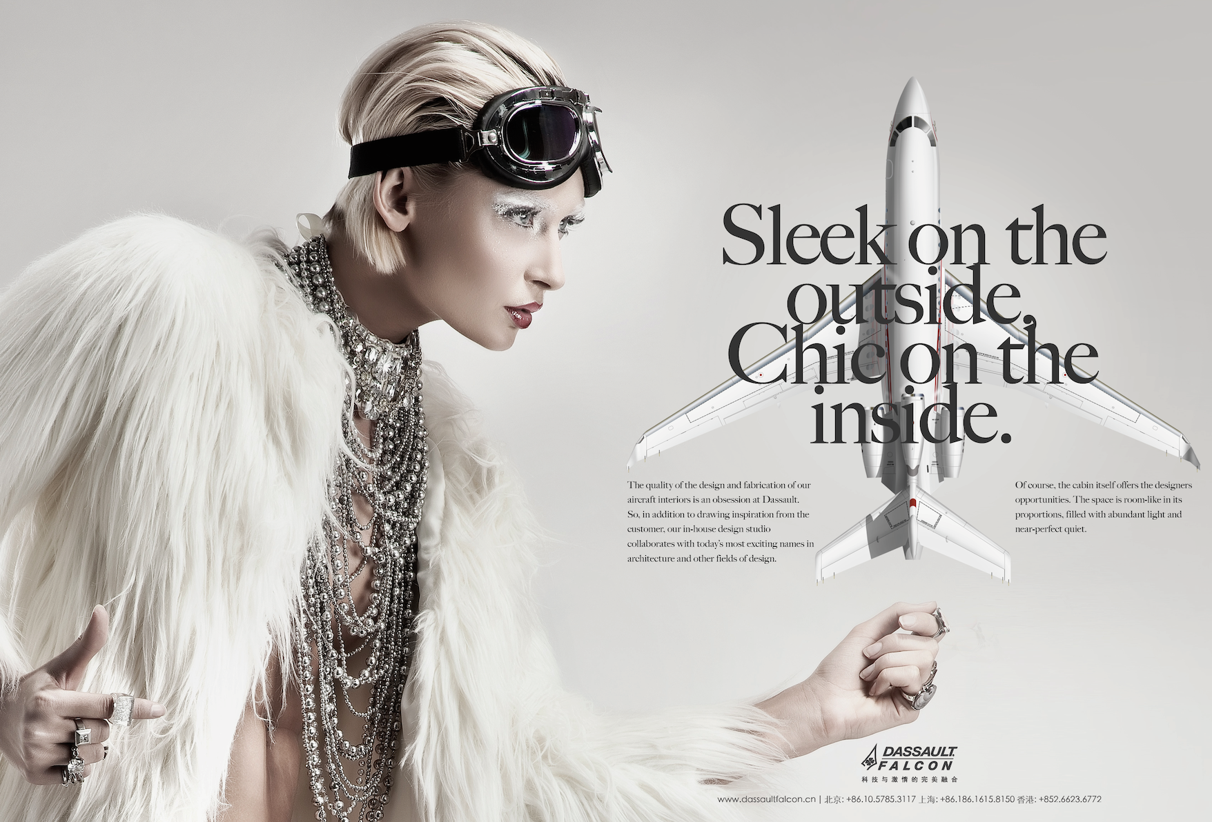
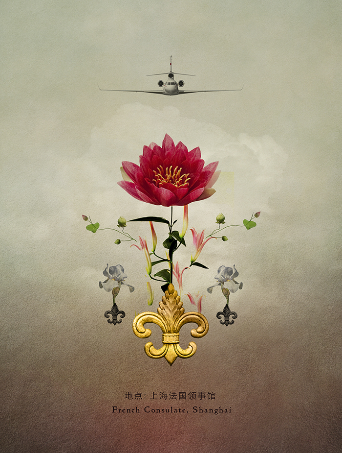
I led the full creative buildout for Dassault Aviation’s 50th anniversary in China - a strategic brand push spanning luxury print, architectural-scale exhibition, and high-touch VIP events. The campaign was engineered to elevate Falcon’s market position among UHNW buyers, aerospace influencers, and government decision-makers across Asia.
SITUATION
Dassault Falcon Jet, a legacy European jet manufacturer, needed to reframe its brand presence in Asia - specifically China - where competitors were dominating the UHNW aviation narrative.
The brand's perception lagged behind its engineering prestige, lacking the cultural and aesthetic resonance required to connect with a rapidly evolving luxury market.
TASK
Create and lead a unifying visual campaign for Dassault Aviation’s 50th anniversary in Asia that could bridge French heritage with Chinese luxury codes. The work needed to cut across all brand expressions - from print to exhibition to experiential - while elevating Falcon into a modern icon of status and power.
ACTION
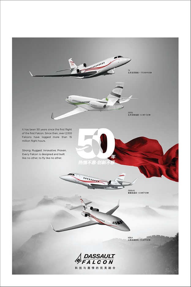
— Concepted the campaign's signature visual: a crimson flag motif inspired by Falcon’s red jet stripe, Parisian design cues, and Chinese symbology of fortune and prestige.
— Developed a complete design system and visual language to maintain fidelity across vastly different touchpoints.
— Led creative direction and design execution across:
• Aircraft imagery and environmental graphics
• Premium print collateral and brand identity
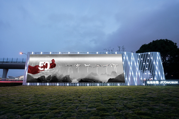
• Large-scale exhibition design and storytelling panels
• VIP events and bespoke spatial experiences
— Directed international production teams across Paris and Shanghai, ensuring seamless cross-cultural execution and stakeholder alignment.
RESULT
The campaign redefined Falcon’s image in Asia. Within three years, China became Falcon’s second-largest global market, with 29 Falcon 7X jets in operation. The campaign also set a new internal benchmark for brand integration across regions and mediums.
50TH ANNIVERSARY LOGOS


CHINA/ 50TH ANNIVERSARY/ NEWSPAPER WRAPS

50TH ANNIVERSARY/ OOH WALL @SHANGHAI AIRPORT

50TH ANNIVERSARY/ MAGAZINE SPREADS

ABACE EVENTS
Held at Shanghai Hongqiao International Airport, the Asian Business Aviation Conference & Exhibition (ABACE) is the region’s most influential business aviation event—where aircraft orders, partnerships, and reputations are forged. The show attracts Asia’s top-tier wealth creators, fleet buyers, and government stakeholders. In this context, design isn’t décor—it’s diplomacy, sales enablement, and competitive signal.
ABACE SHANGHAI/ 50TH ANNIVERSARY/ COLLATERAL - FOLDED DASSAULT HISTORY BROCHURE

ABACE SHANGHAI/ 50TH ANNIVERSARY/ POSTERS & BANNERS
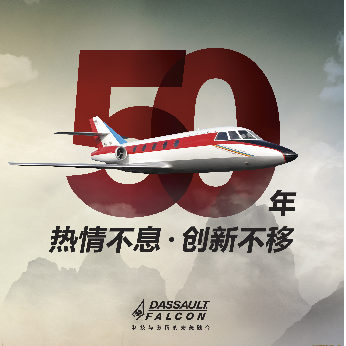
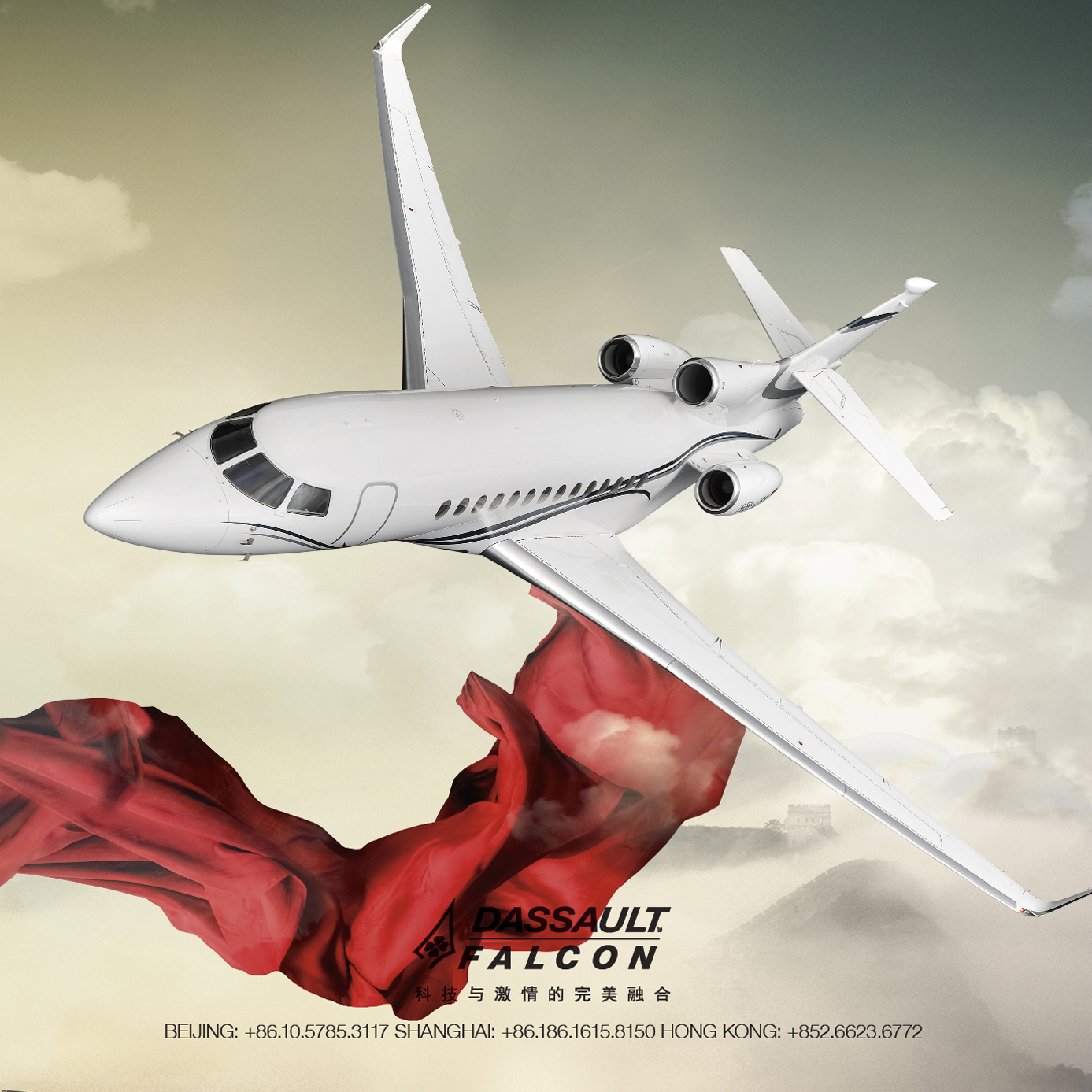
ABACE SHANGHAI/ 50TH ANNIVERSARY/ CHALET WALL WRAPS


SPATIAL DESIGN
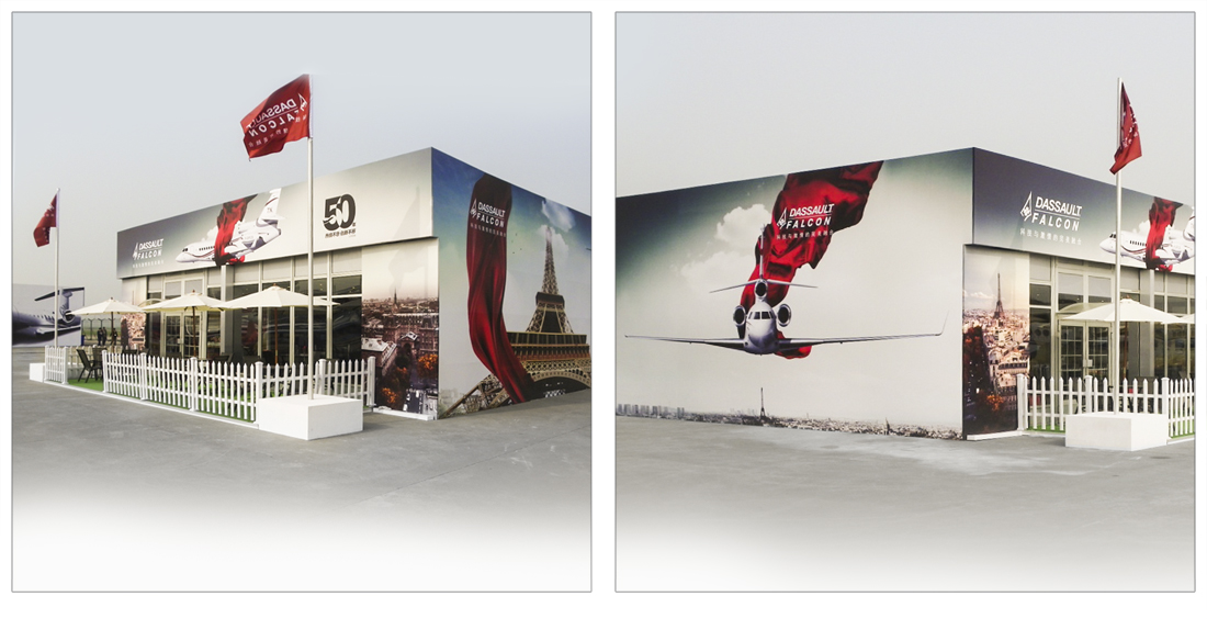
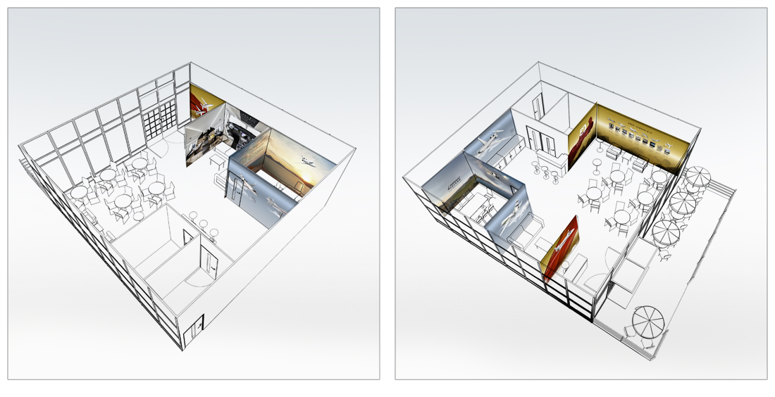
ABACE SHANGHAI/ 50TH ANNIVERSARY/ CHALET INTERIOR WALL WRAPS


DASSAULT AVIATION 50TH ANNIVERSARY BRAND FILM HERE
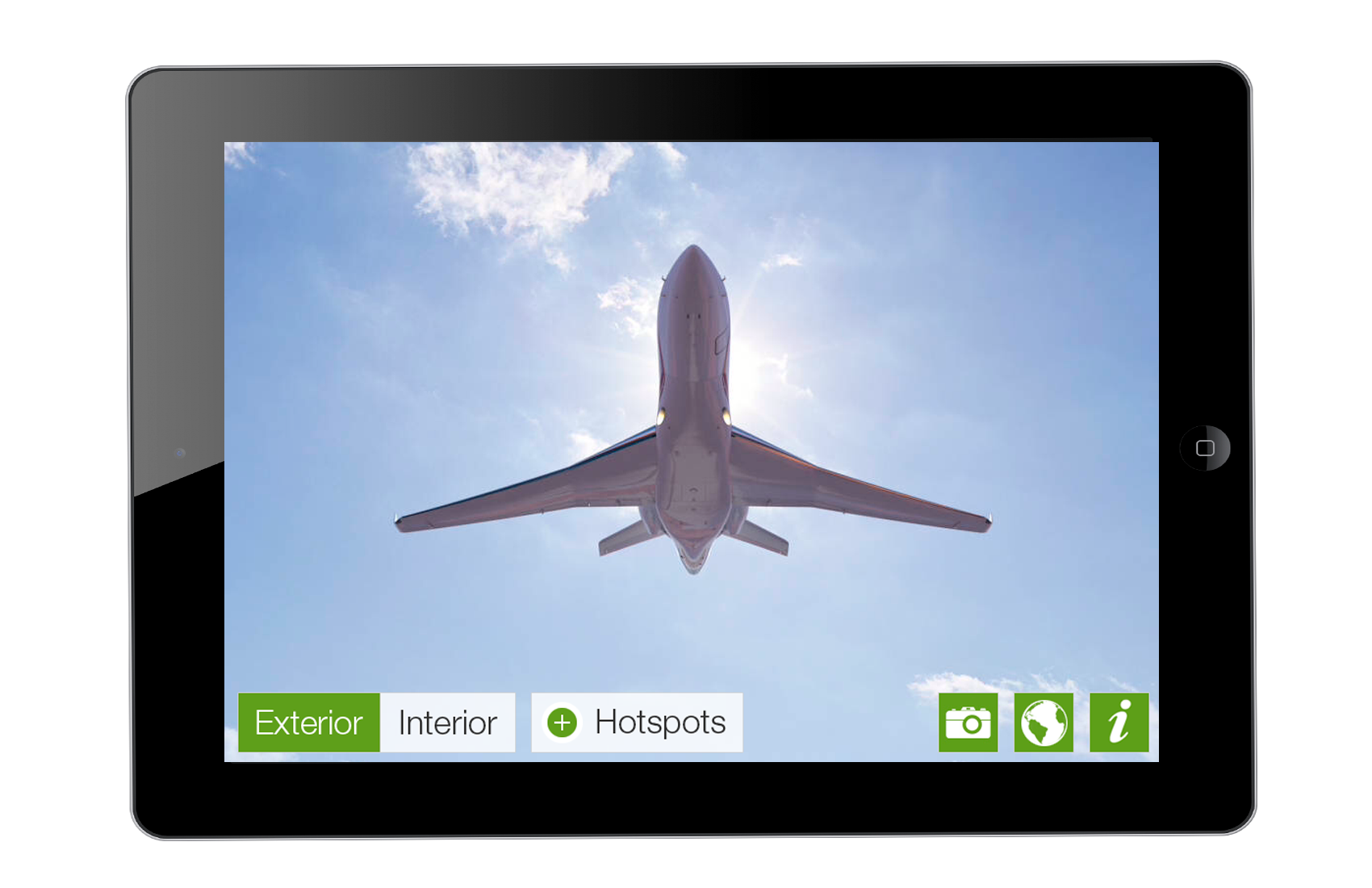
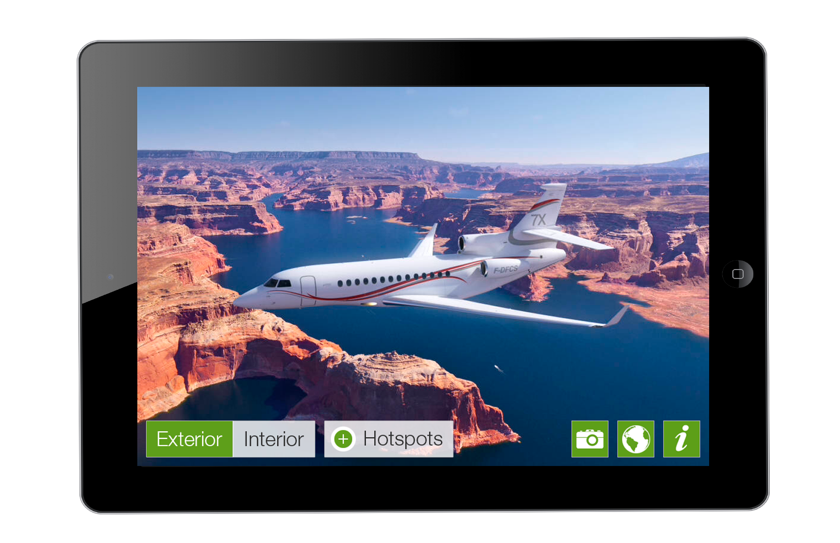
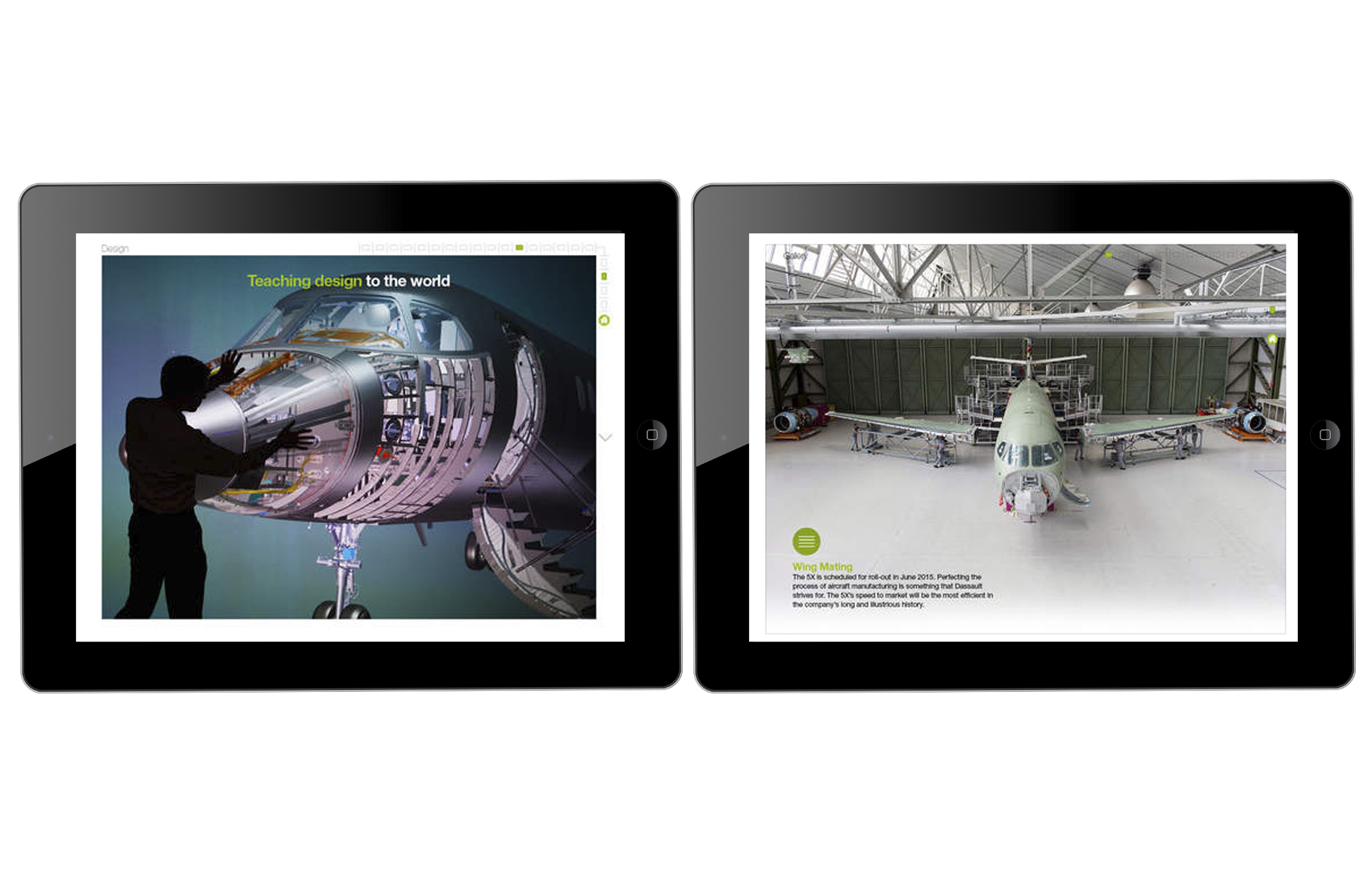
FIRST FALCON APPS
IOS PRESENCE AS BRAND EXPRESSION
SITUATION
In an industry defined by physical precision and legacy aesthetics, Dassault Falcon Jet faced a subtle branding challenge: how to show digital fluency without disrupting the craft-driven mystique of luxury aviation.
Apps weren’t a necessity - UHNW owners, corporations or states, weren’t asking for them, and over-indexing on tech could erode the brand’s analog credibility. But staying silent risked appearing stagnant.
TASK
Support the strategy, content, and design for Falcon’s first suite of iOS applications - not to drive usage, but to quietly assert that the brand understood modern UX expectations. The goal: signal relevance, not revolution.
ACTION
— Developed content and narrative structure for three distinct apps:
• 360° Explorer: A tactile cabin walkthrough with deep material storytelling.
• Manufacturing Journey: A visual thread through Falcon’s build process, balancing complexity and artisanal detail.
• Service Locator: A minimal, map-based utility for global route and support planning.
— Ensured the apps embodied Falcon’s luxury code: refined, and intentionally underdesigned to stay out of the way.
— Positioned the suite as quiet theater - a strategic gesture meant to impress without trying too hard. A nod to the modern customer, not a grasp at their attention.
RESULT
The iOS suite wasn’t built to be used. It was built to exist.
By launching it, Falcon became the first in its category to signal digital competence in a way that felt effortless, not pandering.
The apps recontextualized Falcon as forward-thinking without chasing novelty - preserving the physical aura of the brand while projecting quiet modernity.





5X TEASER CAMPAIGN
VISUAL RESTRAINT AS STRATEGY
SITUATION
Following the global announcement of the Falcon 5X, Dassault faced a prolonged production runway and delivery delays. The challenge: maintain market interest and narrative control across a multi-year gap, without showing the aircraft. Traditional luxury aviation visuals risked overexposure and dilution.TASK
Develop a visual campaign to preserve cultural relevance, assert brand confidence, and manage perception over time - without relying on product visibility. Design needed to convey capability, exclusivity, and national identity while maintaining strict visual discipline.ACTION
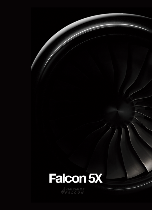
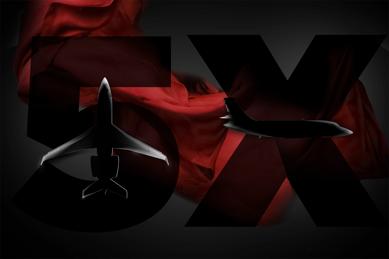
Crafted a multi-platform teaser campaign rooted in visual restraint and symbolic precision:- Established a black-on-black design system where the aircraft was never fully revealed - an implied silhouette, not an asset on display
- Directed tone and composition across print, digital, and mobile interfaces, using high-contrast shadowplay
- Collaborated on a 90-second brand film scored by Daft Punk - blending French culture and aerospace form language into a cinematic signal piece
- Integrated screen takeover modules and mobile UX elements designed for minimalism and continuity, not novelty
- Built a system of visual pacing - treating absence as tension, not limitation
RESULT
The Falcon 5X remained top-of-mind across key markets - including China and EMEA - without revealing its final form. The campaign redefined how a luxury aerospace brand could operate by treating design as narrative infrastructure, not just presentation.It demonstrated that:
- Controlled visibility drives perception
- Design can carry strategic load
- And in markets where timing slips, brand signal discipline is a tactical advantage



FLEET BOOK
A DOCTRINE, IN PRINT
Created a print book for Dassault Falcon Jet - equal parts technical reference, brand artifact, and philosophical statement. Every element was guided by the founding ethos of Marcel Dassault: ‘For a plane to fly well, it must be beautiful.’
SITUATION
Dassault Falcon Jet needed a tool to support strategic sales - especially among sovereign and UHNW clients - where decisions hinge not just on specs, but on story, heritage, and design philosophy.
Competitors like Gulfstream leaned heavily on data. Falcon needed to lean on identity.
The opportunity: create a print artifact that functioned as technical documentation and brand doctrine.
TASK
Design a print piece that could operate on multiple levels:
- A high-trust technical reference
- A luxury brand artifact
- A philosophical argument about beauty as engineering principle
The goal was to sell jets - but do it elegantly, through cultural pereception AND design fluency.
ACTION
— Concepted and designed the Fleet Book, an editorial-grade print piece structured around Marcel Dassault’s foundational belief: ‘For a plane to fly well, it must be beautiful.’
— Developed an architecture that married hard data with visual storytelling:
• Fleet specs, cabin configurations, and mission profiles
• Cinematic black-and-white aerials above China, the Himalayas, and Paris
• Premium materials (pearlescent stock, high-density print) to echo Falcon’s own craft
— Used design systems - information hierarchy, photographic cadence, visual rhythm - to align with Falcon’s aerodynamic aesthetic and strategic identity.
— Directed the visual tone to distinguish Falcon from rivals: abstract jet silhouettes, archival quotes, and refined graphic restraint gave the book weight without noise.
RESULT
The Fleet Book became more than a sales tool. It was a tactile argument - a piece designed to sit on the desks of ministers, billionaires, and procurement heads and say everything without speaking.
It helped position Falcon not just as a manufacturer, but as a design-led authority - blending French engineering, visual elegance, and global cultural fluency into a single, high-trust object, and contributing to a $6B annual pipeline growth through strategic brand positioning.
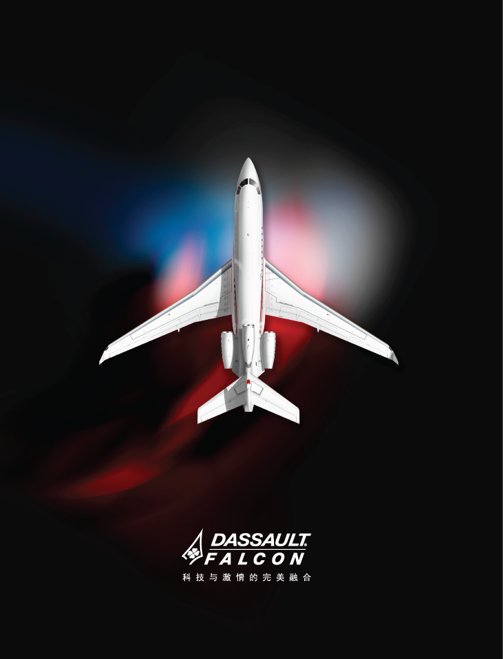
FRONT+BACK COVER

INTERIOR SPREADS
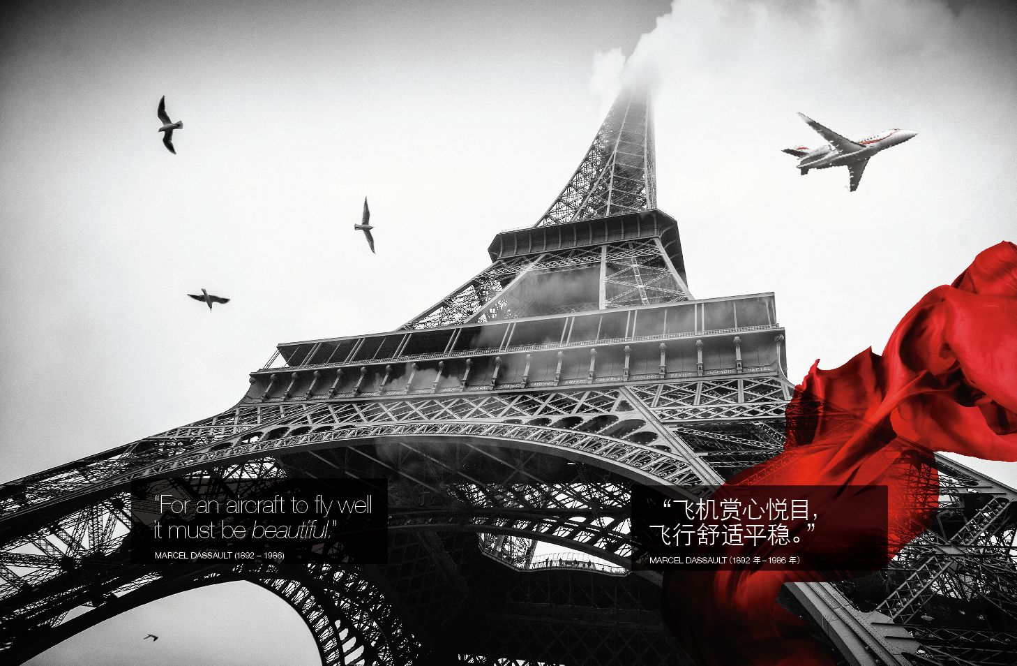

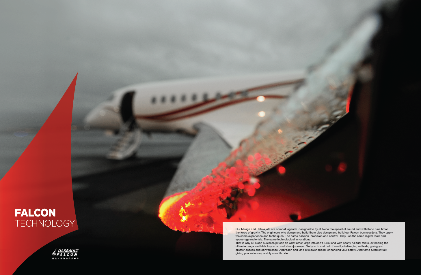


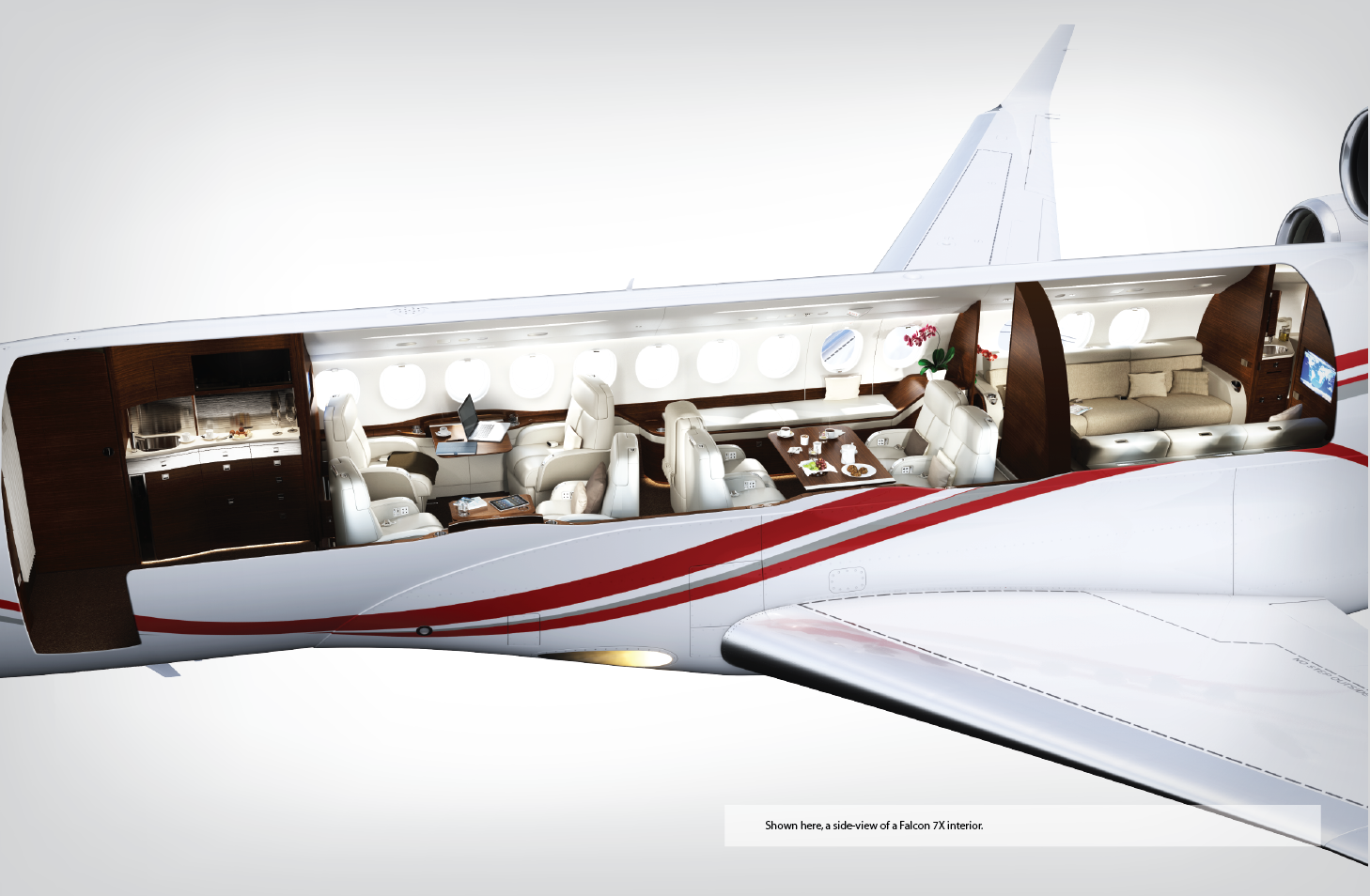


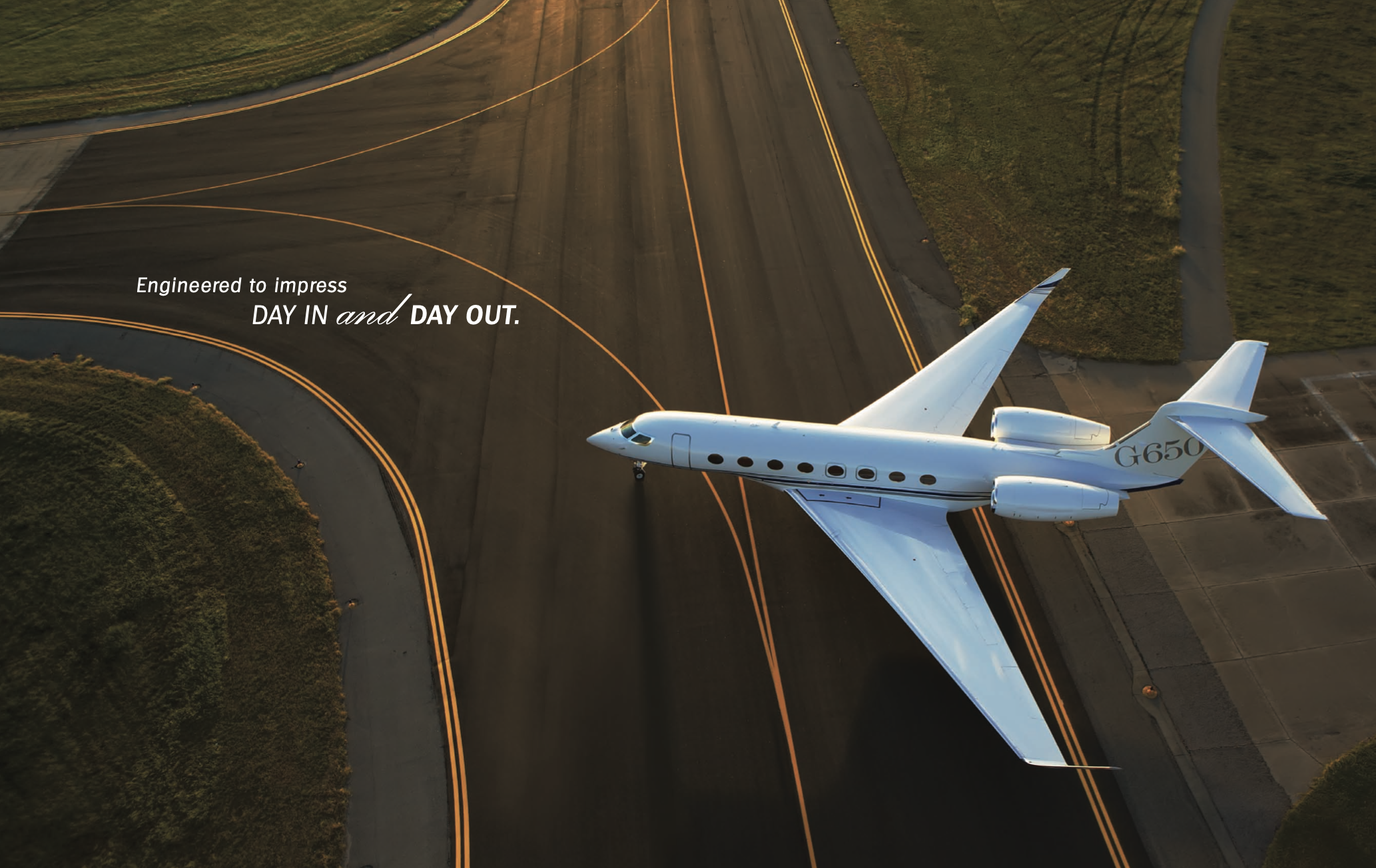
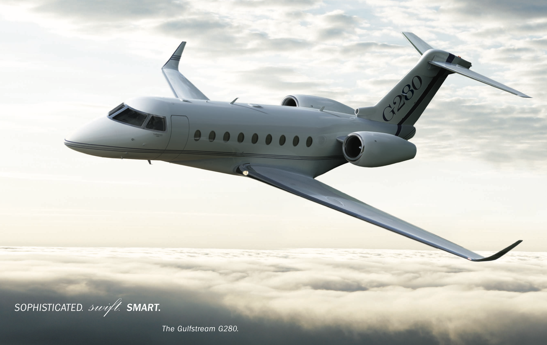
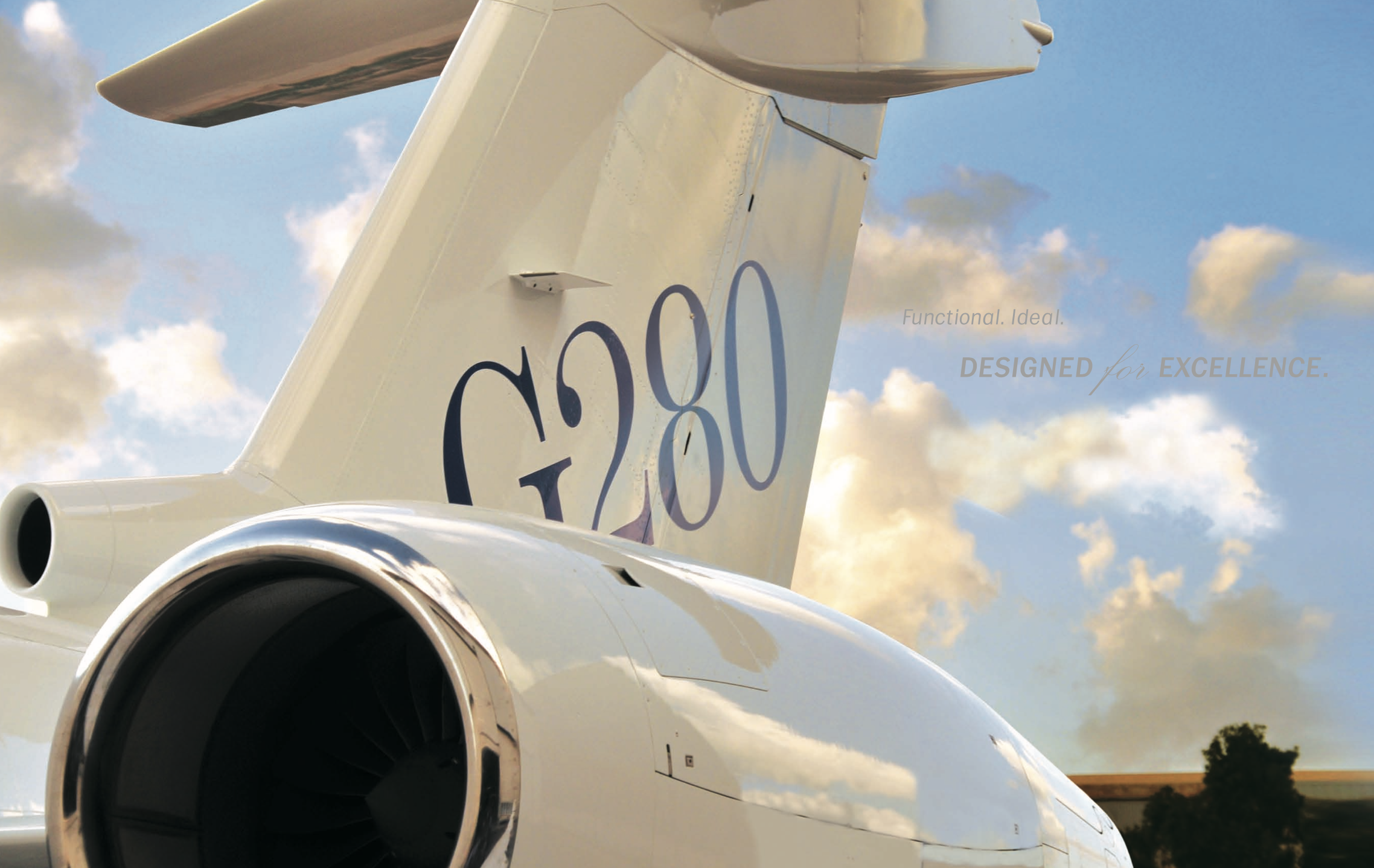
( SIMILAR PRODUCT BOOK FOR DASSAULT COMPETITION GULFSTREAM)
What Gulfstream Shows:
- Literalism. Clean, competent, but obvious. Aircraft as product.
- Utility-First Language. ‘Engineered to impress. Day in and day out.’ Reads like a washing machine ad.
- Commodity Thinking. Front-three-quarter view, parked tarmac, warm light. It’s competent marketing - but it’s marketing.
- No Emotion, No Philosophy. These layouts speak to reliability, not meaning.
What Falcon Shows:
- Ideological Design. The jet-on-black image isn’t just dramatic - it’s intentional. A jet rendered like a cultural artifact, set against painterly light.
- Philosophical Anchoring. Marcel Dassault’s ethos is present in form and tone. Beauty as lift. Aesthetic as performance.
- National Signature. The Frenchness is quiet but unavoidable. Not just heritage, but design intelligence made visible.
- Strategic Sophistication. Use of color vs B&W. Abstract interstitials. Tactile stock. This isn’t sales - it’s seduction calibrated to decision-makers in aerospace, diplomacy, and defense.



Bottom Line:
Gulfstream markets aircraft.
Falcon markets design as doctrine.
Gulfstream markets aircraft.
Falcon markets design as doctrine.
INDELIBLE PLANET FOR BMW
BRANDING THE AGENCY. BRANDING THE FUTURE.
Recruited as the Director Of Visual Intelligence for Indelible Planet - a BMW-aligned innovation studio - I was tasked with two parallel challenges: define the visual identity of the agency itself, and shape the visual narratives for its flagship initiatives.
Part 1: Branding the Studio
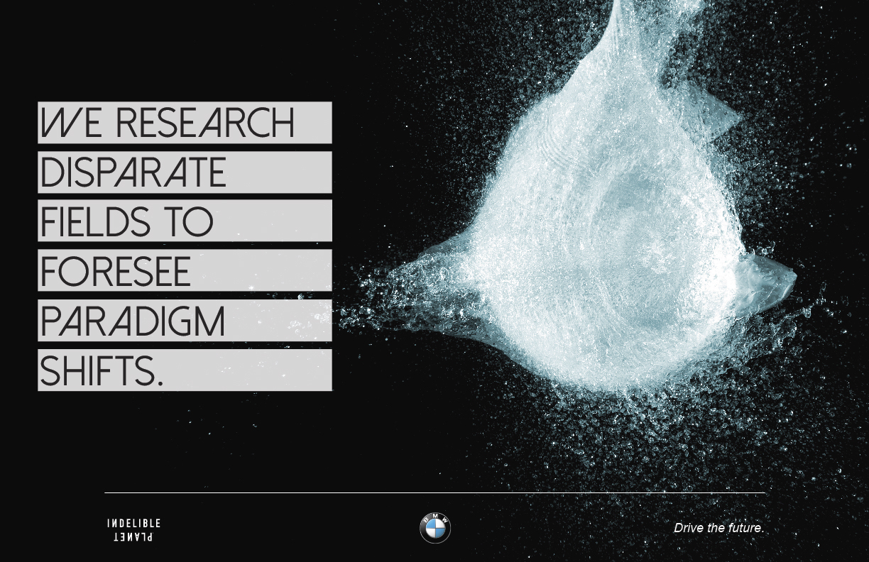
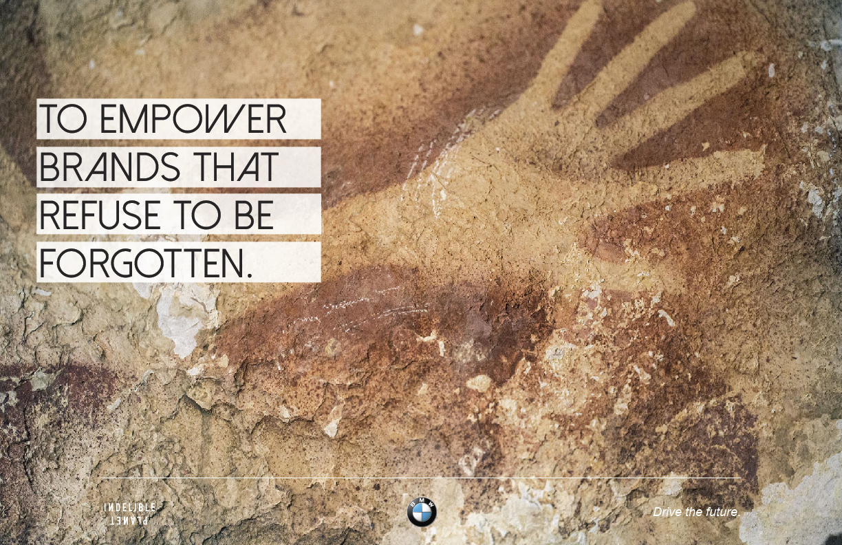
I built the foundational identity for Indelible Planet: naming systems, visual codes, and presentation frameworks that communicated strategic rigor without losing imagination. The design had to signal credibility to senior auto leadership while attracting creative collaborators who think beyond category.
Part 2: Branding the Projects
Led the visual development for two radical BMW initiatives:
- The Ultimate Ultimate Driving Experience (a speculative platform envisioning BMW mobility on Mars)
- The Oceans Project (a sustainability-forward narrative in partnership with WHOI and Parley for the Oceans)
For both, I translated conceptual briefs into compelling visual systems - cinematic, emotionally resonant, yet grounded in brand logic. Deliverables included identity marks, environmental design, key imagery, and deck frameworks used to pitch global stakeholders.
This wasn’t about making things look cool. It was about designing trust, vision, and momentum - at both the studio and enterprise level.
︎
IP IDENTITY
Branding Indelible Planet: Art becomes strategy.
SITUATION
Indelible Planet (IP), a strategic studio created to serve BMW's board, needed a distinct identity - one that could stand apart from legacy agencies and telegraph creative intelligence to both C-suite clients and cultural collaborators.
The studio’s positioning required visual language that felt original, expressive, and unafraid of complexity.
TASK
Design a logo and identity system that could reflect IP’s core values - whimsy, innovation, and radical imagination - while maintaining the credibility required for executive audiences in automotive, tech, and defense.
ACTION
I rejected standard tech signifiers (clean lines, sterile minimalism) and built the system from a different philosophical base.
- Researched visual traditions from da Vinci’s sketches to prehistoric carvings - seeking forms that conveyed human curiosity across time
- Used artist Julian Schnabel’s layered design language as a launch point: rough, intuitive, precise in its looseness
- Crafted a logo that felt drawn, not built - to reflect IP’s role as an idea catalyst, not a conventional agency
- Developed a full identity system with flexible usage: from deck frameworks to concept boards and spatial applications
RESULT
Created a visual identity that disarmed the expected - and in doing so, earned trust. The system was adopted across all touchpoints and became a core signal of IP’s creative mandate: to challenge how visionary work looks, feels, and functions.


The aesthetic of the logo led to the creation of unique iconography, used in print and in digital:
KEYART IMAGE
I created a rich visual world, part reality, part future, part imagination in which bold ideas could live.
At the heart of the project was a central keyart image that shaped the entire branding philosophy. Inspired by Sonora Webster's daring horse dives, it invited the viewer to abandon the familiar and follow us into a new world of possibilities.
Suspended between heaven and sea, neither falling nor rising, frozen mid-flight, the horse became a symbol of an impossible leap, a moment of pure transformation.
It set the tone for a startup agency unafraid to transcend the boundaries of the common. Everything that followed - the strategy, the decks, the presentations - was a reflection of this ethos.

BRAND BOOK EXCERPTS






STUDIO COLLATERAL


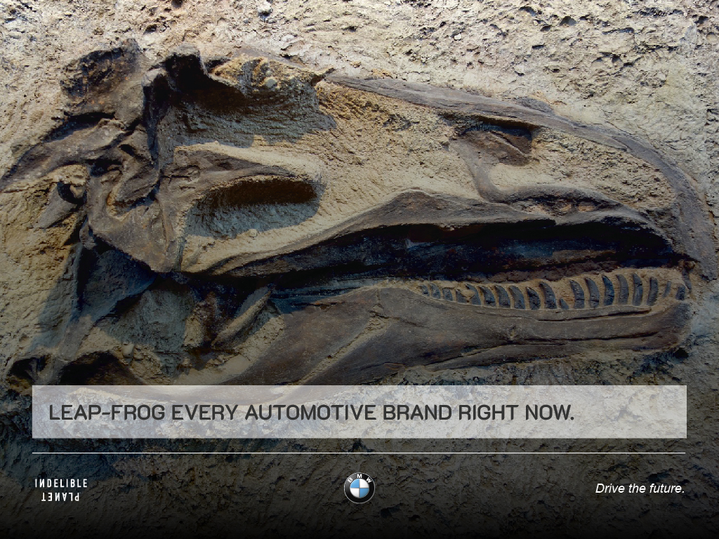
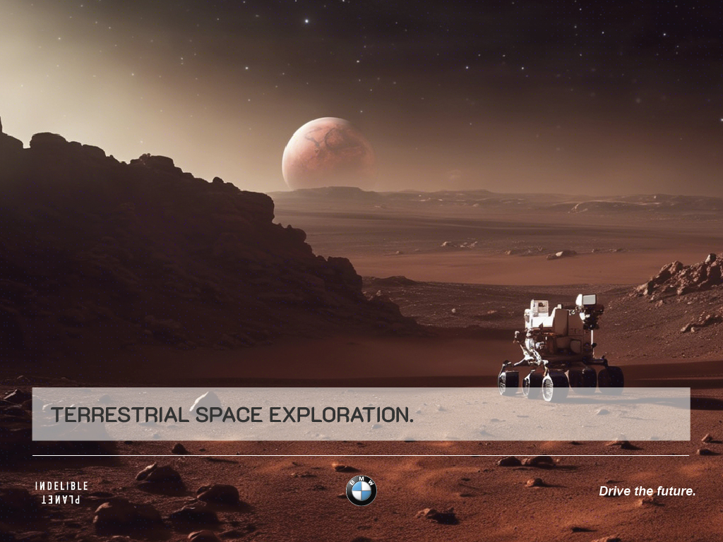
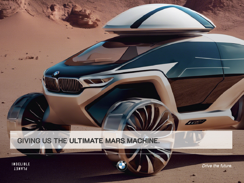
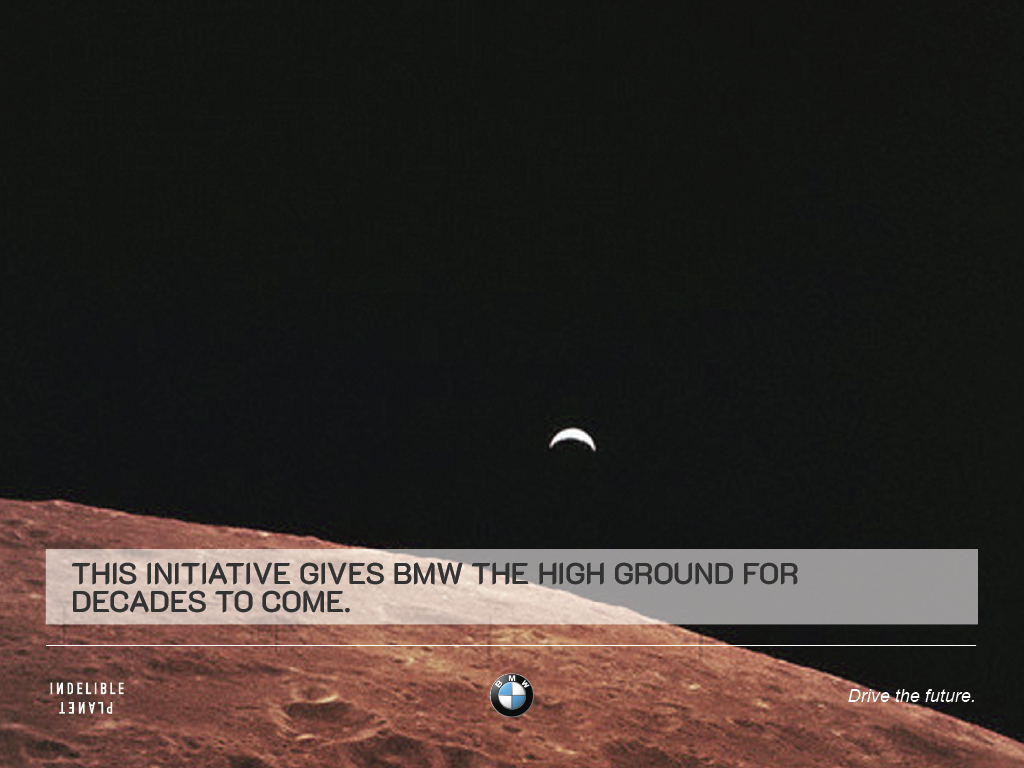
THE ULTIMATE ULTIMATE DRIVING EXPERIENCE:DRIVE A BMW ON MARS
PROJECT OVERVIEW
The Ultimate Ultimate Driving Experience was a speculative brand platform developed for BMW’s board, exploring what it would mean to extend the brand beyond Earth - specifically, to Mars. This was part of a broader “legacy branding” effort led by Indelible Planet to help BMW reimagine its long-term role as a mobility and innovation leader in a rapidly transforming world.
The goal wasn’t product - it was perception.
Could BMW maintain relevance in a future shaped by climate disruption, space colonization, and shifting cultural values?
Our job was to help them see how.
The following deck was created to help BMW’s leadership visualize the concept. My role was to make the possible feel tangible. This wasn’t just design - it was strategic translation. Every image, layout, and visual cue was engineered to turn a bold future into something boardroom-legible, emotionally resonant, and culturally inevitable.
(excerpts)






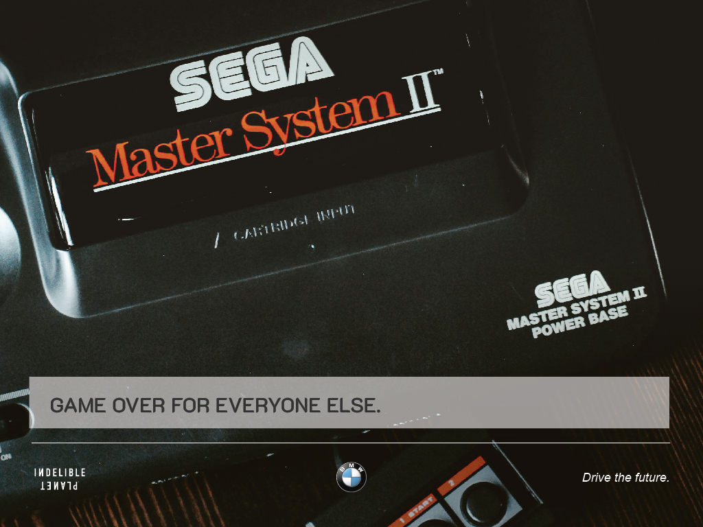
EXPERIENTIAL CAMPAIGN
SITUATION
As part of The Ultimate Ultimate Driving Experience platform, BMW sought to explore how a legacy mobility brand could claim cultural relevance in a spacefaring future. The challenge: translate an internal Mars concept into a bold, global-facing campaign that could inspire customers, stakeholders, and the public alike.
TASK
Develop a multi-tiered experiential campaign that would extend BMW’s Mars narrative into public consciousness - blending real space tech, cultural symbolism, and participatory storytelling. The campaign needed to be visionary enough to provoke media attention, yet grounded enough to feel technically and ethically credible.
ACTION
Led creative direction for Project XB, a speculative global activation that included:
- A BMW concept vehicle placed in Earth orbit, visible via telescope
- Interactive LED “torch” activations connecting customers across continents
- A Moon-based social-media-connected rover, enabling public exploration
- A message to the stars - the Record of Humanity and Engineering, broadcast via S.E.T.I., positioning BMW as only the second brand (after NASA's Voyager) to reach for deep space communication
RESULT
Though unexecuted due to budget constraints, the campaign was recognized as a breakthrough in experiential strategy - blending aerospace, media, and symbolic storytelling to expand what a brand activation could be. It remains a blueprint for how legacy brands can tap emerging technologies and space exploration to generate cultural relevance and public unity at global scale.
(DECK EXCERPTS)


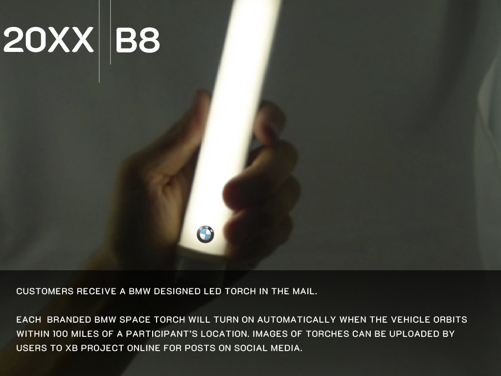

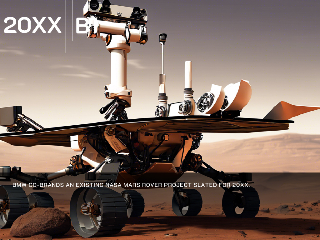
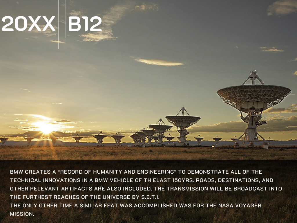

︎
THE OCEANS PROJECT
PROJECT OVERVIEW
The Oceans Project asked a simple question: how does a performance brand perform for the planet?
Developed in partnership with the Woods Hole Oceanographic Institution and Pharrell’s Parley for the Oceans, the project explored BMW’s potential role in ocean plastic remediation - from algae-based materials to circular product systems. But the real challenge wasn’t ecological. It was emotional.
My task was to create a unifying visual - one that could distill complexity, cut through fatigue, and spark belief at the highest levels of the company. The result: a surreal image of a swimming elephant, drawn from the waters of the Andaman Islands. It became a symbol of weight, grace, and engineered harmony - mythic enough to move the imagination, grounded enough to anchor strategic ambition.
Because in legacy branding - as in defense, biotech, and AI - transformation doesn’t begin with data.
It begins with conviction.
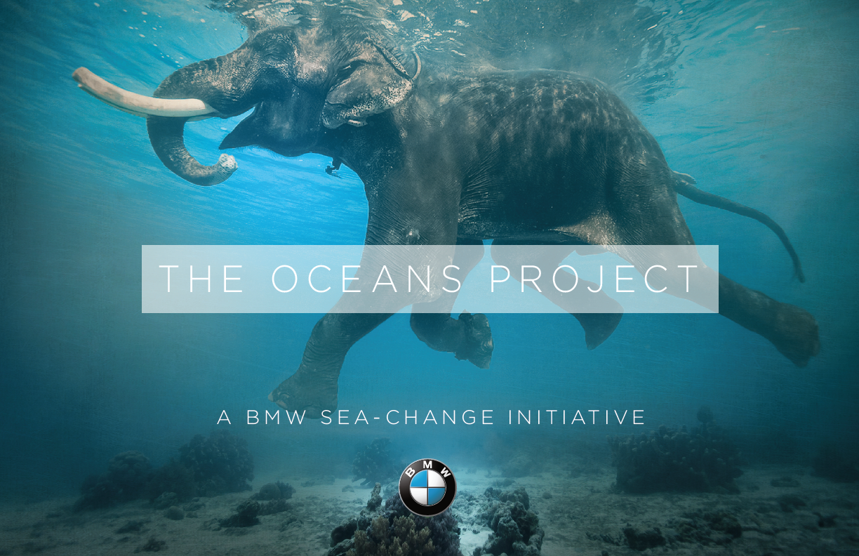

A PROJECT SHORT
I created, edited and scored our signature short featuring an elephant swimming in the Andaman Sea - a dreamlike sequence that captured the project's boundless spirit.
BRAND FILMS
Visual Storytelling, Brand Perception Design, Human-Centered Tech Narrative
SITUATION
CreativeDrive was known for speed, automation, and scale - but lacked warmth. Clients saw machinery. Creatives saw a faceless vendor. The challenge: humanize a content-tech powerhouse before it alienated the very talent and partners it needed most.
TASK
Create a visual storytelling system that reintroduced CreativeDrive as a place of collaboration, creativity, and cultural empathy - without hiding its tech-forward DNA.
ACTION
I developed and directed a long-form content strategy built around documentary-style short films - crafted to spotlight the people behind the process, not just the output. This included:
This wasn’t just brand comms - it was perception engineering. The series worked as external marketing, internal culture-building, and recruitment positioning all at once.
RESULT
The films became a cornerstone of CreativeDrive’s brand ecosystem - earning trust from creatives, attracting top talent, and helping potential clients see the tech not as cold automation, but as creative augmentation. It reshaped the company's public identity: from faceless scale to human-scale intelligence.
I developed and directed a long-form content strategy built around documentary-style short films - crafted to spotlight the people behind the process, not just the output. This included:
- Intimate portraits of creators across disciplines: motion designers, photographers, sound artists, even in-house teams
- Narratives structured to explore not just what they made, but why they made it
- BTS content that revealed how our proprietary tools (CGI, AR, ML, SaaS platforms) actually empowered creativity, not replaced it
- A hybrid tone: high-production polish blended with lo-fi vulnerability - mirroring the balance between engineered tech and raw artistry
This wasn’t just brand comms - it was perception engineering. The series worked as external marketing, internal culture-building, and recruitment positioning all at once.
RESULT
The films became a cornerstone of CreativeDrive’s brand ecosystem - earning trust from creatives, attracting top talent, and helping potential clients see the tech not as cold automation, but as creative augmentation. It reshaped the company's public identity: from faceless scale to human-scale intelligence.
THE DANCE CREW - KINGS OF SPANK
THE MUSIC LEGEND - GHOSTBUSTERS’ OWN RAY PARKER
THE AI EXPERT - NEAL CONLON
THE CREATIVE DIRECTOR - ECD FRANK TARTAGLIA
THE DESIGNER - JOSUE GARRO
THE MAKEUP ARTIST - MAHFUD
IN THE DRIVER SEAT - LIZ
IN THE DRIVER SEAT - BLAKE
IN THE DRIVER SEAT - ESTEFFANIA
WOMEN OF CREATIVEDRIVE
CREATIVEDRIVE REEL
SOCIAL MEDIA CONTENT
Content Strategy, Editorial Systems, Cultural Positioning
SITUATION
CreativeDrive was preparing to launch its editorial platform, Amazing Happenings, but its existing social media presence lacked direction. Despite a global network of 1500 creatives, the company had no distinct voice or rhythm online - no signal to the industry that it stood for something beyond output.
TASK
Design a branded content system for social media that could:
ACTION
I developed a social content strategy anchored in rhythm, restraint, and meaning.
Core to the system was the idea of #LayeredContent - CreativeDrive’s philosophy that great content blends people, process, and tech.
I implemented a strict three-times-a-week posting schedule (Mon/Wed/Fri), with content grouped into three distinct lanes:
Mon–Tues: OUR WORK
→ Highlighted in-house creative from our global studio network
→ Showcased campaign work, motion pieces, experimental formats
→ Repositioned CreativeDrive as not just a vendor, but a creative force
Wed–Thurs: WORK WE ADMIRE
→ Curated culturally significant work—contemporary or historical
→ Signaled taste, reference depth, and respect for creative lineage
→ Created industry trust and peer recognition
Fri–Sun: WEEKEND POST
→ Music, film, gallery picks—culture recs from our team
→ Positioned the brand as plugged in, not just productive
→ Humanized the brand voice and boosted engagement
CreativeDrive was preparing to launch its editorial platform, Amazing Happenings, but its existing social media presence lacked direction. Despite a global network of 1500 creatives, the company had no distinct voice or rhythm online - no signal to the industry that it stood for something beyond output.
TASK
Design a branded content system for social media that could:
- Signal CreativeDrive’s cultural intelligence and taste
- Showcase internal talent without feeling self-congratulatory
- Bridge the gap between tech platform and creative community
- Seed the brand philosophy behind Amazing Happenings before launch
ACTION
I developed a social content strategy anchored in rhythm, restraint, and meaning.
Core to the system was the idea of #LayeredContent - CreativeDrive’s philosophy that great content blends people, process, and tech.
I implemented a strict three-times-a-week posting schedule (Mon/Wed/Fri), with content grouped into three distinct lanes:
Mon–Tues: OUR WORK
→ Highlighted in-house creative from our global studio network
→ Showcased campaign work, motion pieces, experimental formats
→ Repositioned CreativeDrive as not just a vendor, but a creative force
Wed–Thurs: WORK WE ADMIRE
→ Curated culturally significant work—contemporary or historical
→ Signaled taste, reference depth, and respect for creative lineage
→ Created industry trust and peer recognition
Fri–Sun: WEEKEND POST
→ Music, film, gallery picks—culture recs from our team
→ Positioned the brand as plugged in, not just productive
→ Humanized the brand voice and boosted engagement
To unify the system and extend our brand philosophy into the social space, we deployed #LayeredContent as a hashtag we could own. Applied across captions, campaigns, and editorial previews, it turned CreativeDrive’s posting cadence into an ecosystem with voice and intent.
RESULT
In the first month, the system increased CreativeDrive’s following by over 10K. But more importantly, it reframed perception: from silent content factory to culturally fluent creative engine.
This strategy laid the groundwork for the Amazing Happenings magazine launch and helped attract major clients (Victoria’s Secret, Tom Ford, Lululemon) who connected with the brand’s new tone, taste, and consistency.
IDENTITY AND BRAND BOOK
Global Brand Architecture, Philosophy, Visual & Sonic Systems
SITUATION
CreativeDrive was a creative-tech hybrid scaling fast across five continents - combining content production, CGI, automation, and ecomm strategy. But its identity was fragmented. Teams lacked a shared language. Clients saw a pipeline, not a partner. The brand had tech - but no soul.
TASK
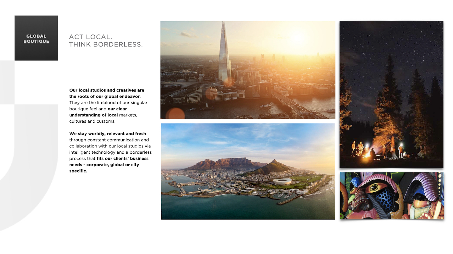
Define the company’s purpose, voice, and visual DNA. Build a scalable brand system that united 150+ global studios, 8 practice areas, and a growing suite of SaaS platforms—while honoring both local culture and global cohesion. Make it strategic, semiotic, and alive.
ACTION
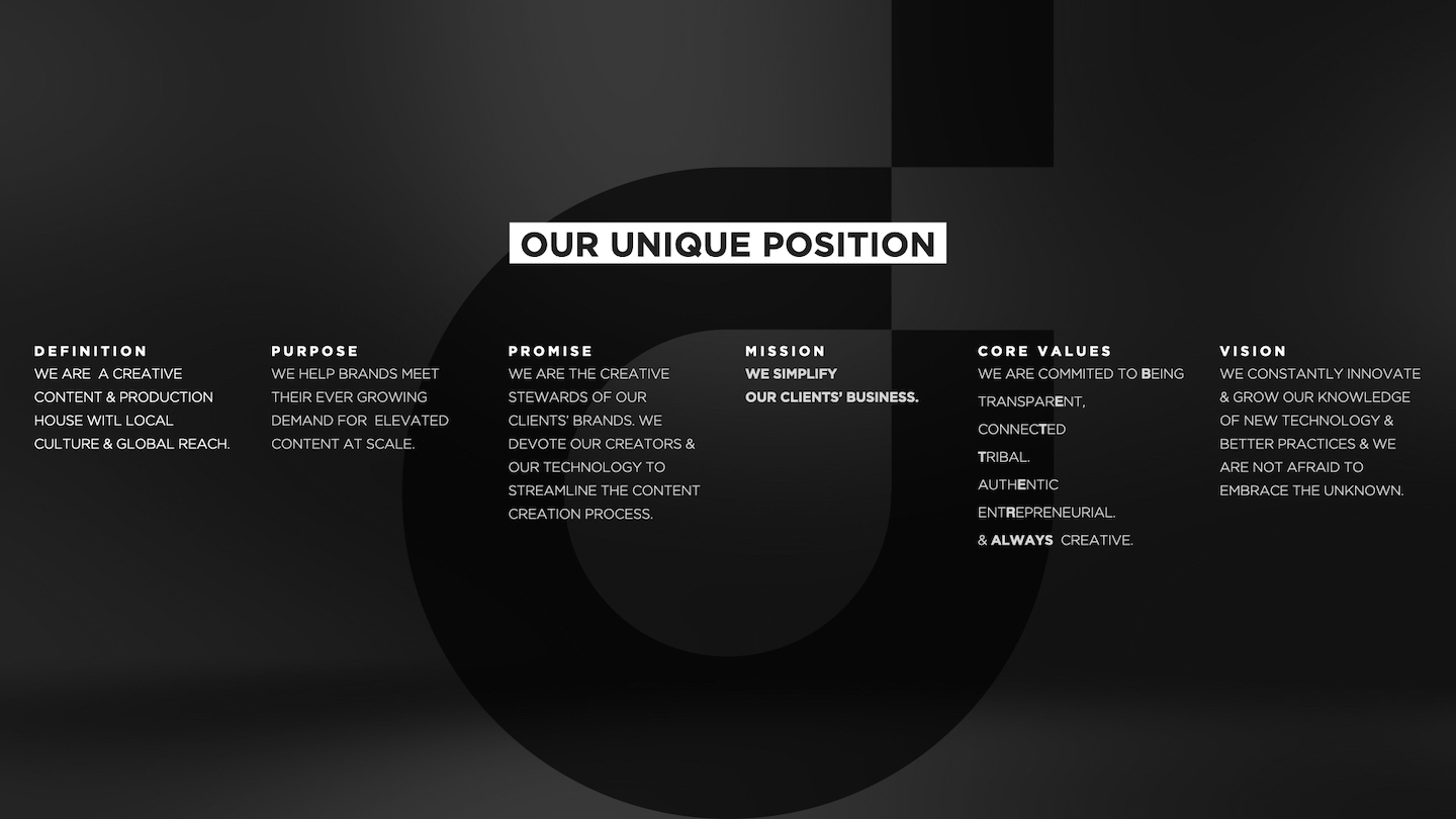
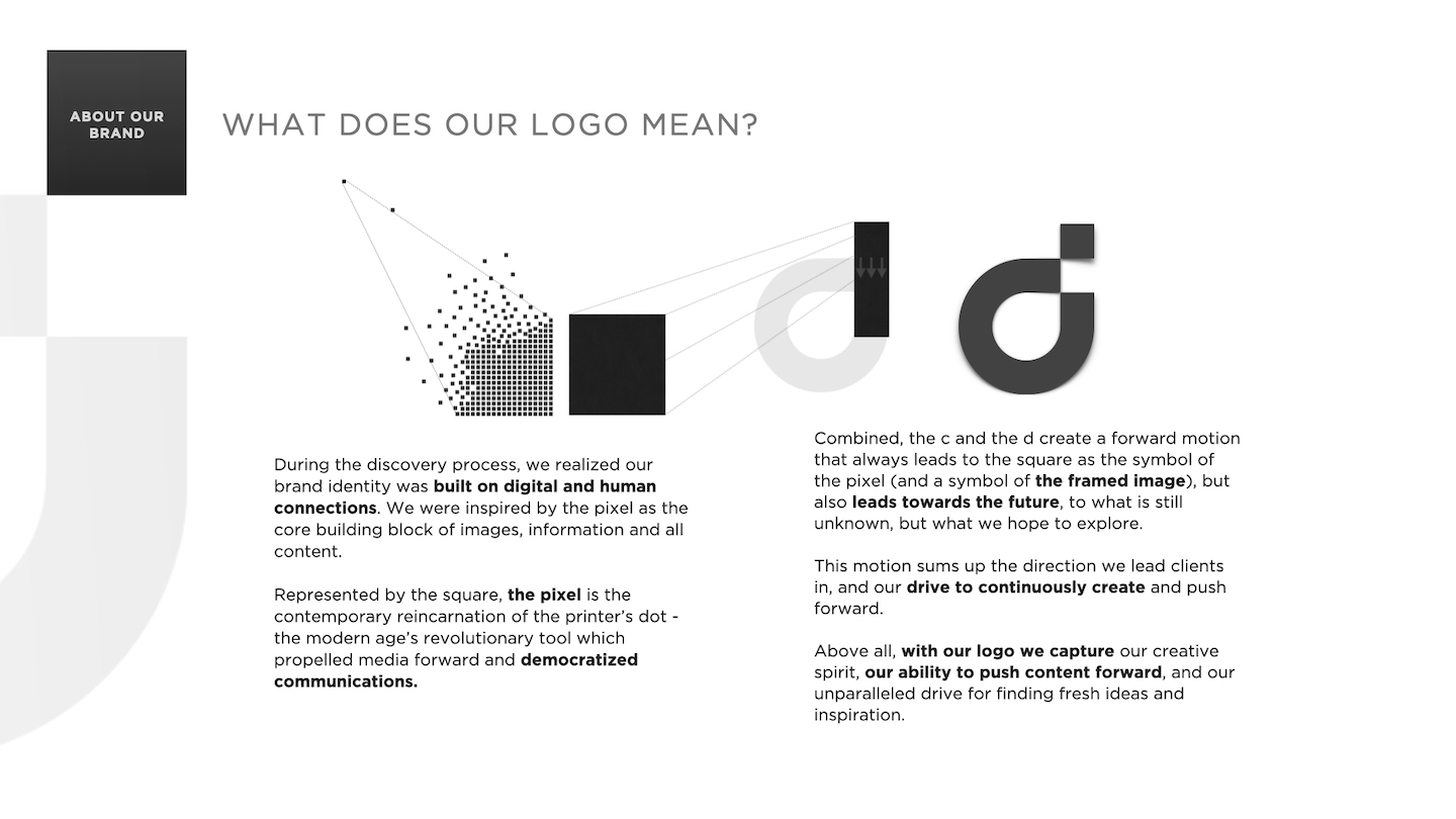
I led the full development of the CreativeDrive Brand Book - part manifesto, part design system, part cultural operating system.
Key moves:
- Brand purpose & POV: Positioned CD as ‘the creative stewards of our clients’ brands’ - a hybrid of agency craft, production speed, and startup innovation.
Mission: simplify business through creativity and tech.
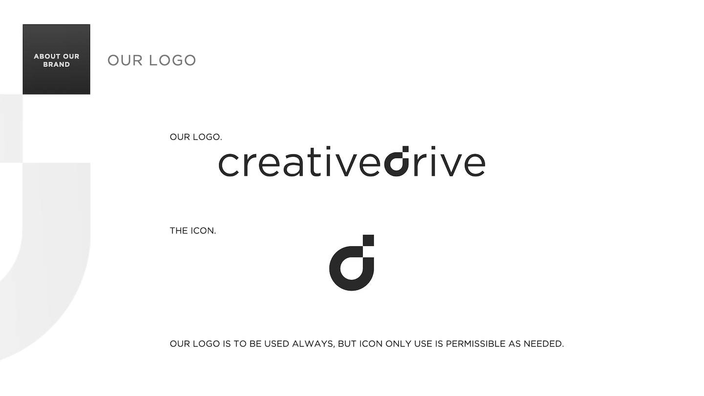
- Global design system: Modular logo built around the pixel as modern creative atom. Identity guidelines spanned print, digital, motion, and spatial.
- Naming architecture: Created a dual-layer naming system - studio code + cultural tag (e.g., d3209 the lion)- that made every office feel boutique yet connected.
- Sonic identity: Designed and launched a branded sound logo signaling CreativeDrive’s voice as curious, modern, and emotionally intelligent.
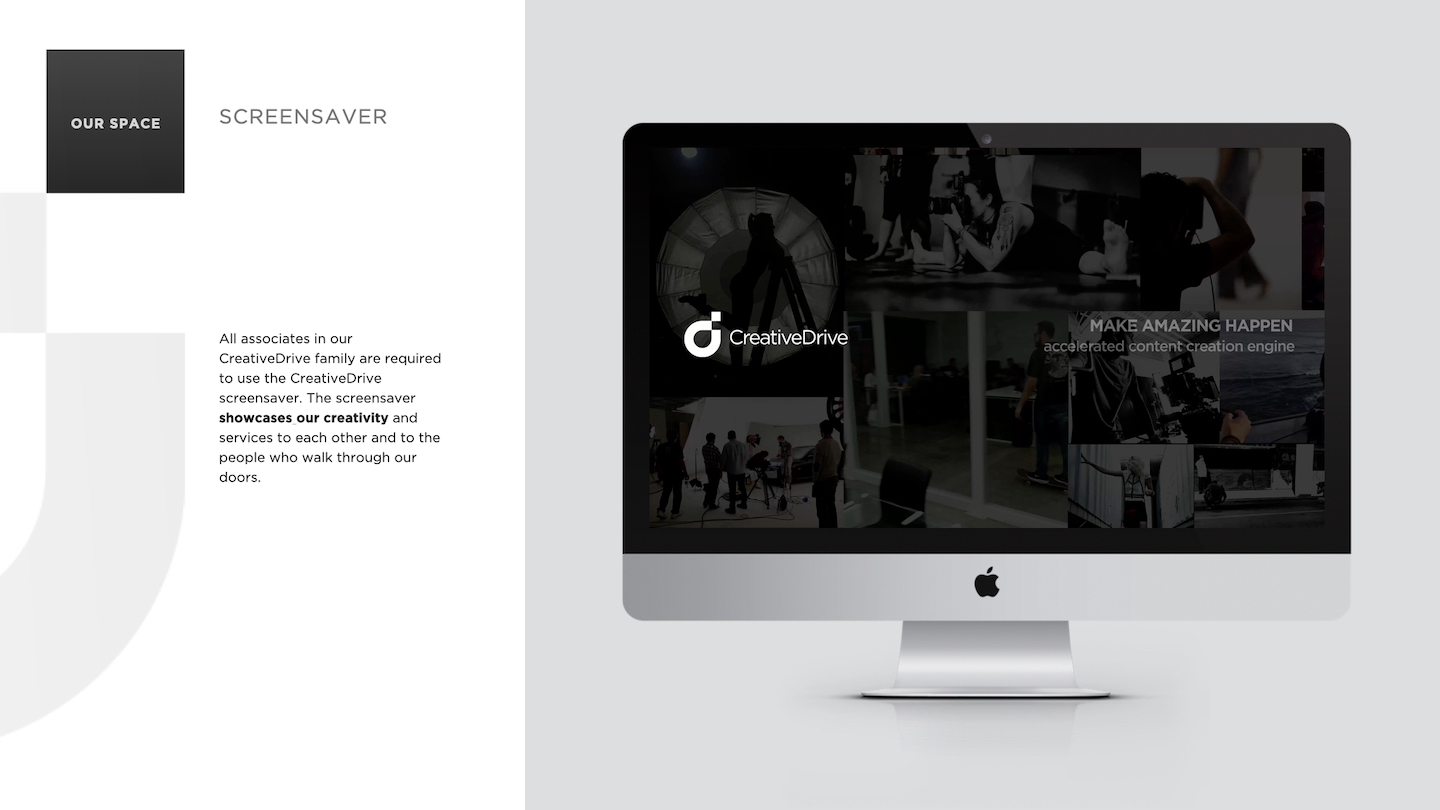
- Environmental + cultural branding: Rolled out interior brand systems - neon signage, motto walls, localized artwork, quote boards, swag - and screensaver protocols for brand immersion.
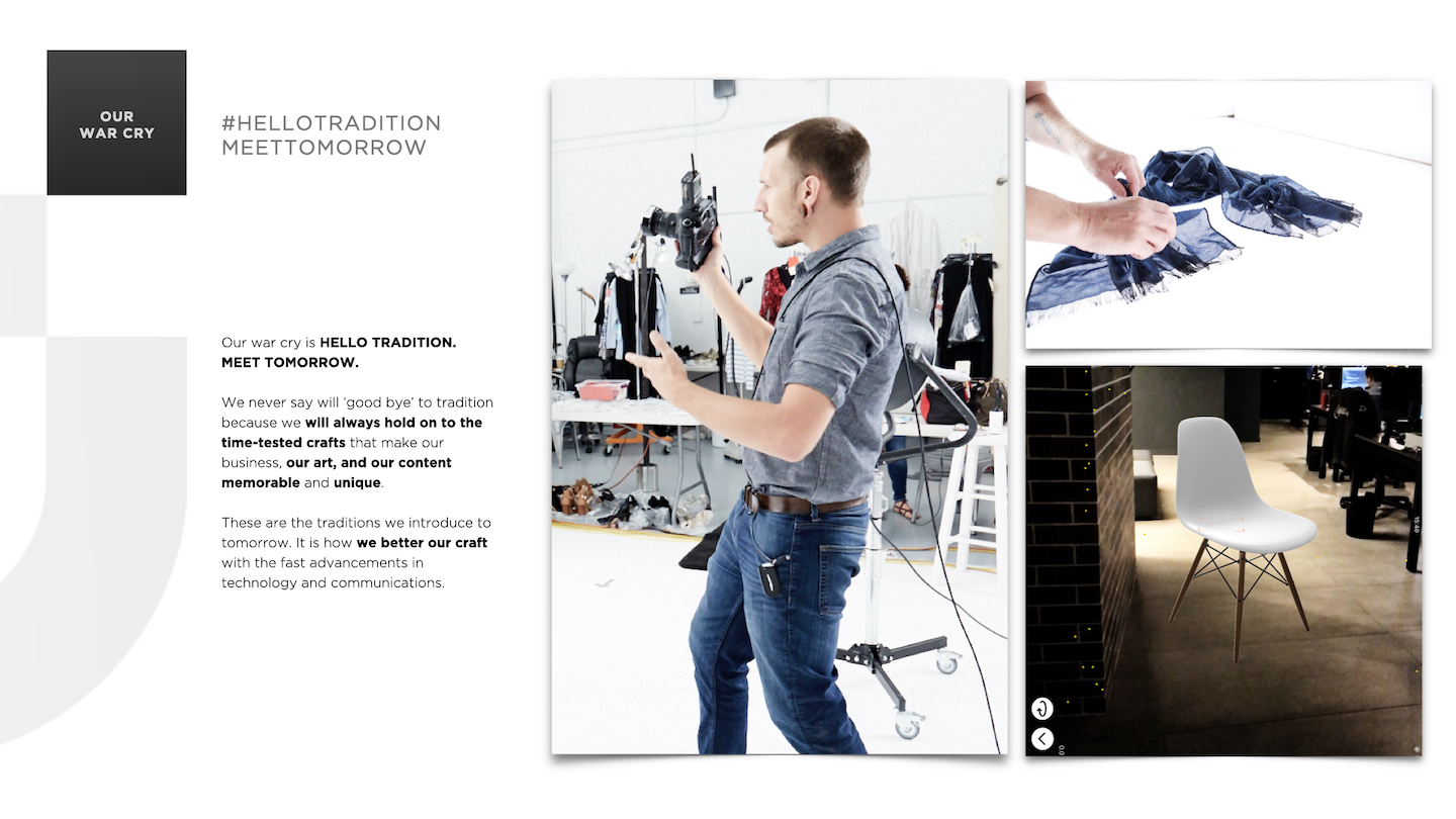
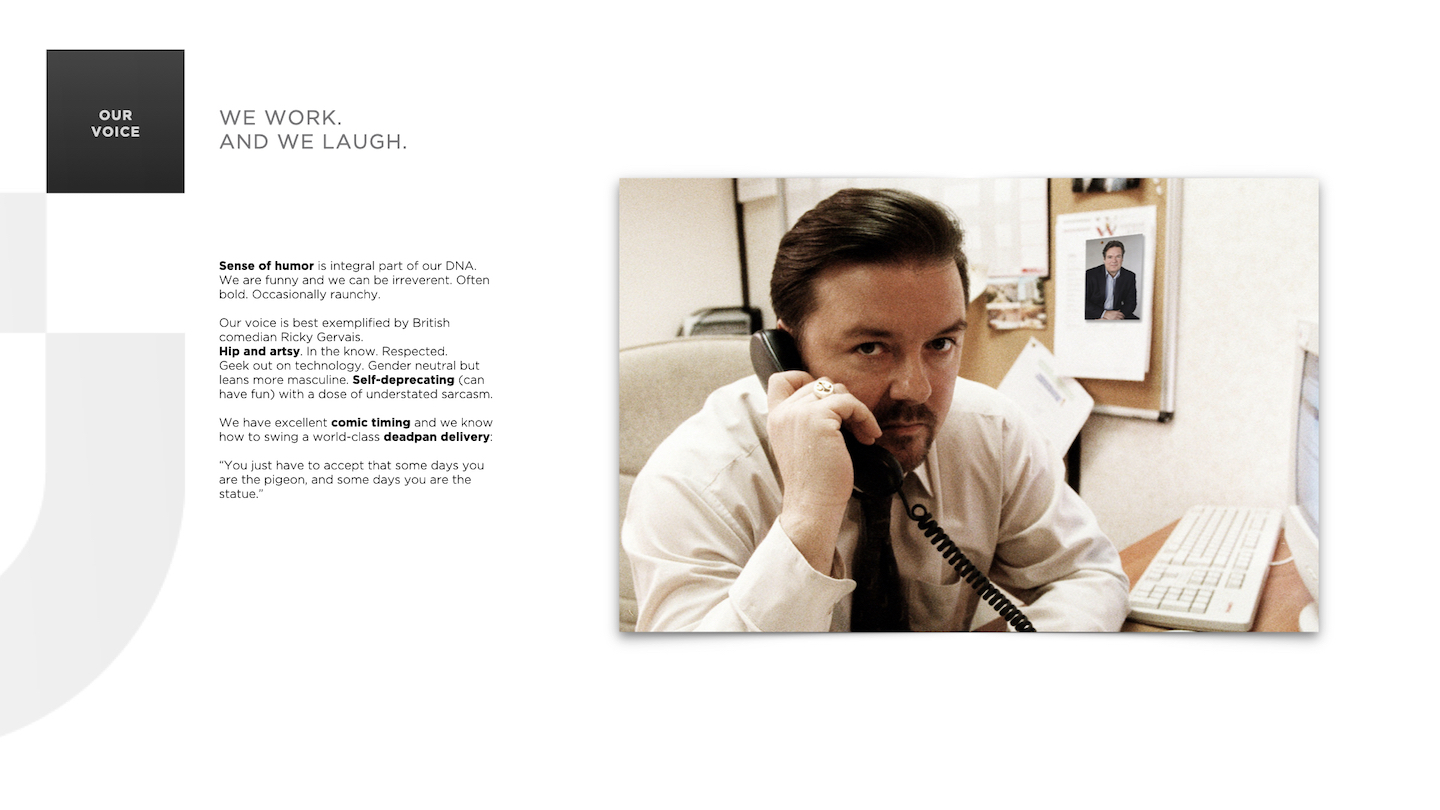
- Voice + tone system: Defined brand personality as witty, dry, emotionally fluent, and culturally tuned - 'British brain, global heart.’
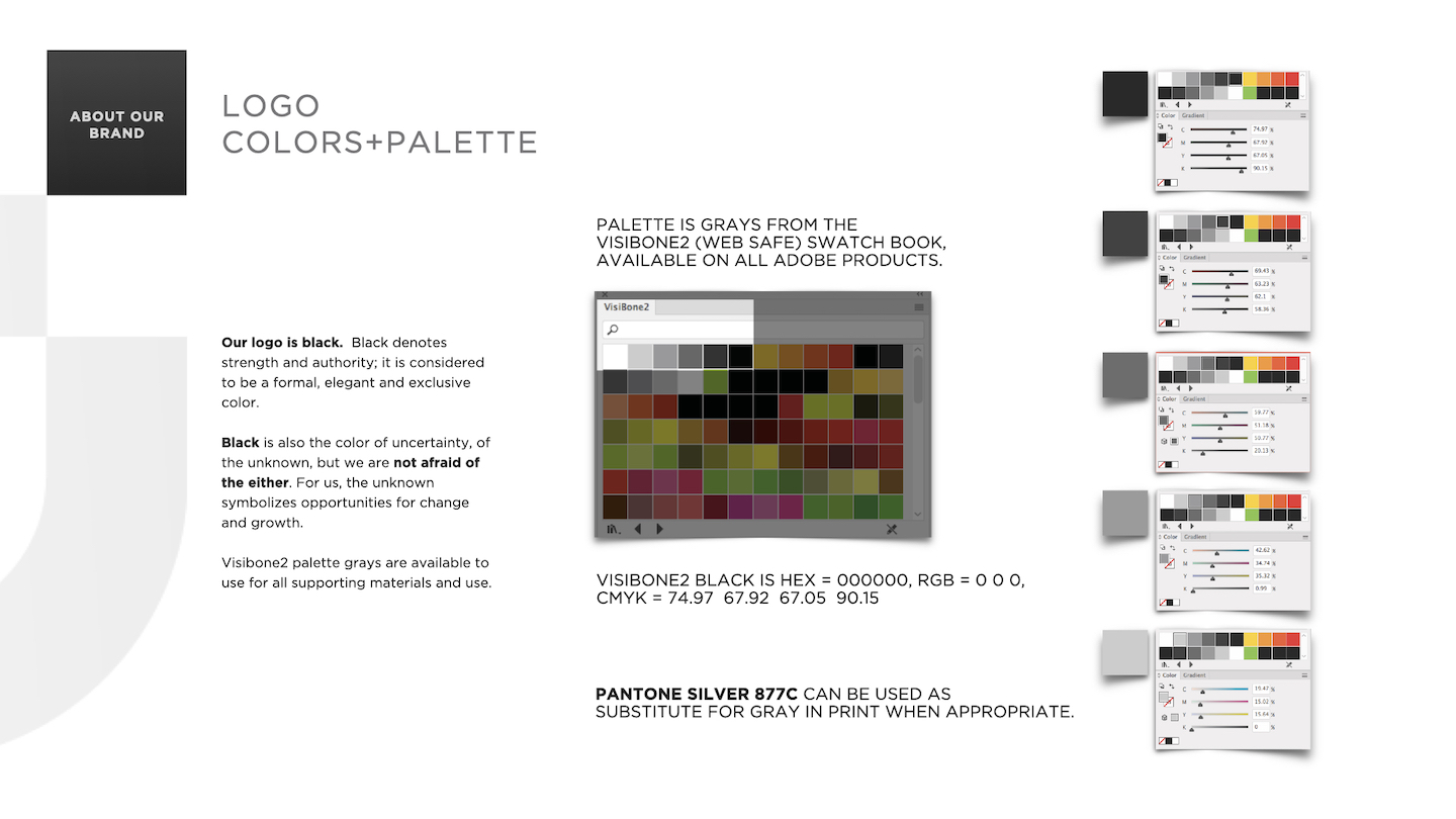
- Color & typography: Grayscale Visibone2 palette + chromatic accent system for emotional tone-matching; Gotham and Caslon as balance of clarity and style.
Core to the system was the concept of LayeredContent - a term I coined to describe CreativeDrive’s philosophy that great content blends people, process, and tech.
This became a throughline across social, editorial, and pitch work, tying abstract philosophy to practical execution.
RESULT
The Brand Book became more than design documentation - it was an engine of identity. It unified global studios, aligned execs and creatives, and turned CreativeDrive into a culturally fluent, future-facing brand with both polish and personality.
The system flexed across product launches, recruitment, IRL events, and social - proving that even in a high-volume, tech-driven ecosystem, brand can still lead with soul.
LOGO STILL & LOGO MOTION


BRAND BOOK














PROMO REEL
NAMING ARCHITECTURE + IDENTITY SYSTEM
Modular Brand Language, Semantic Systems, Cultural Encoding
SITUATION
CREATIVEDRIVE NEEDED A COHESIVE YET FLEXIBLE NAMING SYSTEM THAT COULD:
- Unite a global network of creative studios
- Maintain corporate clarity while fostering boutique agency feel
- Scale effectively with company growth
- Create distinctive identities for locations, practices, and products
TASK
Create a scalable naming system that could unify CreativeDrive’s expanding global footprint - without sacrificing local personality or creative edge. The system had to align with the brand’s corporate identity, support cross-functional clarity, and flex across locations, service lines, and digital products - all while feeling boutique, not bureaucratic.
ACTION
I developed an integrated naming architecture anchored by the brand's signature 'd' icon that worked across multiple touchpoints:
LOCATION NAMING
CREATED A DUAL NAMING SYSTEM COMBINING PRECISION WITH PERSONALITY:
Functional: Street number + icon (d55, d3209)
Memorable: Location-inspired names (d55 the water, d3209 the lion) This allowed each studio to operate as a boutique creative agency while maintaining clear corporate connection.
PRACTICE NAMING
UNIFIED EIGHT GLOBAL PRACTICES UNDER THE 'D' SYSTEM:
plan’d (Strategy), create’d (Creative), d’igital (Interactive), etra’d’e (ecomm), d’lux (luxury/fashion), soun’d, culture’d (events+culture), d’iscovery (research/innovation)
PRODUCT NAMING
EXTENDED THE SYSTEM TO SAAS OFFERINGS:
Tune’d, View’d
RESULT
The new system turned CreativeDrive into a linguistically unified, culturally expressive brand.
It scaled across continents, departments, and product launches. And it helped employees, clients, and partners understand what CreativeDrive was - and where they belonged within it.


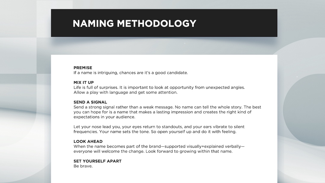


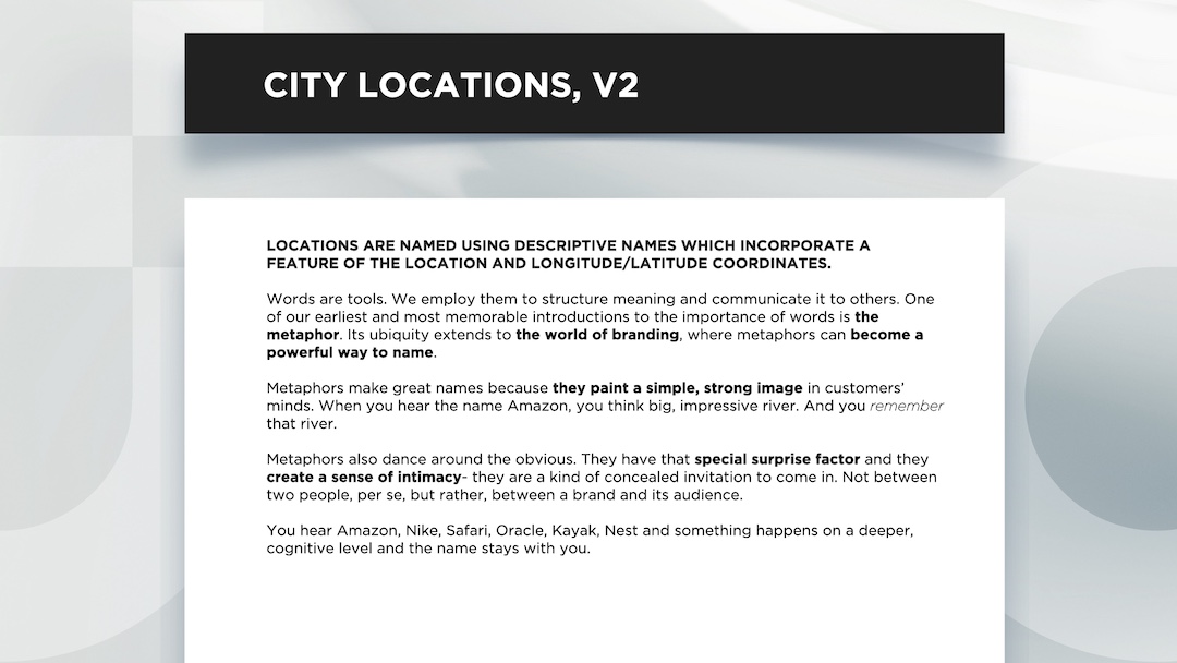

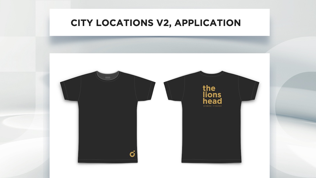


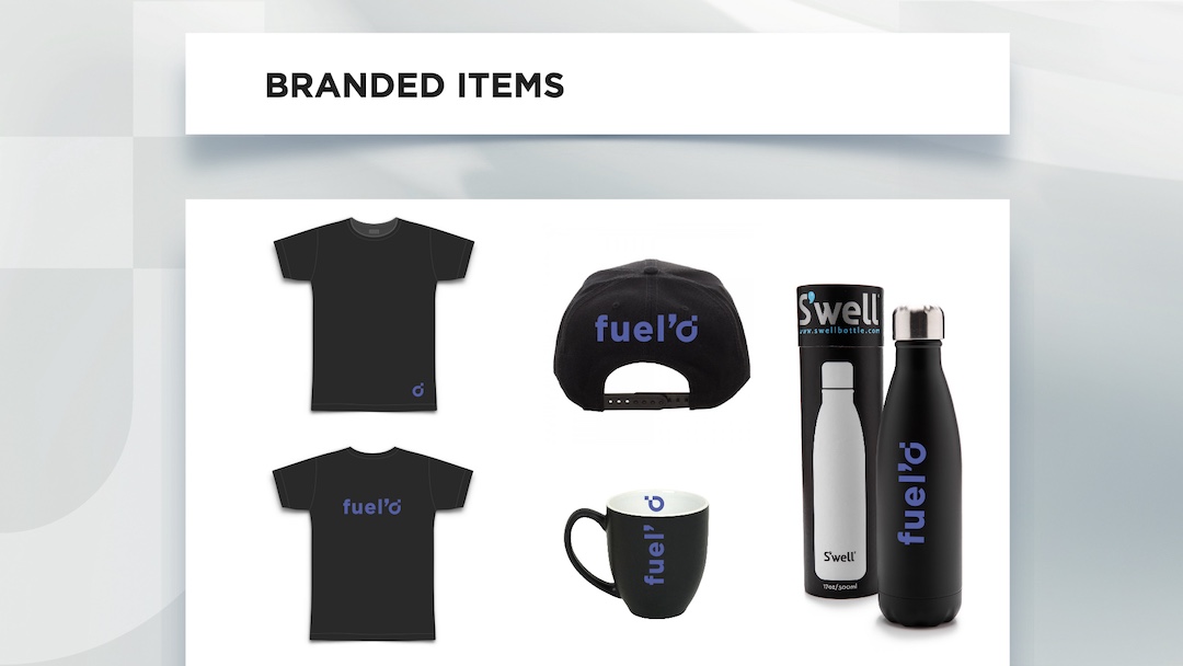


+ The naming conventions also lend themselves to very cool swag.
In essence, I created an insider effect - psychology at work. The t-shirt with "d3209" (with that stylized d) worked on multiple levels:
- Created curiosity - it looks like a code or secret message
- Gave employees a sense of belonging - they're "in the know"
- Sparked conversations - people want to ask about it
- Functioned as subtle but intriguing branding
- Made employees feel special - they're part of something exclusive
CORA CGI AT CREATIVEDRIVE
PRE-LAUNCH, SOCIAL MEDIA TEASER CAMPAIGN
Brand strategy, visual identity, messaging, campaign launchSITUATION
I led the brand development of CoraCGI, a platform born from CreativeDrive’s acquisition of Decora - a Brazilian imaging powerhouse specializing in CGI, AR, and VR for ecommerce.
The challenge: transform this powerful but technical engine into a new SaaS product that could meet a growing demand in the market - high-volume, high-quality content for digital commerce at scale.
TASK
Position CoraCGI as an essential creative tech brand within CreativeDrive’s larger portfolio. Build a full identity system that could speak to both its technical sophistication and its commercial relevance - while retaining visual alignment with the parent company.
ACTION
Working within CreativeDrive’s brand architecture, I developed:
- A brand identity system that visually connected CoraCGI to its parent while establishing a distinctive new presence
- A logo and visual language that emphasized the dual nature of the brand - heritage and innovation
- The tagline ‘Perfected Reality’, capturing CoraCGI’s unique value: delivering optimized imagery that can flex across ecommerce, AR, VR, and whatever comes next
- Full creative direction for the pre-launch teaser campaign across social
- UI design for the product website
- Marketing and experiential collateral for the CommerceNext NYC launch activation
RESULT
Through sharp brand positioning and clear creative execution, we launched CoraCGI as more than a tech rebrand - we defined it as a solution for the future of digital commerce. The brand narrative bridged complex technology with market needs, helping retailers understand CoraCGI not just as a tool, but as a category leader in scalable content innovation.
IDENTITY - LOGO + TAGLINE

PRE-LAUNCH, SOCIAL MEDIA TEASER CAMPAIGN
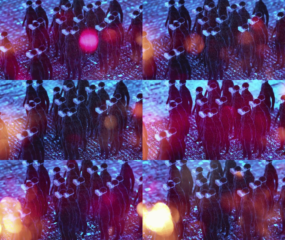
A motion-first teaser campaign exploring the emotional territory of digital reality through handcrafted visuals and existential prompts.
Role: Creative Direction, Animation Concept, Messaging
Medium: Stop-motion, Social Content, Micro-campaign
I thought of this as the short film version of the brand itself.
SITUATION
As part of the brand launch for CoraCGI, CreativeDrive’s new CGI/AR/VR content platform, I was tasked with developing a pre-launch social campaign. The goal wasn’t to explain the tech - it was to spark curiosity, build emotional resonance, and earn credibility with a skeptical creative audience before launch.
TASK
Create a teaser campaign that would speak directly to creators - designers, art directors, visual storytellers - and ease anxieties around automation by repositioning high-tech tools as extensions of their artistry, not threats to it.
ACTION
I developed a two-phase social media strategy built around the tagline ‘Perfected Reality.’ Rather than lead with features, I reframed the message around philosophical and emotional questions: what is real, what is felt, what is believed.
The campaign used:
- Stop-motion animations inspired by Czech cinema, chosen for their handcrafted, nostalgic quality - a deliberate contrast to the digital slickness of the product itself
- Thought-provoking lines like:
‘WHAT IS REAL? WHAT YOU SEE? OR WHAT YOU FEEL?’
‘WHAT IS REAL? WHAT YOU KNOW TO BE TRUE? OR WHAT YOU BELIEVE IN?’
This approach activated the limbic system - prioritizing mood and meaning over product specs - and signaled that this was a tool for artists, not just for enterprise teams.
My role included full creative direction, messaging, and hands-on execution of visual assets across campaign rollout.
RESULT
The campaign generated anticipation and emotional buy-in from the creative audience before the product was even live. By centering human perception over tech features, we laid the groundwork for a values-driven launch - one that positioned CoraCGI as a collaborator in creativity, not a disruptor.
THE CORA LOGO WAS FIRST SEEN AS A PART OF SOCIAL MEDIA TEASER CAMPAIGN (in red above), BEFORE THE OFFICIAL PRODUCT LAUNCH AT COMMERCE NEXT AND THE BIG SHOW TRADE EVENTS IN NYC.
BRAND FILM
PRE-LAUNCH PROMO CONTENT
I wrote the screenplay for the brand launch film and worked with our film production house on its creation.
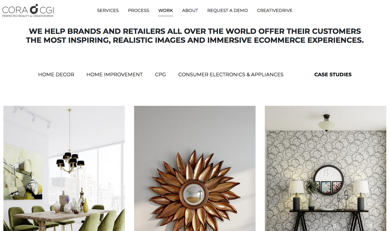
WEBSITE CONTENT DESIGN
SITUATION
CoraCGI needed a microsite that could introduce a highly technical SaaS product to a commerce audience with limited attention spans.
TASK
Design site content that distilled the platform’s complex capabilities into an instantly understandable, buyer-friendly narrative.
CoraCGI needed a microsite that could introduce a highly technical SaaS product to a commerce audience with limited attention spans.
TASK
Design site content that distilled the platform’s complex capabilities into an instantly understandable, buyer-friendly narrative.
ACTION
Structured and wrote the site to be visually minimal and verbally precise - clear headlines, concise copy blocks, and strategically placed feature callouts to surface key capabilities without overwhelming the user.
RESULT
Created a site experience that allowed prospective buyers to understand CoraCGI’s value proposition at a glance -reducing cognitive load, increasing clarity, and aligning the brand’s online presence with its premium, innovation-led positioning.


︎


CONTENT
SITUATION
CoraCGI needed to convey a complex SaaS product’s capabilities to time-pressed ecommerce decision-makers.
TASK
Create brand film content that could communicate key features quickly while reinforcing the brand’s premium positioning.
CoraCGI needed to convey a complex SaaS product’s capabilities to time-pressed ecommerce decision-makers.
TASK
Create brand film content that could communicate key features quickly while reinforcing the brand’s premium positioning.
ACTION
Produced a series of short, refined brand films with a clean visual style - distilling each feature into a streamlined, high-impact narrative designed for rapid comprehension and engagement.
RESULT
Enabled potential buyers to grasp CoraCGI’s unique strengths in seconds, increasing clarity and memorability while aligning with the brand’s innovation-led image.
AMAZING HAPPENINGS - CREATIVEDRIVE’S DIGITAL MAGAZINE
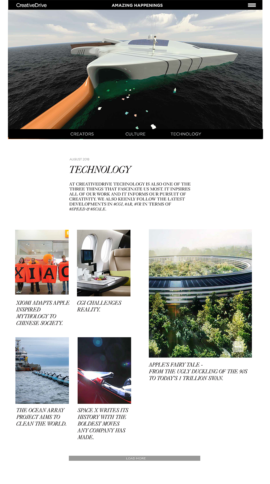
AMAZING HAPPENINGS was launched as CreativeDrive’s online magazine.
I oversaw the visual design of the magazine/blog, and worked closely with our digital team in Costa Rica to manage wireframing and navigational structure.
I oversaw the visual design of the magazine/blog, and worked closely with our digital team in Costa Rica to manage wireframing and navigational structure.
The goal behind the magazine and behind its editorial and visual look was to alleviate the creative community’s fear of techology and also their apprehension of the studio’s adoption of more technology. In short - to humanize its face to the world and its commitment to creativity, creators, and their livelihood.
CONTENT DESIGN & STRATEGY
SITUATION
CreativeDrive needed a way to humanize its advanced production capabilities and build relevance with the creative community. The solution had to be editorial, experience-driven, and scalable - something that could speak to creators, clients, and internal teams alike.
TASK
As Creative Lead, I was responsible for launching an original online magazine that would:
- Shift perception of CreativeDrive from production vendor to cultural partner
- Amplify diverse creative voices across industries and disciplines
- Establish an owned editorial platform that balanced brand storytelling with audience value
ACTION
EDITORIAL STRUCTURE
I built a fixed, monthly content model of 18 feature pieces per issue, structured to encourage discovery and rhythm:
Recurring features like No Comment (video essays), Coffee Links (curated finds), and Proverbs (standalone quotes) added editorial flexibility and tonal variety.
Each issue was centered around a unifying theme, driving narrative cohesion across categories.
INFORMATION ARCHITECTURE & UX
I designed the content structure around three primary pillars:
Navigation avoided heavy menus in favor of inline tagging and section-based browsing, allowing users to move laterally through content without dead ends. Every decision prioritized readability, curiosity, and flow.
I created wireframes and user flows to test the concept and collaborated across editorial, design, and dev teams to align on implementation.
VISUAL DESIGN & TONE
The magazine's identity was editorial-forward, bold but approachable. Key UI elements:
The tone was designed to be smart, inclusive, and anti-jargon - speaking to the creative community without pandering.
RESULT
AMAZING HAPPENINGS launched as a flagship editorial property and helped reposition CreativeDrive as a culturally fluent, creator-first brand.
It drove internal alignment around voice and mission, grew external engagement steadily over its first year*, and set a new standard for how CreativeDrive could tell its own story - not just produce others'.
EDITORIAL STRUCTURE
I built a fixed, monthly content model of 18 feature pieces per issue, structured to encourage discovery and rhythm:
- 2 Conversations (in-depth interviews)
- 4 Creative Spotlights
- 4 'People We Admire' (curated profiles)
- 4 Culture articles
- 4 Technology articles
Recurring features like No Comment (video essays), Coffee Links (curated finds), and Proverbs (standalone quotes) added editorial flexibility and tonal variety.
Each issue was centered around a unifying theme, driving narrative cohesion across categories.
INFORMATION ARCHITECTURE & UX
I designed the content structure around three primary pillars:
- Creators (Conversations, Innovators, People We Admire)
- Culture (Ways of Life, Ways to Create, Behind the Drive)
- Technology (Trends, Tools, Speculation)
Navigation avoided heavy menus in favor of inline tagging and section-based browsing, allowing users to move laterally through content without dead ends. Every decision prioritized readability, curiosity, and flow.
I created wireframes and user flows to test the concept and collaborated across editorial, design, and dev teams to align on implementation.
VISUAL DESIGN & TONE
The magazine's identity was editorial-forward, bold but approachable. Key UI elements:
- A layered homepage split into three zones:
- Light: for brand voice and top-level framing
- Theme: spotlighting the issue’s narrative arc
- Feed: a scrollable stream of rich content
- A flexible grid system built for both longform and shortform content
- Dynamic image treatments and bold typography
- Strategic use of CTAs, quotes, and expandable modules to guide engagement without overwhelming the reader
The tone was designed to be smart, inclusive, and anti-jargon - speaking to the creative community without pandering.
RESULT
AMAZING HAPPENINGS launched as a flagship editorial property and helped reposition CreativeDrive as a culturally fluent, creator-first brand.
It drove internal alignment around voice and mission, grew external engagement steadily over its first year*, and set a new standard for how CreativeDrive could tell its own story - not just produce others'.
*please note that CreativeDrive was acquired by Accenture in 2020 and all of its sites were subsumed under AccentureSong, which prioritized different goals.
+ HOME PAGE TEMPLATE +

+ MONTHLY THEME TEMPLATE+
 + TECHNOLOGY SECTION TEMPLATE +
 + CULTURE SECTION TEMPLATE +
+ CREATORS SECTION TEMPLATE +
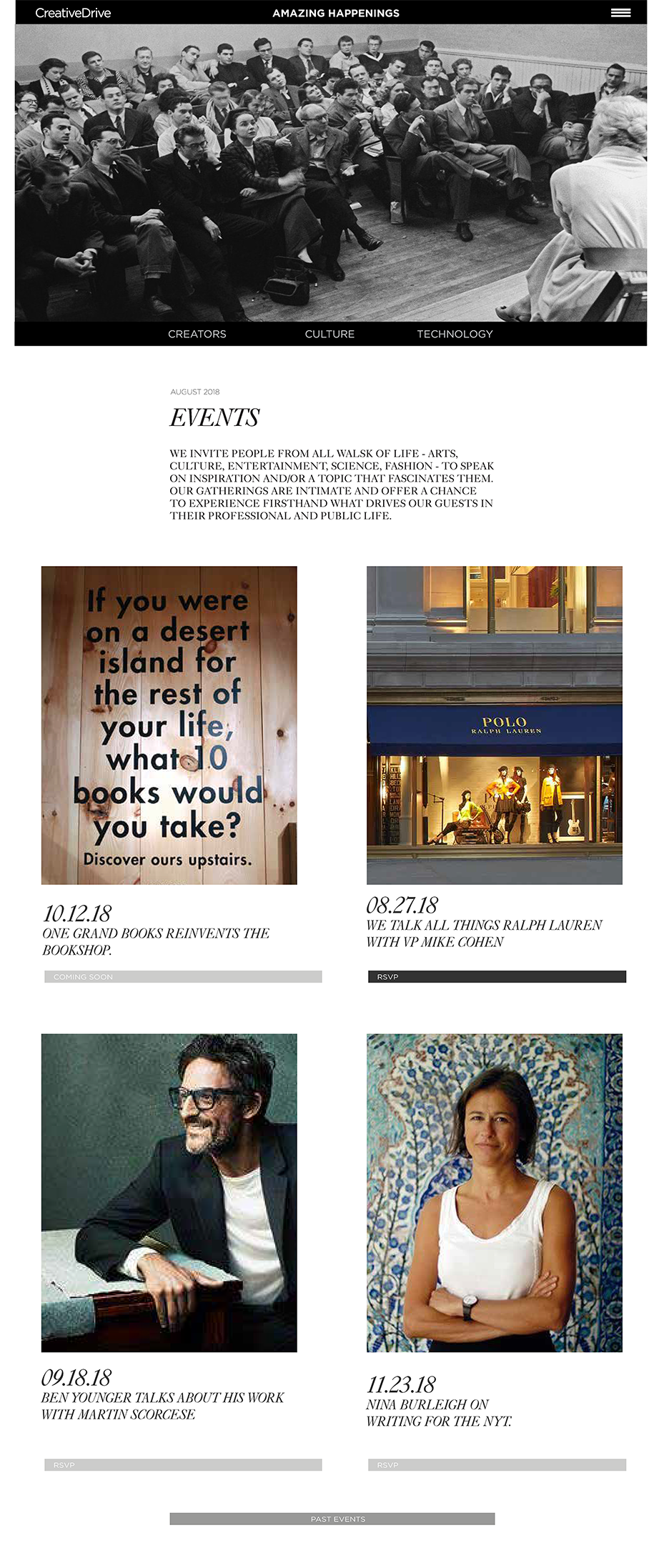
 + EVENTS SECTION TEMPLATE +
 + OBSESSIONS SECTION TEMPLATE +

CREATIVEDRIVE
GLOBAL TECHOLOGY STUDIO
CREATIVE & VISUAL INNOVATION: BRAND SYSTEMS, CONTENT UX, SCALABLE DESIGN FRAMEWORKS
I led brand and visual design for CreativeDrive, a global content technology studio automating the future of production - across CGI, AR, ML, and ecommerce at scale. My role: architect a living brand system that could flex with the tech and stay human.
This wasn’t just about standardizing identity - it was about protecting soul. As automation accelerated, I helped build a brand that creatives could still connect to: through emotionally resonant content, modular design systems, and storytelling that positioned technology not as a threat, but as a collaborator.
From brand book to social to spatial design to a documentary-style film series, every artifact was designed to say: yes, we move fast - but we still care who’s behind the lens. That shift helped unite a global team, attract high-profile talent, and position CreativeDrive as a partner - not a pipeline.
.
︎︎︎︎
scroll or jump to:
IDENTITY AND BRAND BOOK
NAMING ARCHITECTURE + IDENTITY SYSTEM
SOCIAL MEDIA & BRANDED CONTENT
SAAS PRODUCT BRANDING, LAUNCH, SITE UX
AMAZING HAPPENINGS - CONTENT DESIGN
NAMING ARCHITECTURE + IDENTITY SYSTEM
SOCIAL MEDIA & BRANDED CONTENT
SAAS PRODUCT BRANDING, LAUNCH, SITE UX
AMAZING HAPPENINGS - CONTENT DESIGN
HAVAS PR
TECHNOLOGY SECTOR TRANSFORMATION
CREATIVE STRATEGY & NEW BUSINESS DEVELOPMENT
.
︎︎︎︎
SITUATION
Havas was pursuing major growth in the technology sector, where new business pitches often hinged on making complex technical narratives emotionally resonant. The challenge? Most decks were functionally accurate but narratively dead - failing to inspire either internal PR teams or potential clients.
TASK
Reimagine the pitch deck process to bridge the gap between technical specificity and brand storytelling. The goal: create beautiful, strategy-backed presentations that didn’t just explain process - they reframed them, sparking fresh narratives and deeper engagement.
ACTION
— Led creative strategy and visual storytelling across high-stakes new business pitches, particularly in technology and innovation-driven categories.
— Developed bespoke visual systems that translated dense specs into clear, emotionally compelling story arcs.
— Elevated pitch materials beyond transactional decks, turning them into PR tools that unlocked broader narrative opportunities.
— Served as a creative liaison between internal strategy, PR, and design teams - ensuring storytelling integrity from concept to client delivery.
RESULT
— Achieved a 90% success rate across high-stakes new business pitches, helping Havas secure major tech accounts.
— Inspired internal PR teams to expand their storytelling ambitions, using the decks as narrative launchpads rather than one-off sales tools.
— Helped clients see their own products differently - creating moments of recognition that led to stronger partnerships and richer media outcomes.
— Set a new internal standard for pitch design - where strategy and aesthetics work in lockstep to drive results.
︎︎︎︎
EXEGER POWERFOYLE
2023 CES + 2023 EXPERIENTIAL, PR & ACTIVATION CAMPAIGNS
SITUATION
Exeger was launching Powerfoyle - a solar cell that could harvest energy from any light source. The product was groundbreaking, but the story around it was still rooted in conventional tech language. The challenge: elevate the narrative to match the innovation, and help stakeholders see beyond the science into the possibility.
TASK
Develop a visual pitch narrative that made Powerfoyle feel less like a solar product and more like a portal into the future. The deck needed to spark imagination, align internal teams, and provide PR with a launchpad for ambitious storytelling.
ACTION
— Designed a sci-fi-inspired visual world that positioned Powerfoyle between the magical and the attainable.
— Created a hero image of an astronaut - evoking exploration, scale, and transformation.
— Used cinematic, forward-looking visuals to suggest Powerfoyle’s potential as a cultural object - not just a technological breakthrough.
— Developed a pitch deck structure that moved beyond specs, framing Powerfoyle as an emotional, visual story meant to inspire press, partners, and clients.
— Treated the deck as a thought-starter, not a sales doc - designed to unlock new ways of seeing, writing, and pitching the product.
RESULT
The visual narrative reframed Powerfoyle from an advanced solar material into a vision of what comes next.
— Sparked richer conversations around media positioning, leading to more expansive, imagination-driven PR angles.
— Helped the client rediscover their own product through a new lens - one that emphasized wonder as much as function.
— Proved that a well-crafted pitch deck can do more than inform - it can ignite.
excerpts
COVER ART/ KEYART

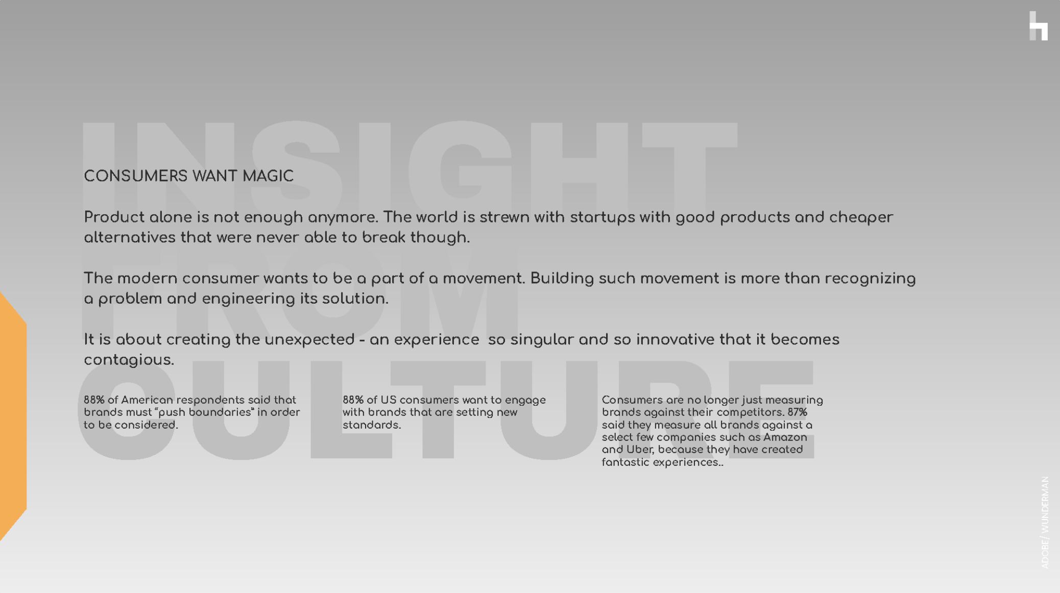
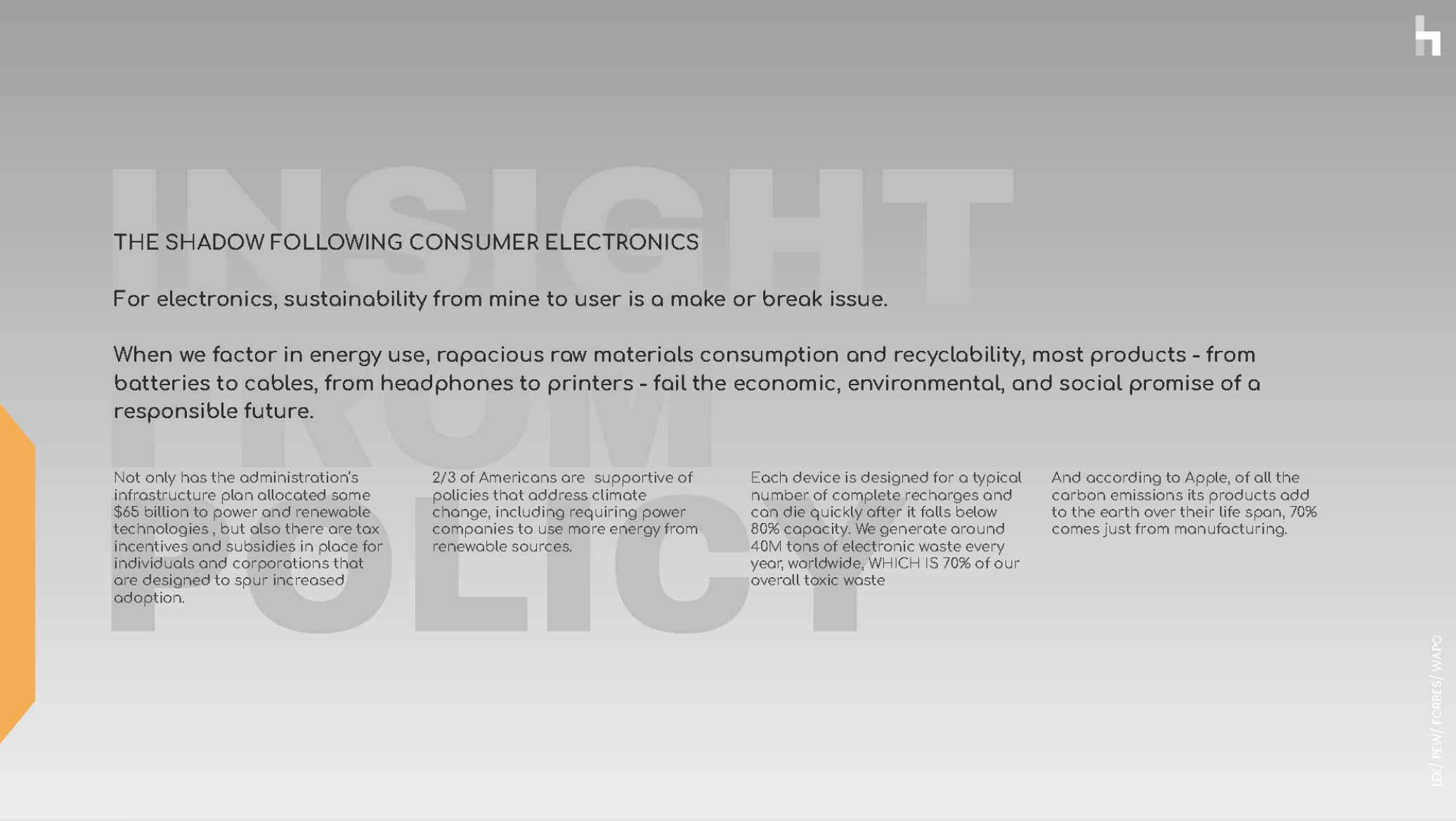
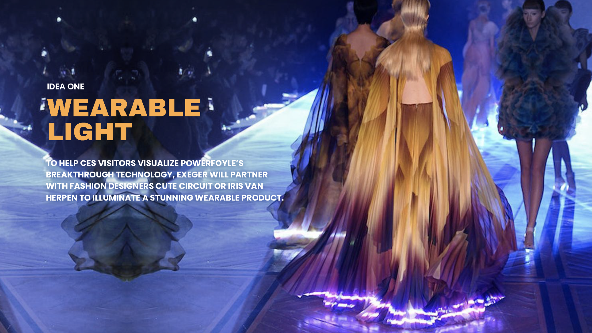
Strategy deck excerpts - CULTURAL TRUTHS, LANDSCAPE, INSIGHTS, HOW WE WIN, and CREATIVE CAMPAIGNS based on the strategy and insights.




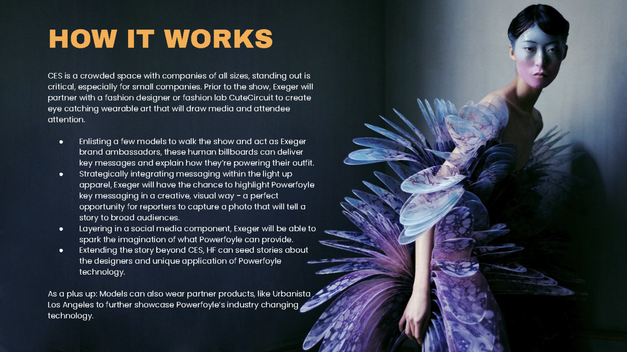

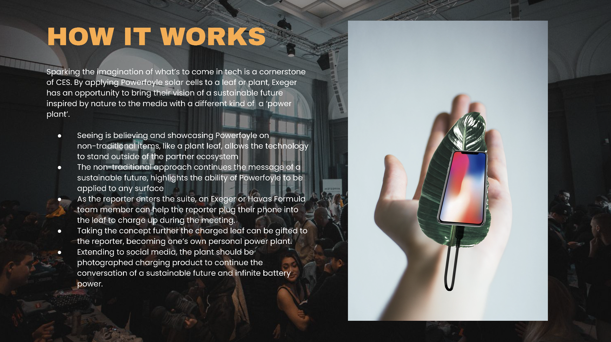
EXPERIENTIAL CAMPAIGN
SITUATION
Exeger was preparing to launch Powerfoyle - its breakthrough solar tech capable of drawing energy from any light source. But awareness was low, and the science wasn’t intuitive. The challenge: create a public-facing campaign that made the technology real, tangible, and unforgettable -not just explained, but experienced.
TASK
Design a guerrilla experiential campaign that could educate, engage, and spark conversation - while reinforcing Exeger’s brand as a visionary in sustainable innovation. The campaign had to serve multiple masters: public education, social virality, media attention, and partner attraction.
ACTION
— Conceived three distinct experiential concepts centered around live, real-time demonstrations of Powerfoyle’s energy-harvesting capabilities.
— Integrated QR codes into installations, driving to a custom microsite that explained the tech and applications in accessible language.
— Crafted an influencer amplification strategy targeting sustainability and tech creators to extend reach and credibility.
— Developed creative platform concepts around the idea of ‘limitless power’, offering co-branded opportunities for strategic partners.
— Built a comprehensi ve PR strategy covering:
• Media relations and press event concepts
• Social media activation playbooks
• Narrative frameworks for earned content
• Content production strategy for live moments
• Cross-platform partner engagement architecture
RESULT
— Reframed Powerfoyle as a cultural proof-of-concept - elevating it from niche tech to a vision of what's next in clean energy.
— Designed immersive, shareable moments that could make the invisible visible and drive organic amplification.
— Positioned Exeger as a credible innovation leader -provocative enough to earn media, compelling enough to attract strategic partners.
— Laid the groundwork for a scalable brand ecosystem across channels, markets, and collaborations - ready for real-world activation.


MASIMO CONSUMER HEALTH
2023 EXPERIENTIAL & PR CAMPAIGN
SITUATION
Masimo Consumer Health was preparing to expand its global footprint - but doing so meant stepping directly into Apple Watch territory. The product had clinical credibility but lacked cultural capital. Competing in that space meant more than proving technical superiority - it required a story, an image, and a presence that could sit confidently next to the most design-forward brand in the world.
TASK
Elevate Masimo’s positioning from medical device maker to premium health-tech challenger. The visuals for the startegy needed to balance clinical precision with contemporary design sensibility - without losing the brand’s professional credibility. Visual storytelling had to operate at Silicon Valley levels of sophistication while emphasizing Masimo’s difference.
ACTION
— Developed a strategic PR framework for global launch, targeting media, influencers, and healthcare partners.
— Designed the campaign’s presentation materials to mirror its strategic intent: confident enough to rival Apple, distinct enough to showcase Masimo’s unique strengths.
— Ensured that every visual and narrative element communicated reassurance as well as revolution - a key duality in personal health technology.
RESULT
— Reframed Masimo’s positioning in the health-tech space - elevating it as a credible, premium alternative to Apple’s consumer-first narrative.
— Garnered strong internal traction, with stakeholders responding to the visual maturity and strategic clarity of the deck.
— Encouraged a more ambitious, culturally attuned approach to consumer marketing across teams.
— Set a new internal benchmark for visual storytelling -demonstrating that medical-grade credibility and brand charisma can coexist within a unified design system.
excerpts


THE EXPERIENTIAL CAMPAIGN
INTRO
The centerpiece of my work was the 'Pulse of the Nation' campaign.
This was a bold experiential campaign that reimagined public health engagement by turning crosswalk posts into interactive health hubs - collecting anonymous data while democratizing access to medical-grade metrics. Inspired by voices like Huberman Lab, the initiative gamified wellness through city-to-city competition, positioning Masimo as a civic-minded innovator with real-world tech credibility.
SITUATION
Masimo needed a high-profile, culturally resonant way to stand apart from lifestyle-first health brands like Apple. The opportunity: create a public campaign that turned health itself into a shared, measurable experience - and Masimo into a brand known for activating civic innovation, not just personal devices.
TASK
Design a large-scale experiential activation that could elevate Masimo's profile, generate national conversation, and showcase the real-world utility of its technology -without relying on traditional product marketing.
ACTION
— Developed Pulse of the Nation, a national urban installation campaign that repurposed crosswalk posts as real-time health check-in points, offering anonymous, medical-grade diagnostics to the public.
— Infused the campaign with competitive storytelling -ranking cities by collective metrics to trigger civic pride, press interest, and social sharing.
— Modeled the tone and ambition of the campaign after voices like Andrew Huberman, aligning Masimo with the cutting edge of health discourse.
— Designed the activation as a media and policy-ready statement - not just a marketing play, but a provocation about the future of public health.
— Positioned Masimo as a quietly radical player in tech: not chasing trends, but building infrastructure for a healthier society.
RESULT
— Positioned Masimo as a civic-tech brand in the making - not just a med-tech player - giving it a narrative edge over lifestyle-first competitors.
— Established a scalable platform concept designed to activate local partnerships and generate repeatable, PR-worthy moments.
— Reframed the conversation around wearables - from individual self-tracking to collective wellbeing - in a way only Masimo is uniquely equipped to deliver.


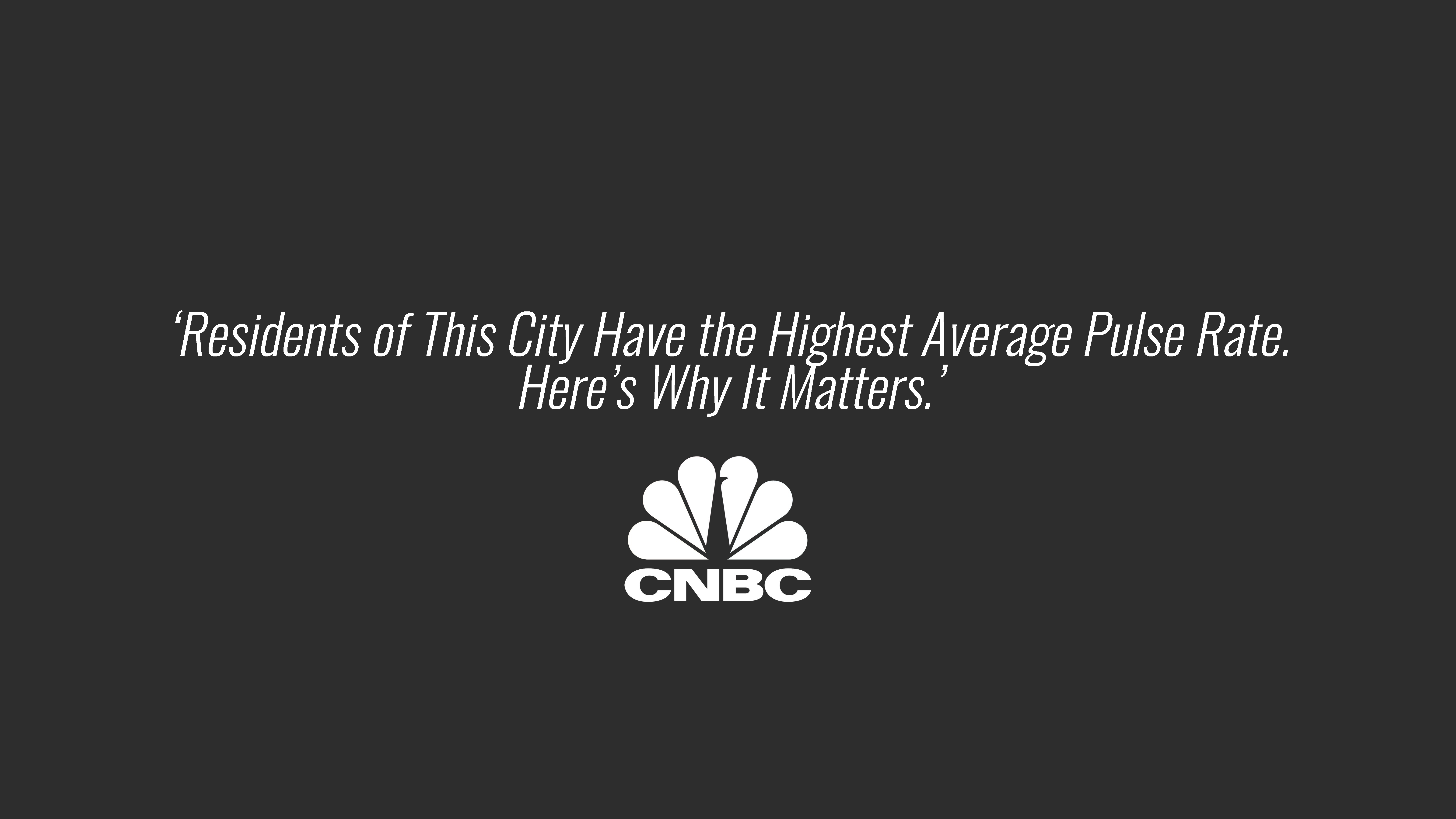

I OPTED TO END OUR DECK WITH A QUOTE FROM NASSIM NICHOLAS TALEB, A QUANT AND THE WRITER OF ‘THE BLACK SWAN’ AND ‘ANTIFRAGILITY’ BOOKS, WHICH ARE GREATLY RESPECTED IN THE WORLD OF TECHNOLOGY AND RISK TAKING.

AICADIUM SINGAPORE
2023 B2B PR STRATEGY
SITUATION
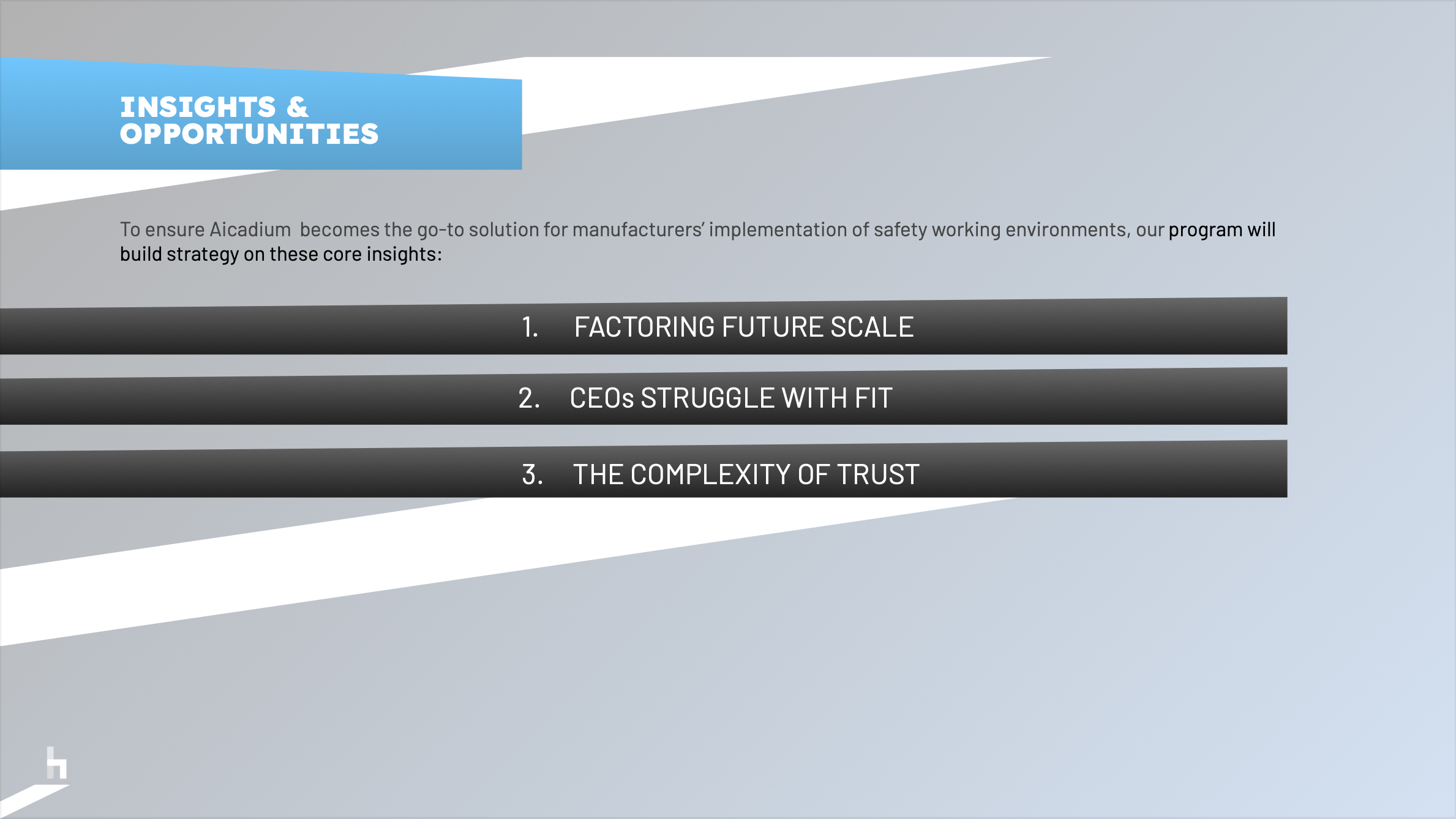
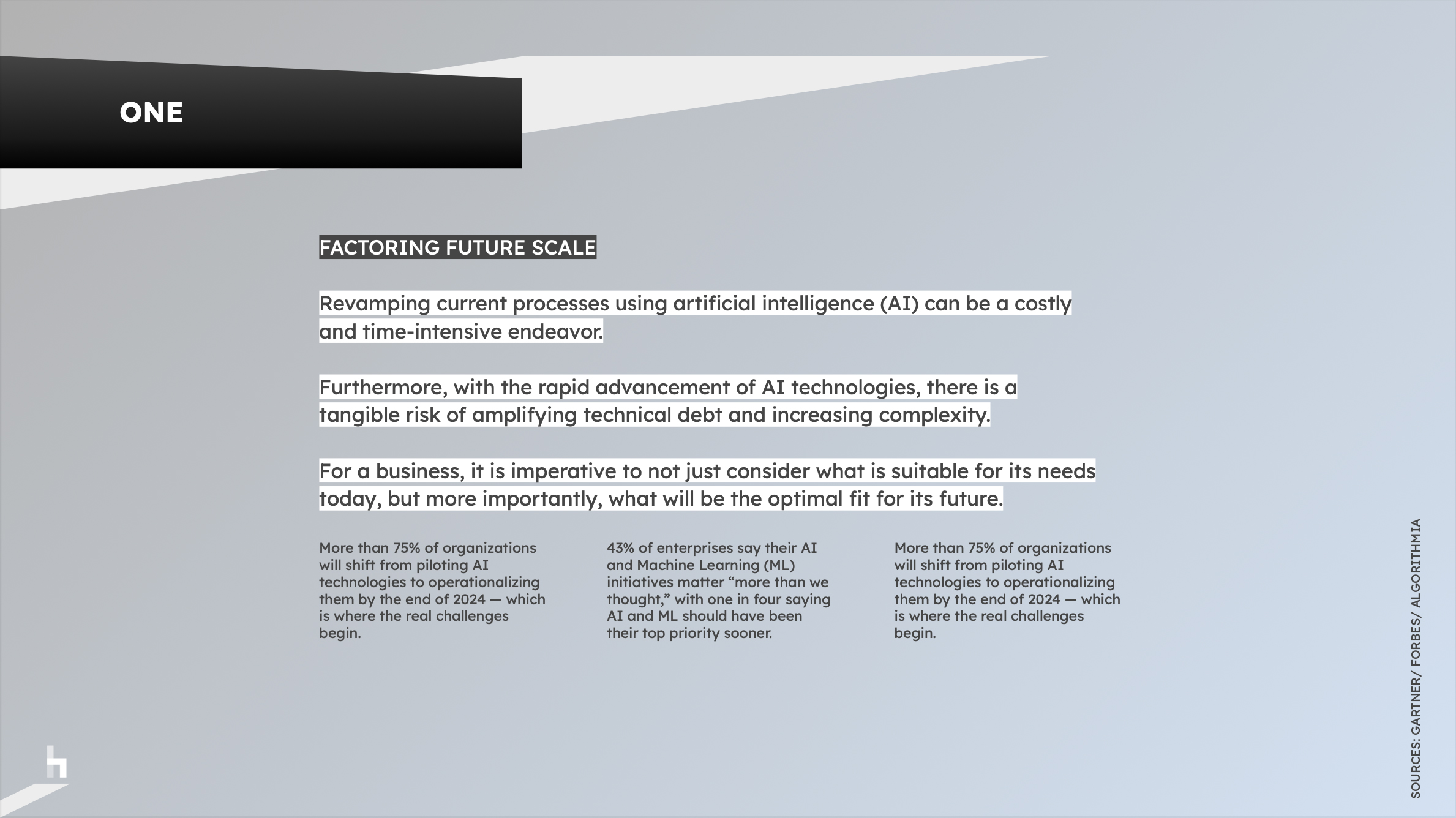
AIcadium, a leading AI solutions provider for manufacturing, was facing the challenge of conveying the complex potential of AI in a way that felt accessible to business leaders.
At a time when AI was still emerging in the broader conversation - well before tools like ChatGPT became mainstream - the company needed a strategy to bridge the gap between technical sophistication and human understanding.
TASK
My role was to craft a compelling narrative and strategic framework that positioned AI as a crucial, non-threatening evolution in business, particularly within the B2B sector.
The challenge was twofold: making AI approachable without simplifying its transformative power, and addressing cultural resistance to AI adoption, all while building stakeholder trust in a highly technical context.
ACTION
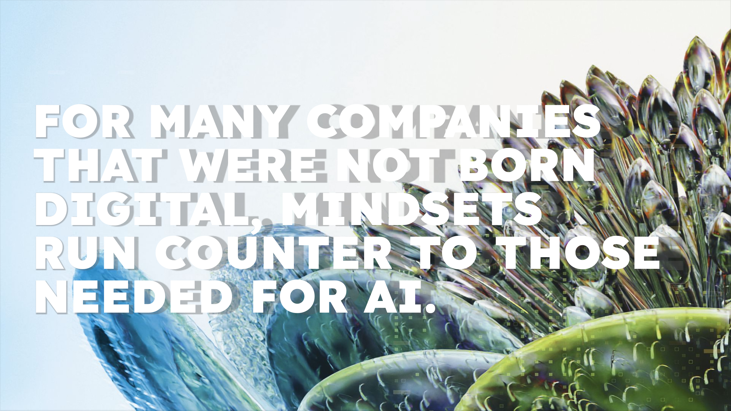
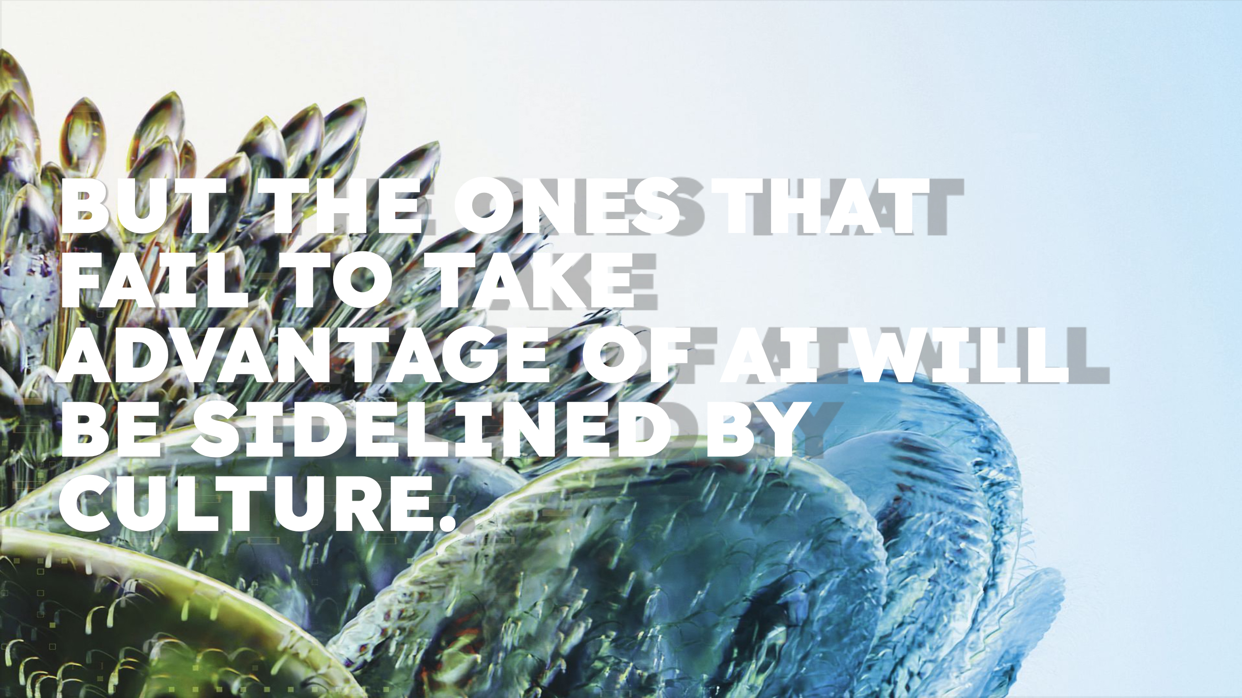
I led the creation of a narrative that combined sharp strategic insights with evocative design elements. The messaging focused on AI as an integral part of business evolution, warning that companies 'not born digital' risked being left behind by both technological and cultural shifts.
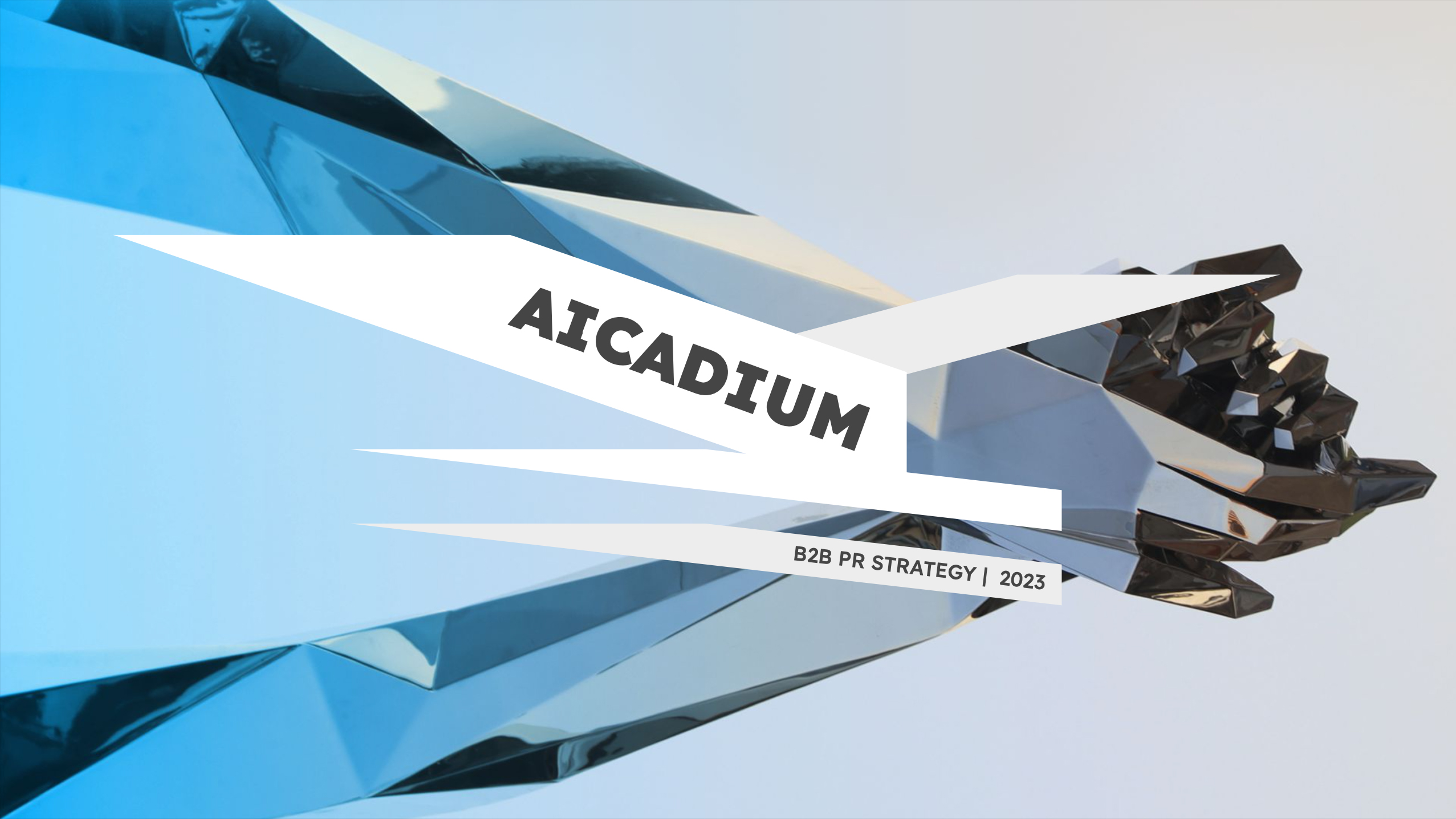
In parallel, I designed visual metaphors - ethereal representations of neural networks and AI-interpretations of botanical forms - that symbolized AI’s potential while making the technology feel more organic and human. This marriage of strategy and design allowed us to demystify AI’s complexity while positioning it as an evolutionary force, not a disruptive threat.
RESULT
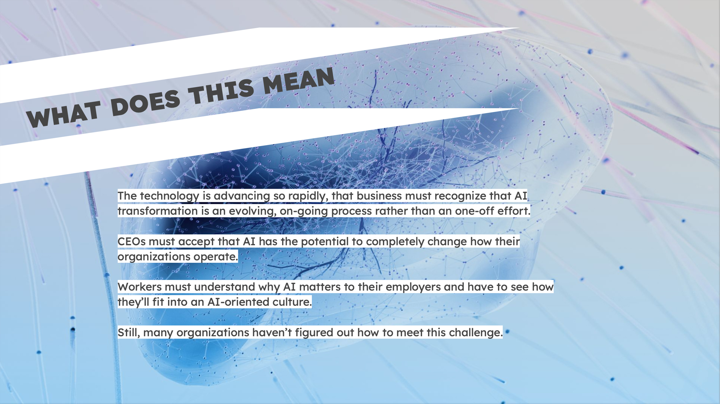
The resulting deck successfully reframed AI for AIcadium’s stakeholders, transforming the abstract into the actionable and empowering business leaders to embrace AI as a future-forward tool for innovation. It positioned AI not as a threat, but as a natural, strategic evolution in human enterprise. This strategic vision, combined with the evocative design, helped AIcadium secure critical partnerships and expand its influence in the manufacturing sector.
excerpts





VARIOUS DESIGN PROJECTS
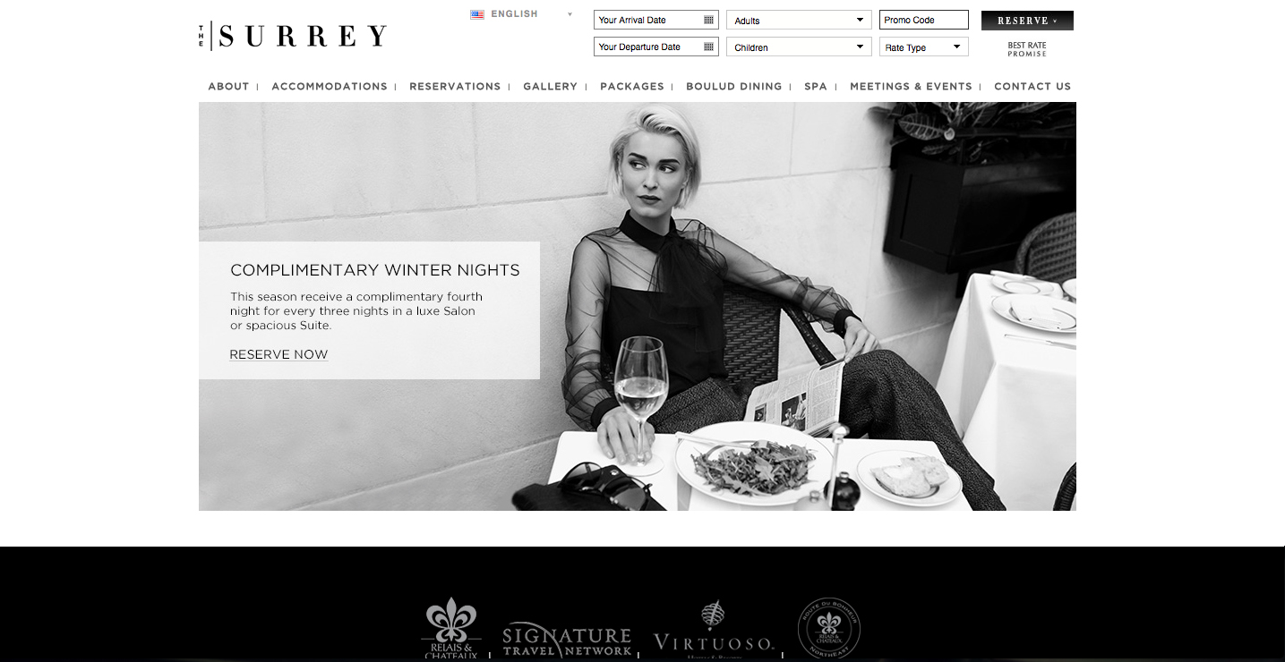
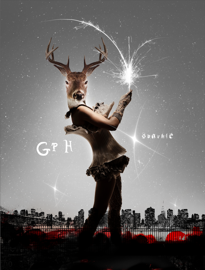
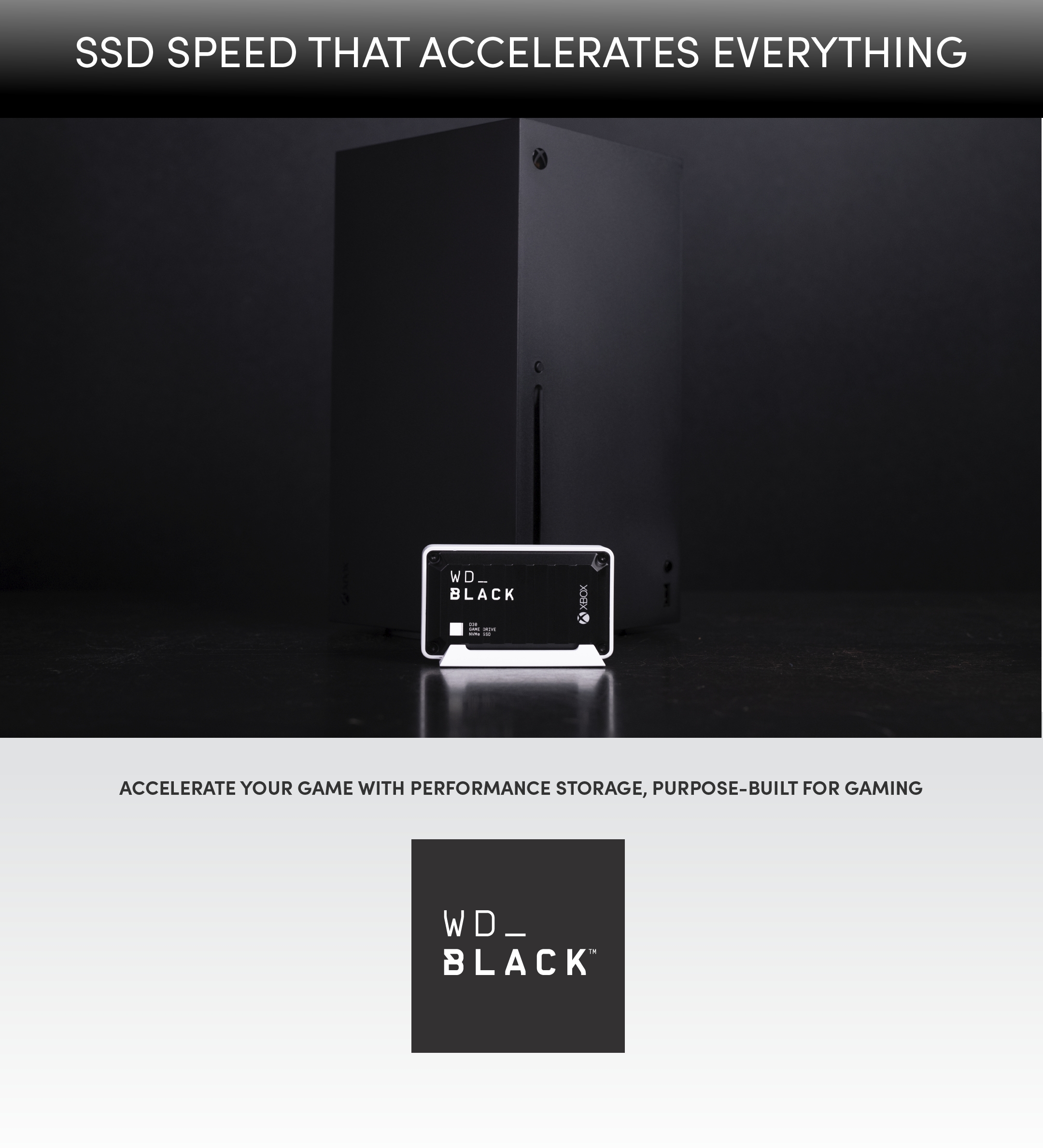
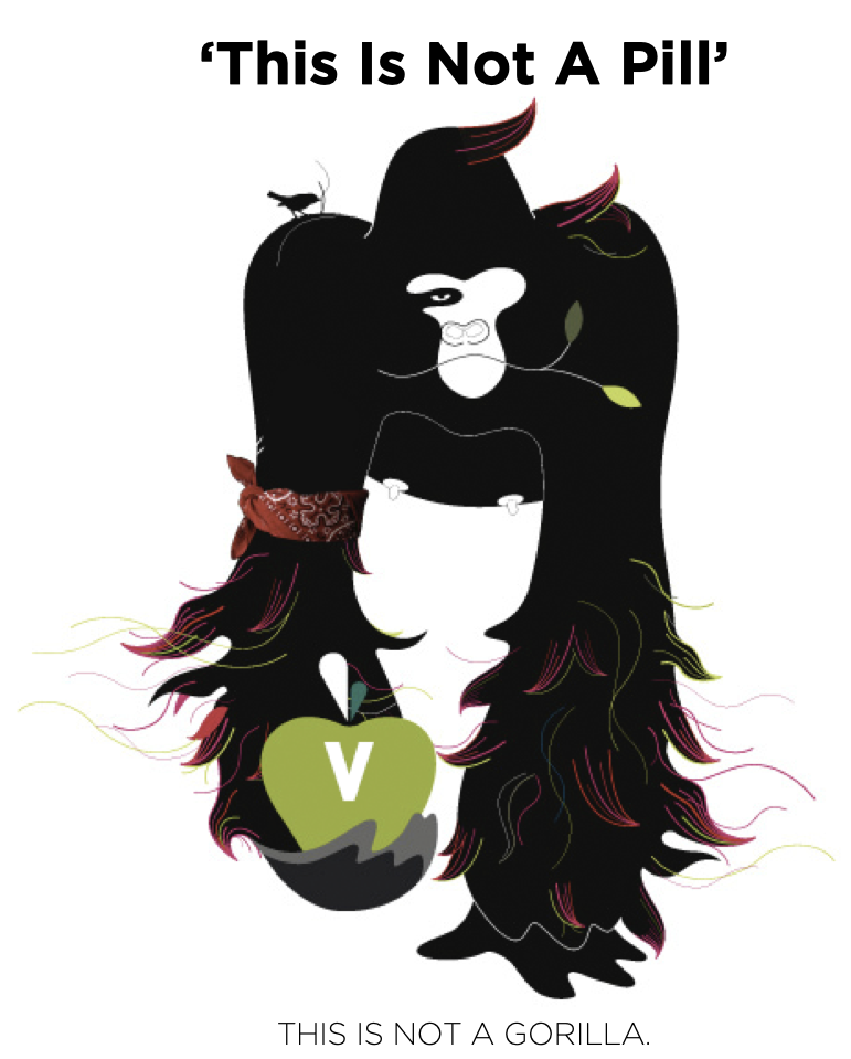
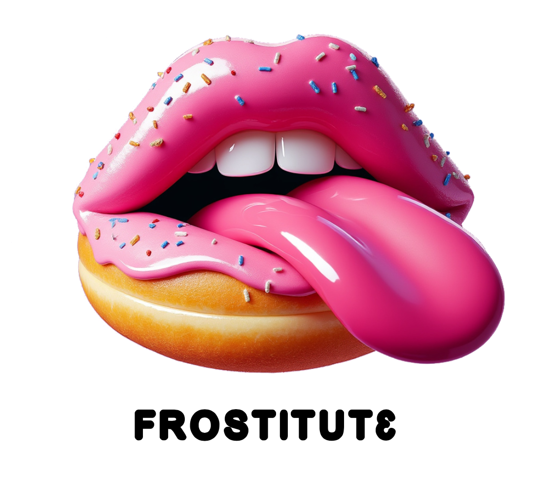
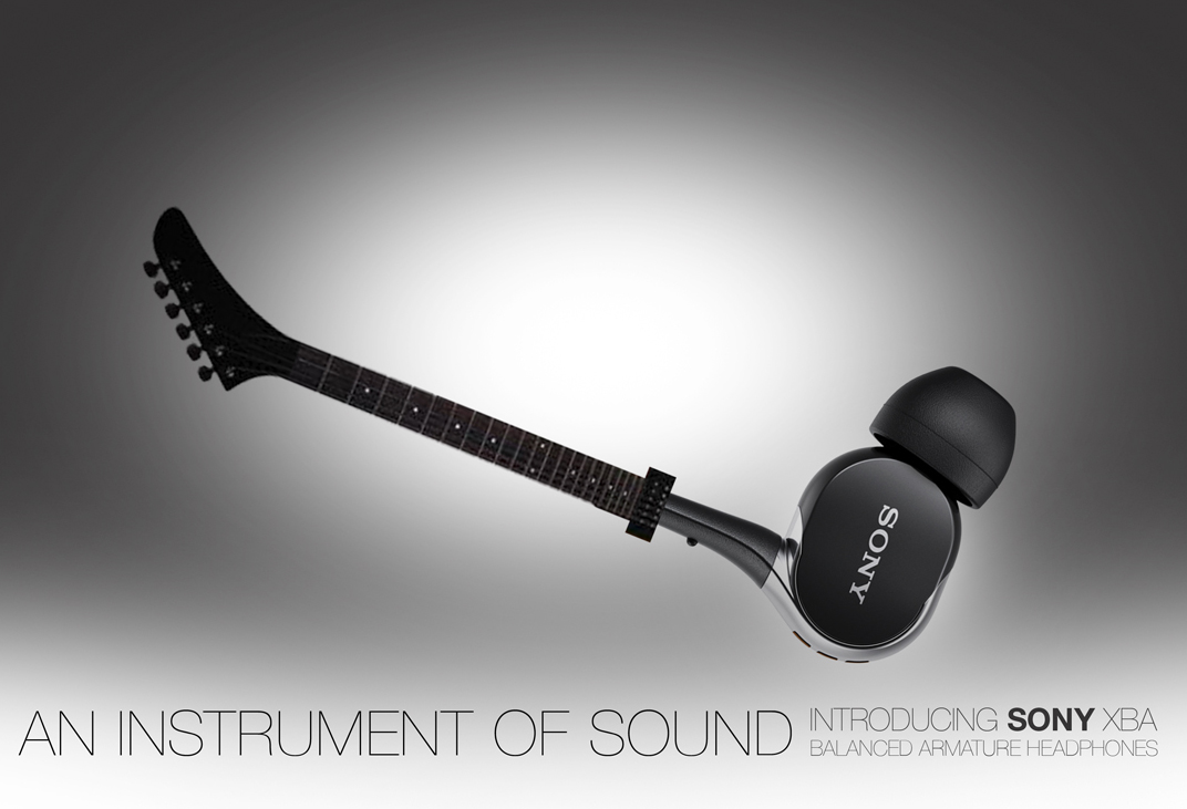
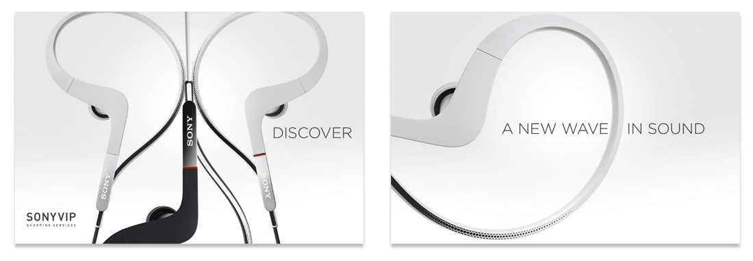
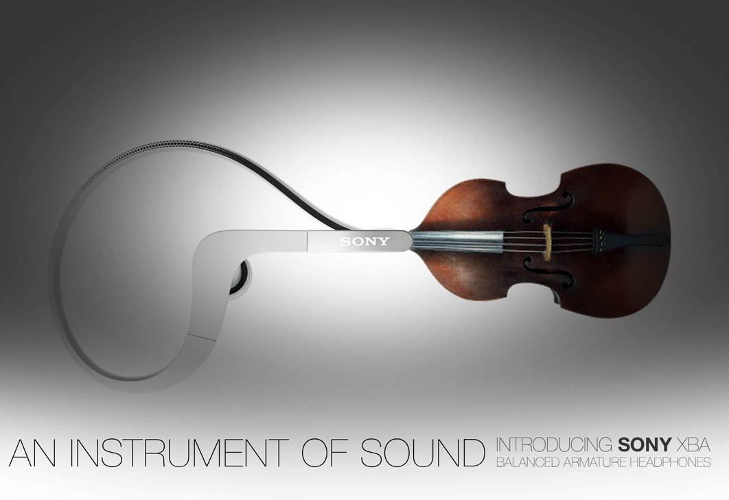
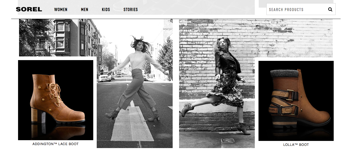
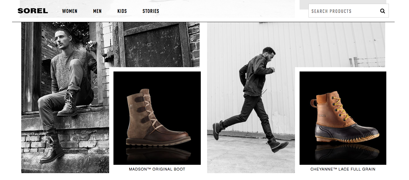
A cross-section of brand work spanning luxury, lifestyle, tech, hospitality, and consumer goods. Each project reflects a different facet of my creative leadership - from global brand systems to campaign art direction - showcasing range, adaptability, and fluency across markets and industries.


︎



︎

︎

︎


︎
︎




︎


︎


︎


︎
︎

︎


︎


︎




des
‘WHEN YOU ARE INSPIRED BY SOME GREAT PURPOSE, SOME EXTRAORDINARY PROJECT, ALL YOUR THOUGHTS BREAK THEIR BONDS; YOUR MIND TRANSCENDS LIMITATIONS; YOUR CONSCIOUS EXPANDS IN EVERY DIRECTION; AND YOU FIND YOURSELF IN A GREAT, NEW AND WONDERFUL WORLD.’
/ PATANJALI पतञ्जलि
/ PATANJALI पतञ्जलि
FOUR BRANDS. FOUR RADICALLY DIFFERENT DESIGN CHALLENGES. ONE CONSISTENT OBSESSION: BUILDING SYSTEMS THAT CREATE CULTURAL IMPACT - ACROSS IDENTITY, INTERFACE, CONTENT, AND CULTURE.
CREATIVEDRIVE
FROM SILENT POWERHOUSE TO CULTURE-BUILT BRAND.
CreativeDrive needed new brand language and tone - workspace environments to motion rules. A modular, scalable system that humanized a tech-forward studio.
WORK SNAPSHOT: Brand Identity | Content Systems | Environmental | Event | Marketing | Advertising | Corporate Comms
︎
DASSAULT FALCON JET
ENGINEERING, MADE INTUITIVE. BRAND SYSTEMS FOR GLOBAL SCALE..
Luxury aviation meets global brand thinking. We turned raw technical brilliance into a prestige identity built for UHNW buyers, corporations and governments.
WORK SNAPSHOT: Brand Identity | Digital | UI | Environmental | Event | Marketing | Advertising | Corporate Comms | Content Design
︎
INDELIBLE PLANET FOR BMW
BMW, BUT SPECULATIVE.
Storytelling at the edge of innovation. From driving on Mars to restoring the oceans, our team helped BMW explore visionary territory - blending mythic imagery with strategic intent.
WORK SNAPSHOT: Brand Identity | Narrative Strategy | Brand Comms | Investor Comms
︎
HAVAS
BRANDING IN THE PRESSURE COOKER.
AI, BIOTECH, AND THE FUTURE OF EVERYTHING.
Creative strategy for brands with everything on the line. I built narratives that moved capital, media, and public trust - bridging PR, pitch, and brand in one cohesive system.
WORK SNAPSHOT: PR Strategy | Brand Comms | Marketing Strategy | Investment Decks | Messaging Systems