AMAZING HAPPENINGS - CREATIVEDRIVE’S DIGITAL MAGAZINE
AMAZING HAPPENINGS was launched as CreativeDrive’s online magazine.
I oversaw the visual design of the magazine/blog, and worked closely with our digital team in Costa Rica to manage wireframing and navigational structure.
I oversaw the visual design of the magazine/blog, and worked closely with our digital team in Costa Rica to manage wireframing and navigational structure.
The goal behind the magazine and behind its editorial and visual look was to alleviate the creative community’s fear of techology and also their apprehension of the studio’s adoption of more technology. In short - to humanize its face to the world and its commitment to creativity, creators, and their livelihood.
CONTENT DESIGN & STRATEGY
SITUATION
CreativeDrive needed a way to humanize its advanced production capabilities and build relevance with the creative community. The solution had to be editorial, experience-driven, and scalable - something that could speak to creators, clients, and internal teams alike.
TASK
As Creative Lead, I was responsible for launching an original online magazine that would:
- Shift perception of CreativeDrive from production vendor to cultural partner
- Amplify diverse creative voices across industries and disciplines
- Establish an owned editorial platform that balanced brand storytelling with audience value
ACTION
EDITORIAL STRUCTURE
I built a fixed, monthly content model of 18 feature pieces per issue, structured to encourage discovery and rhythm:
Recurring features like No Comment (video essays), Coffee Links (curated finds), and Proverbs (standalone quotes) added editorial flexibility and tonal variety.
Each issue was centered around a unifying theme, driving narrative cohesion across categories.
INFORMATION ARCHITECTURE & UX
I designed the content structure around three primary pillars:
Navigation avoided heavy menus in favor of inline tagging and section-based browsing, allowing users to move laterally through content without dead ends. Every decision prioritized readability, curiosity, and flow.
I created wireframes and user flows to test the concept and collaborated across editorial, design, and dev teams to align on implementation.
VISUAL DESIGN & TONE
The magazine's identity was editorial-forward, bold but approachable. Key UI elements:
The tone was designed to be smart, inclusive, and anti-jargon - speaking to the creative community without pandering.
RESULT
AMAZING HAPPENINGS launched as a flagship editorial property and helped reposition CreativeDrive as a culturally fluent, creator-first brand.
It drove internal alignment around voice and mission, grew external engagement steadily over its first year*, and set a new standard for how CreativeDrive could tell its own story - not just produce others'.
EDITORIAL STRUCTURE
I built a fixed, monthly content model of 18 feature pieces per issue, structured to encourage discovery and rhythm:
- 2 Conversations (in-depth interviews)
- 4 Creative Spotlights
- 4 'People We Admire' (curated profiles)
- 4 Culture articles
- 4 Technology articles
Recurring features like No Comment (video essays), Coffee Links (curated finds), and Proverbs (standalone quotes) added editorial flexibility and tonal variety.
Each issue was centered around a unifying theme, driving narrative cohesion across categories.
INFORMATION ARCHITECTURE & UX
I designed the content structure around three primary pillars:
- Creators (Conversations, Innovators, People We Admire)
- Culture (Ways of Life, Ways to Create, Behind the Drive)
- Technology (Trends, Tools, Speculation)
Navigation avoided heavy menus in favor of inline tagging and section-based browsing, allowing users to move laterally through content without dead ends. Every decision prioritized readability, curiosity, and flow.
I created wireframes and user flows to test the concept and collaborated across editorial, design, and dev teams to align on implementation.
VISUAL DESIGN & TONE
The magazine's identity was editorial-forward, bold but approachable. Key UI elements:
- A layered homepage split into three zones:
- Light: for brand voice and top-level framing
- Theme: spotlighting the issue’s narrative arc
- Feed: a scrollable stream of rich content
- A flexible grid system built for both longform and shortform content
- Dynamic image treatments and bold typography
- Strategic use of CTAs, quotes, and expandable modules to guide engagement without overwhelming the reader
The tone was designed to be smart, inclusive, and anti-jargon - speaking to the creative community without pandering.
RESULT
AMAZING HAPPENINGS launched as a flagship editorial property and helped reposition CreativeDrive as a culturally fluent, creator-first brand.
It drove internal alignment around voice and mission, grew external engagement steadily over its first year*, and set a new standard for how CreativeDrive could tell its own story - not just produce others'.
*please note that CreativeDrive was acquired by Accenture in 2020 and all of its sites were subsumed under AccentureSong, which prioritized different goals.
+ HOME PAGE TEMPLATE +
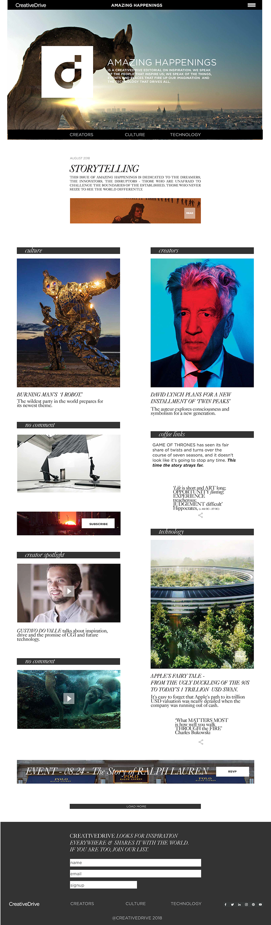
+ MONTHLY THEME TEMPLATE+
 + TECHNOLOGY SECTION TEMPLATE +
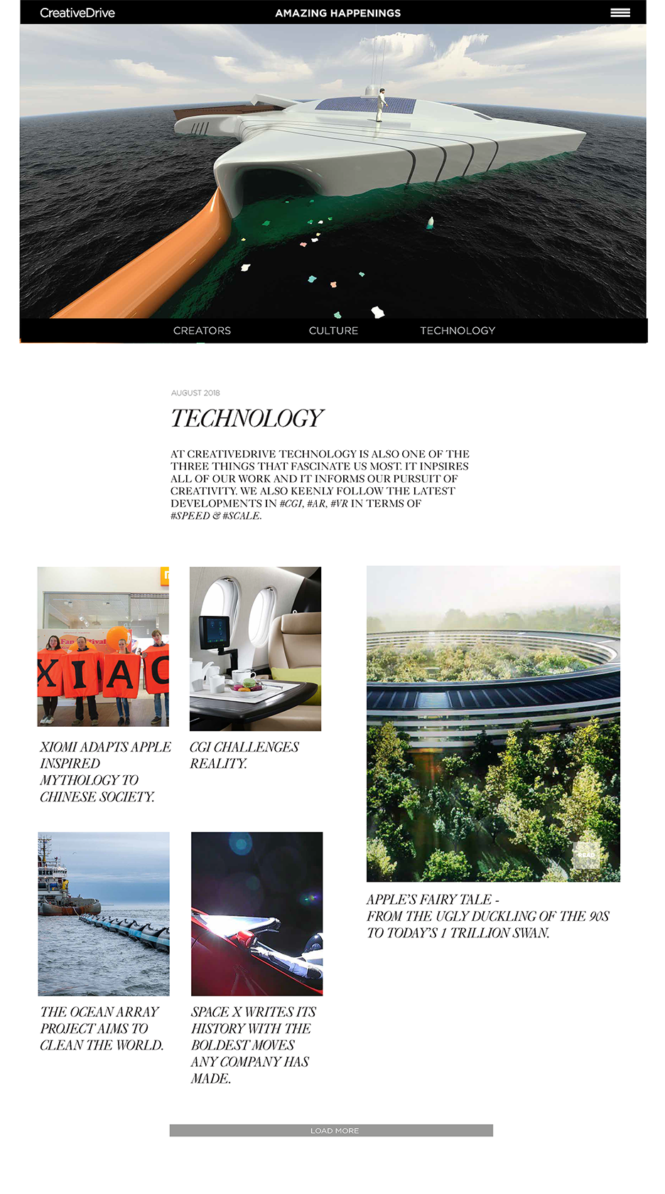 + CULTURE SECTION TEMPLATE +
+ CREATORS SECTION TEMPLATE +
 + EVENTS SECTION TEMPLATE +
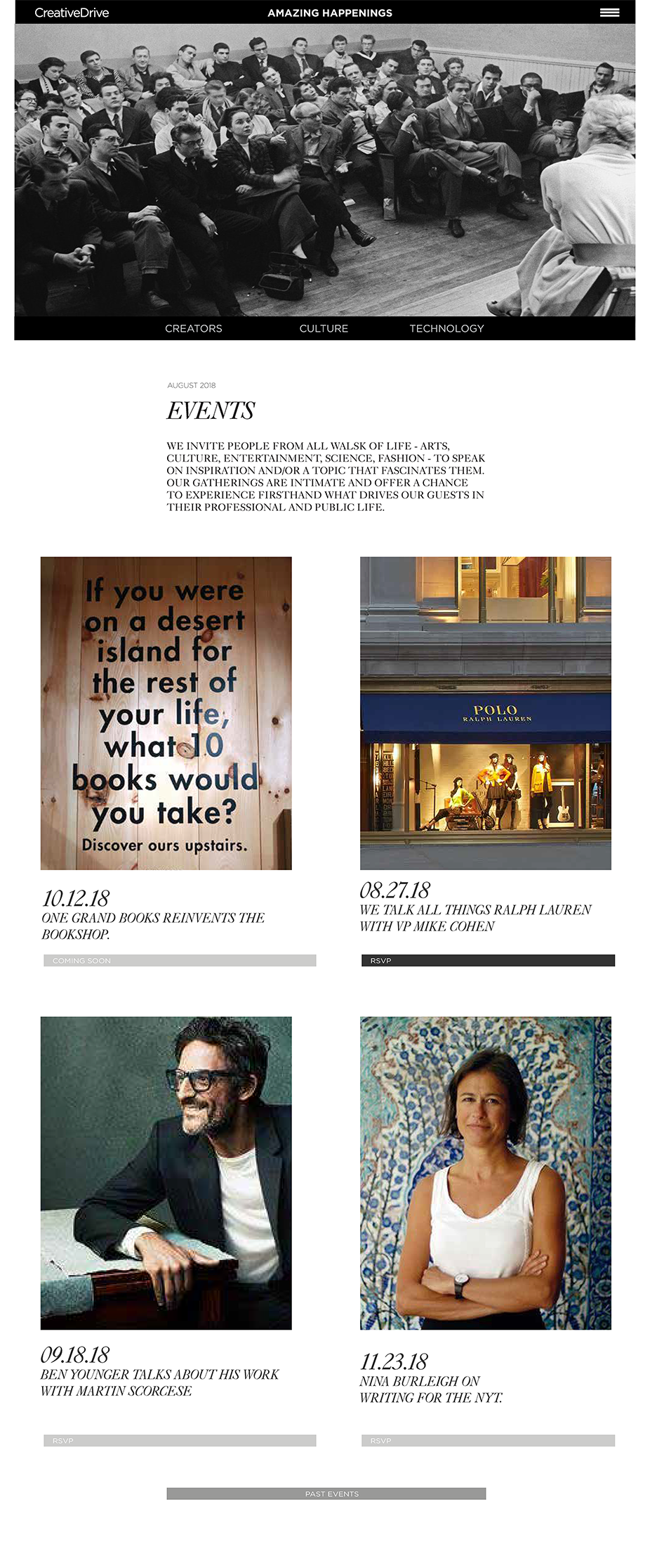 + OBSESSIONS SECTION TEMPLATE +
