FALCON PILOT FOCUSED ADS
DESIGNING FOR THE DECISION BEHIND THE DECISION
SITUATION
In private aviation, jet purchasing decisions typically flow through high-net-worth individuals, corporate boards, or government buyers. But in certain cases - particularly in the U.S. market - pilots act as influential recommenders, shaping what aircraft gets selected. Their criteria, however, differ dramatically from owners'.
TASK
Develop a series of ads targeting professional pilots - not to inspire aspiration, but to establish operational credibility. The goal was to position Falcon as the pilot’s aircraft of choice by aligning with their mindset: technical performance, cockpit ergonomics, reliability, service footprint.
ACTION
Created a graphic-led campaign designed for print in high-circulation aviation magazines read by professional pilots and flight departments. The visual system employed:
This design approach intentionally diverged from owner-facing materials, which leaned on visual warmth, lifestyle composition, and French luxury cues. Pilots don’t want seduction - they want signal.
RESULT
The campaign extended Falcon’s visual architecture to a secondary audience that often operates behind the scenes but holds critical influence. It demonstrated that design fluency across stakeholder types isn’t a luxury - it’s a strategic necessity. In a category where sales are closed in boardrooms but shaped in cockpits, this work proved that design precision builds internal advocacy - quietly, and with intent.
Created a graphic-led campaign designed for print in high-circulation aviation magazines read by professional pilots and flight departments. The visual system employed:
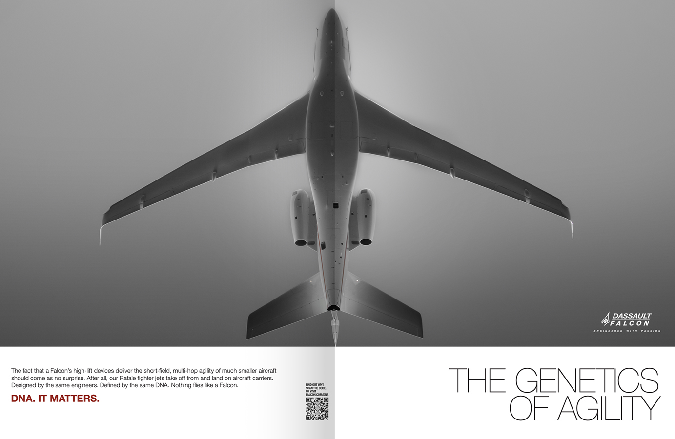
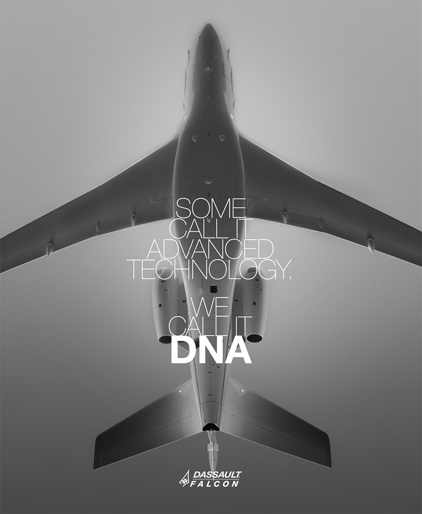
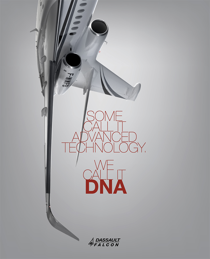
- Crisp geometry and high-contrast layouts to mirror cockpit interface clarity
- Minimal type and no lifestyle imagery to establish trust through focus
- Emphasis on performance metrics and design logic rather than luxury cues
- Alignment with Falcon’s overall design system - but deliberately stripped of prestige language, signaling internal fluency without external flash
This design approach intentionally diverged from owner-facing materials, which leaned on visual warmth, lifestyle composition, and French luxury cues. Pilots don’t want seduction - they want signal.
RESULT
The campaign extended Falcon’s visual architecture to a secondary audience that often operates behind the scenes but holds critical influence. It demonstrated that design fluency across stakeholder types isn’t a luxury - it’s a strategic necessity. In a category where sales are closed in boardrooms but shaped in cockpits, this work proved that design precision builds internal advocacy - quietly, and with intent.
Design Note:
These carefully tailored ads used stark contrast, crisp geometry, and minimal type to speak directly to pilot psychology - clarity over flair, authority over aspiration. Where owner-facing campaigns leaned on mood and materiality, these pieces operated like cockpit UX: precise, no wasted motion, and engineered for instant trust.
PRINT+DIGITAL