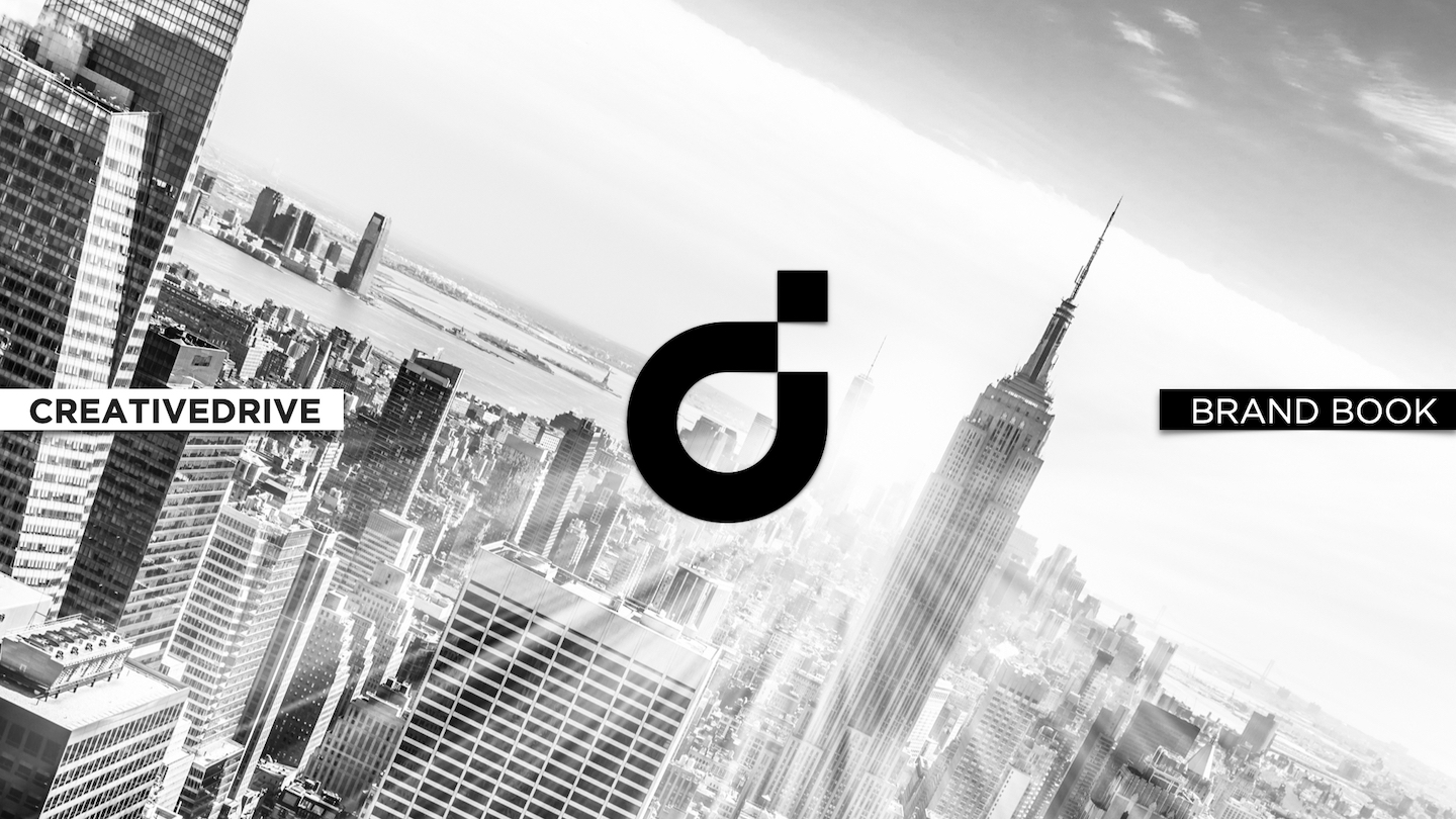
IDENTITY AND BRAND BOOK
Global Brand Architecture, Philosophy, Visual & Sonic Systems
SITUATION
CreativeDrive was a creative-tech hybrid scaling fast across five continents - combining content production, CGI, automation, and ecomm strategy. But its identity was fragmented. Teams lacked a shared language. Clients saw a pipeline, not a partner. The brand had tech - but no soul.
TASK
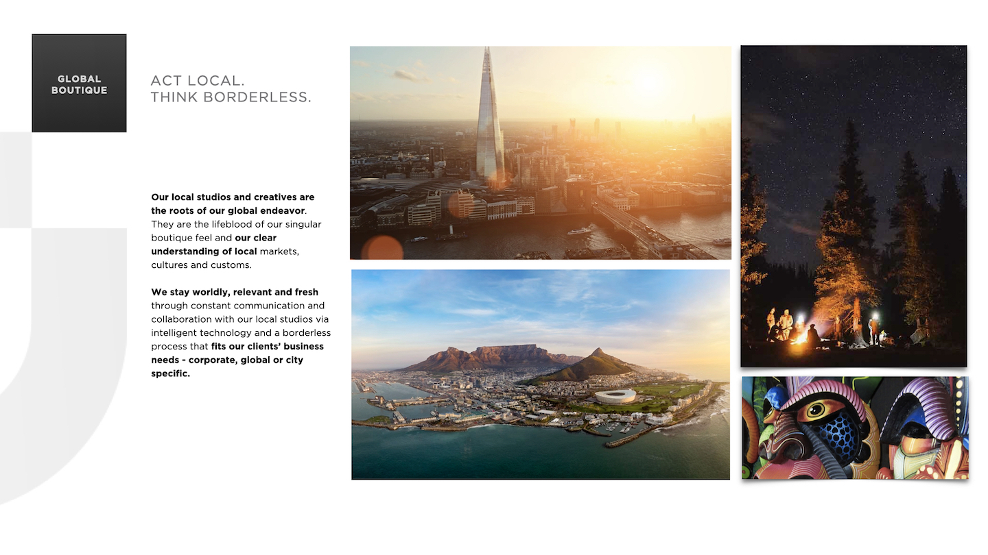
Define the company’s purpose, voice, and visual DNA. Build a scalable brand system that united 150+ global studios, 8 practice areas, and a growing suite of SaaS platforms—while honoring both local culture and global cohesion. Make it strategic, semiotic, and alive.
ACTION
I led the full development of the CreativeDrive Brand Book - part manifesto, part design system, part cultural operating system.
Key moves:
CreativeDrive was a creative-tech hybrid scaling fast across five continents - combining content production, CGI, automation, and ecomm strategy. But its identity was fragmented. Teams lacked a shared language. Clients saw a pipeline, not a partner. The brand had tech - but no soul.
TASK
Define the company’s purpose, voice, and visual DNA. Build a scalable brand system that united 150+ global studios, 8 practice areas, and a growing suite of SaaS platforms—while honoring both local culture and global cohesion. Make it strategic, semiotic, and alive.
ACTION
I led the full development of the CreativeDrive Brand Book - part manifesto, part design system, part cultural operating system.
Key moves:
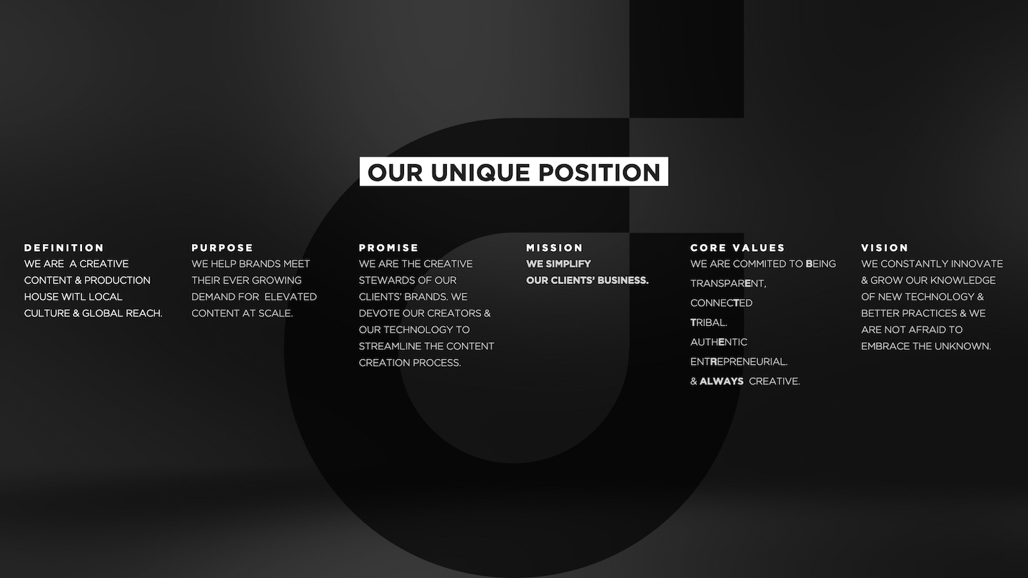
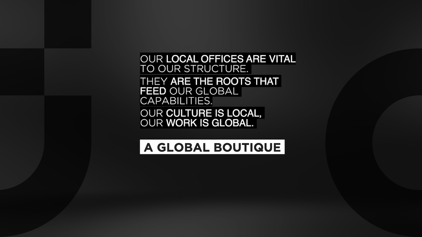
- Brand purpose & POV: Positioned CD as ‘the creative stewards of our clients’ brands’ - a hybrid of agency craft, production speed, and startup innovation.
Mission: simplify business through creativity and tech.
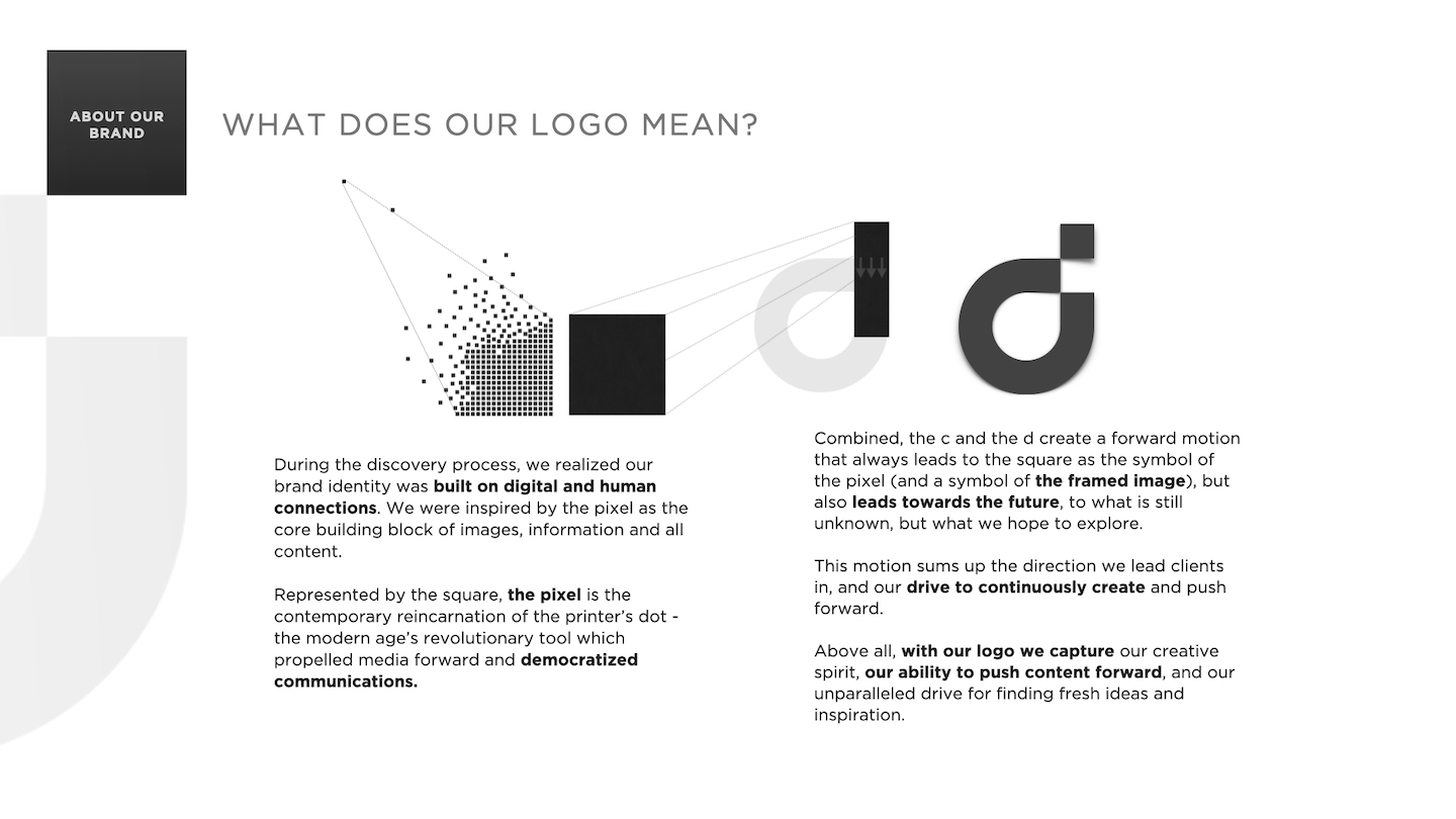
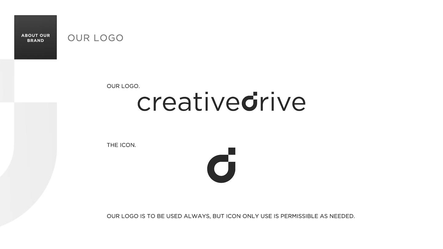
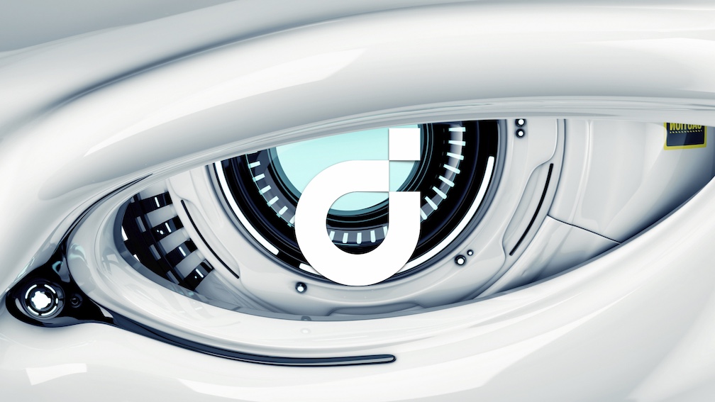
- Global design system: Modular logo built around the pixel as modern creative atom. Identity guidelines spanned print, digital, motion, and spatial.
- Naming architecture: Created a dual-layer naming system - studio code + cultural tag (e.g., d3209 the lion)- that made every office feel boutique yet connected.
- Sonic identity: Designed and launched a branded sound logo signaling CreativeDrive’s voice as curious, modern, and emotionally intelligent.
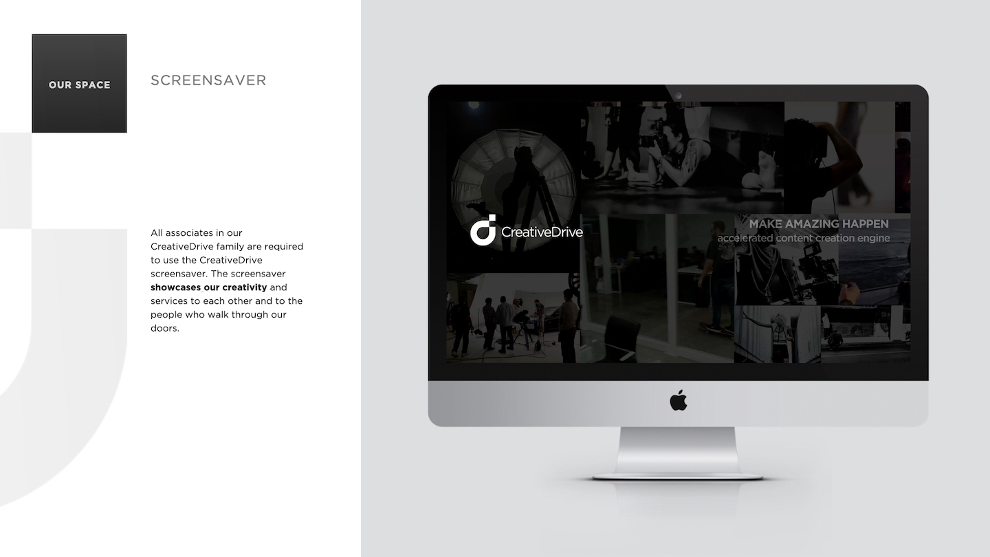
- Environmental + cultural branding: Rolled out interior brand systems - neon signage, motto walls, localized artwork, quote boards, swag - and screensaver protocols for brand immersion.
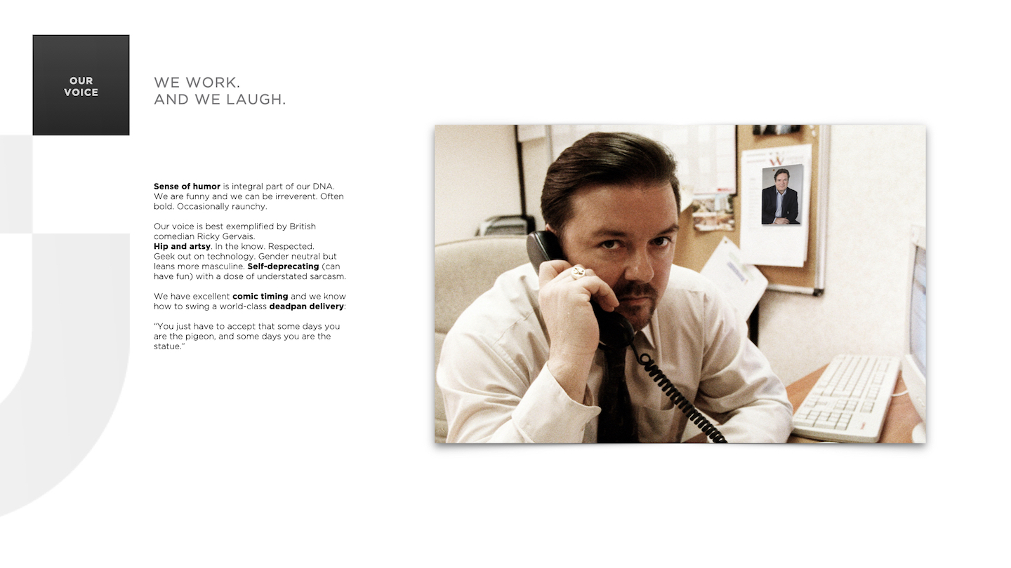
- Voice + tone system: Defined brand personality as witty, dry, emotionally fluent, and culturally tuned - 'British brain, global heart.’
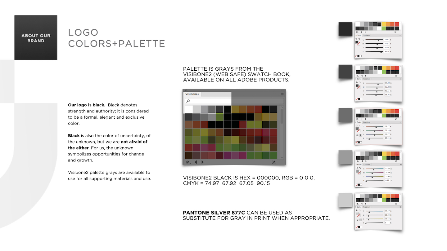
- Color & typography: Grayscale Visibone2 palette + chromatic accent system for emotional tone-matching; Gotham and Caslon as balance of clarity and style.
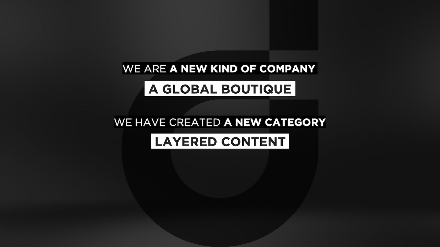
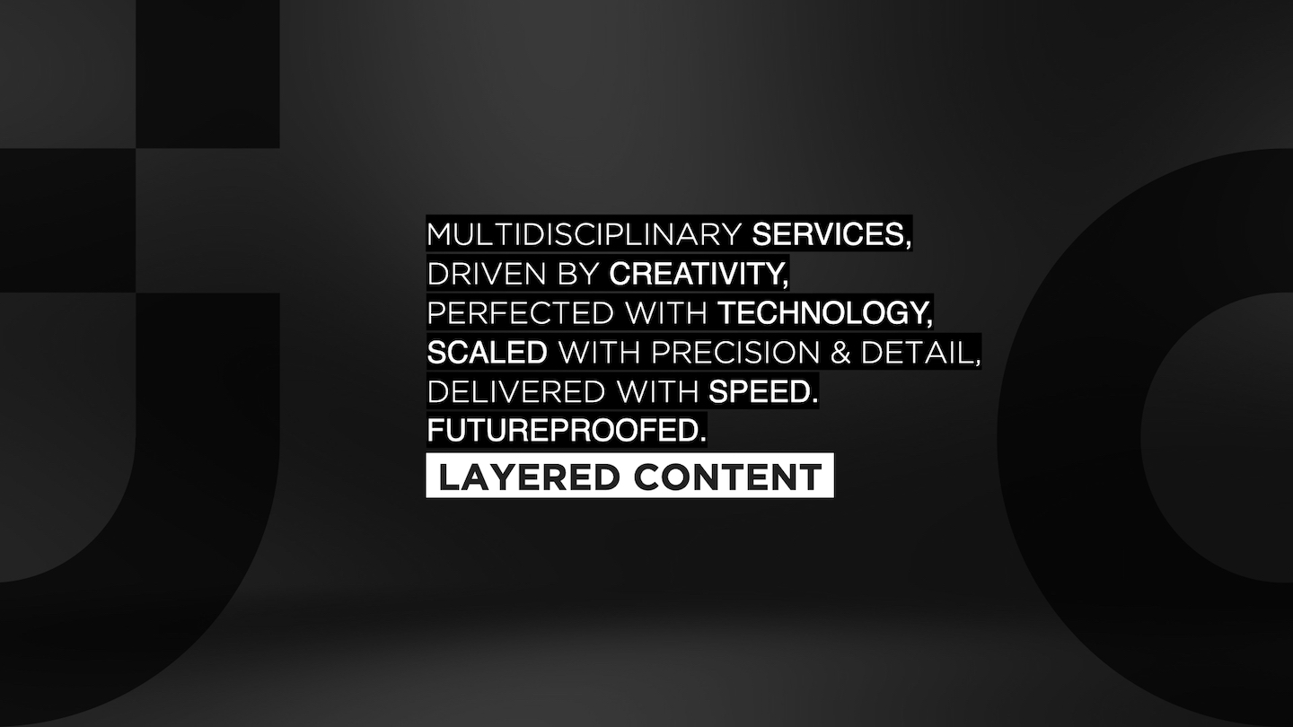
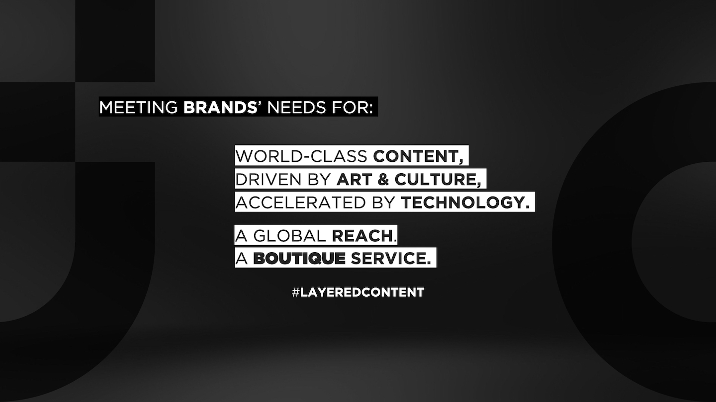
Core to the system was the concept of LayeredContent - a term I coined to describe CreativeDrive’s philosophy that great content blends people, process, and tech.
This became a throughline across social, editorial, and pitch work, tying abstract philosophy to practical execution.
RESULT
The Brand Book became more than design documentation - it was an engine of identity. It unified global studios, aligned execs and creatives, and turned CreativeDrive into a culturally fluent, future-facing brand with both polish and personality.
The system flexed across product launches, recruitment, IRL events, and social - proving that even in a high-volume, tech-driven ecosystem, brand can still lead with soul.
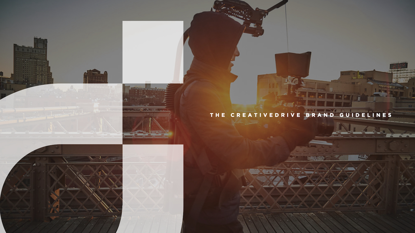
LOGO STILL & LOGO MOTION

BRAND BOOK


PROMO REEL
NAMING ARCHITECTURE + IDENTITY SYSTEM
Modular Brand Language, Semantic Systems, Cultural Encoding
SITUATION
CREATIVEDRIVE NEEDED A COHESIVE YET FLEXIBLE NAMING SYSTEM THAT COULD:
- Unite a global network of creative studios
- Maintain corporate clarity while fostering boutique agency feel
- Scale effectively with company growth
- Create distinctive identities for locations, practices, and products
TASK
Create a scalable naming system that could unify CreativeDrive’s expanding global footprint - without sacrificing local personality or creative edge. The system had to align with the brand’s corporate identity, support cross-functional clarity, and flex across locations, service lines, and digital products - all while feeling boutique, not bureaucratic.
ACTION
I developed an integrated naming architecture anchored by the brand's signature 'd' icon that worked across multiple touchpoints:
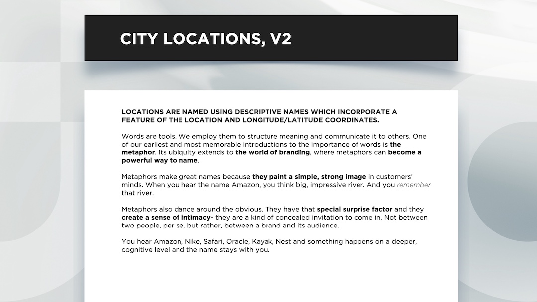
LOCATION NAMING
CREATED A DUAL NAMING SYSTEM COMBINING PRECISION WITH PERSONALITY:
Functional: Street number + icon (d55, d3209)
Memorable: Location-inspired names (d55 the water, d3209 the lion) This allowed each studio to operate as a boutique creative agency while maintaining clear corporate connection.
CREATIVEDRIVE NEEDED A COHESIVE YET FLEXIBLE NAMING SYSTEM THAT COULD:
- Unite a global network of creative studios
- Maintain corporate clarity while fostering boutique agency feel
- Scale effectively with company growth
- Create distinctive identities for locations, practices, and products
TASK
Create a scalable naming system that could unify CreativeDrive’s expanding global footprint - without sacrificing local personality or creative edge. The system had to align with the brand’s corporate identity, support cross-functional clarity, and flex across locations, service lines, and digital products - all while feeling boutique, not bureaucratic.
ACTION
I developed an integrated naming architecture anchored by the brand's signature 'd' icon that worked across multiple touchpoints:
LOCATION NAMING
CREATED A DUAL NAMING SYSTEM COMBINING PRECISION WITH PERSONALITY:
Functional: Street number + icon (d55, d3209)
Memorable: Location-inspired names (d55 the water, d3209 the lion) This allowed each studio to operate as a boutique creative agency while maintaining clear corporate connection.
PRACTICE NAMING
UNIFIED EIGHT GLOBAL PRACTICES UNDER THE 'D' SYSTEM:
plan’d (Strategy), create’d (Creative), d’igital (Interactive), etra’d’e (ecomm), d’lux (luxury/fashion), soun’d, culture’d (events+culture), d’iscovery (research/innovation)
PRODUCT NAMING
EXTENDED THE SYSTEM TO SAAS OFFERINGS:
Tune’d, View’d
RESULT
The new system turned CreativeDrive into a linguistically unified, culturally expressive brand.
It scaled across continents, departments, and product launches. And it helped employees, clients, and partners understand what CreativeDrive was - and where they belonged within it.


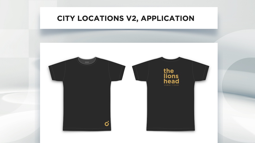


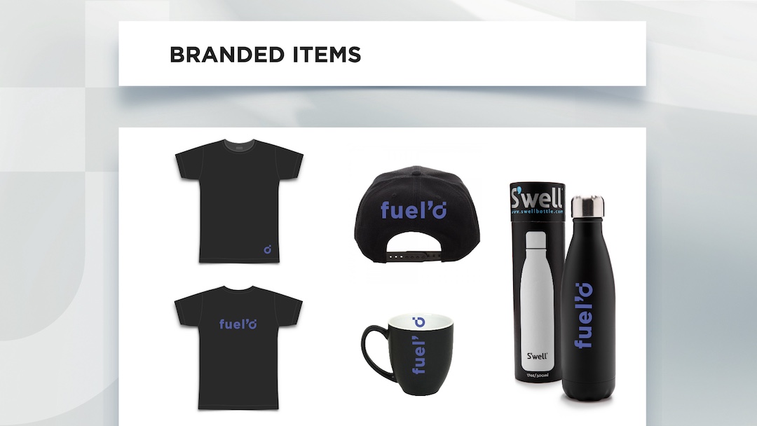


+ The naming conventions also lend themselves to very cool swag.
In essence, I created an insider effect - psychology at work. The t-shirt with "d3209" (with that stylized d) worked on multiple levels:
- Created curiosity - it looks like a code or secret message
- Gave employees a sense of belonging - they're "in the know"
- Sparked conversations - people want to ask about it
- Functioned as subtle but intriguing branding
- Made employees feel special - they're part of something exclusive