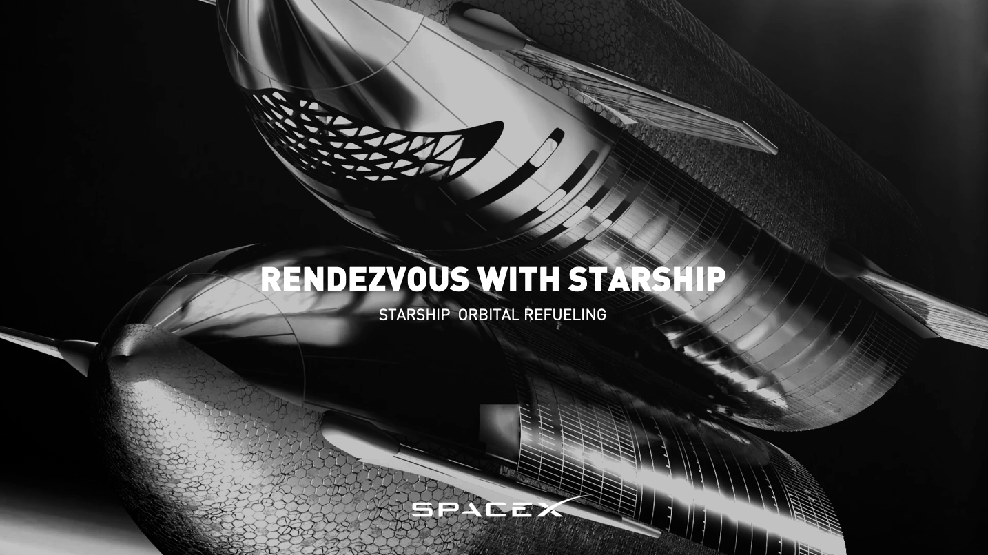
SPACEX ORBITAL REFUELING VISUAL LANGUAGE
A VISUAL SYSTEM TO EXPLAIN STARSHIP’S ORBITAL REFUELING ARCHITECTURE — CINEMATIC, TECHNICAL, AND SCALABLE.
BACKGROUND
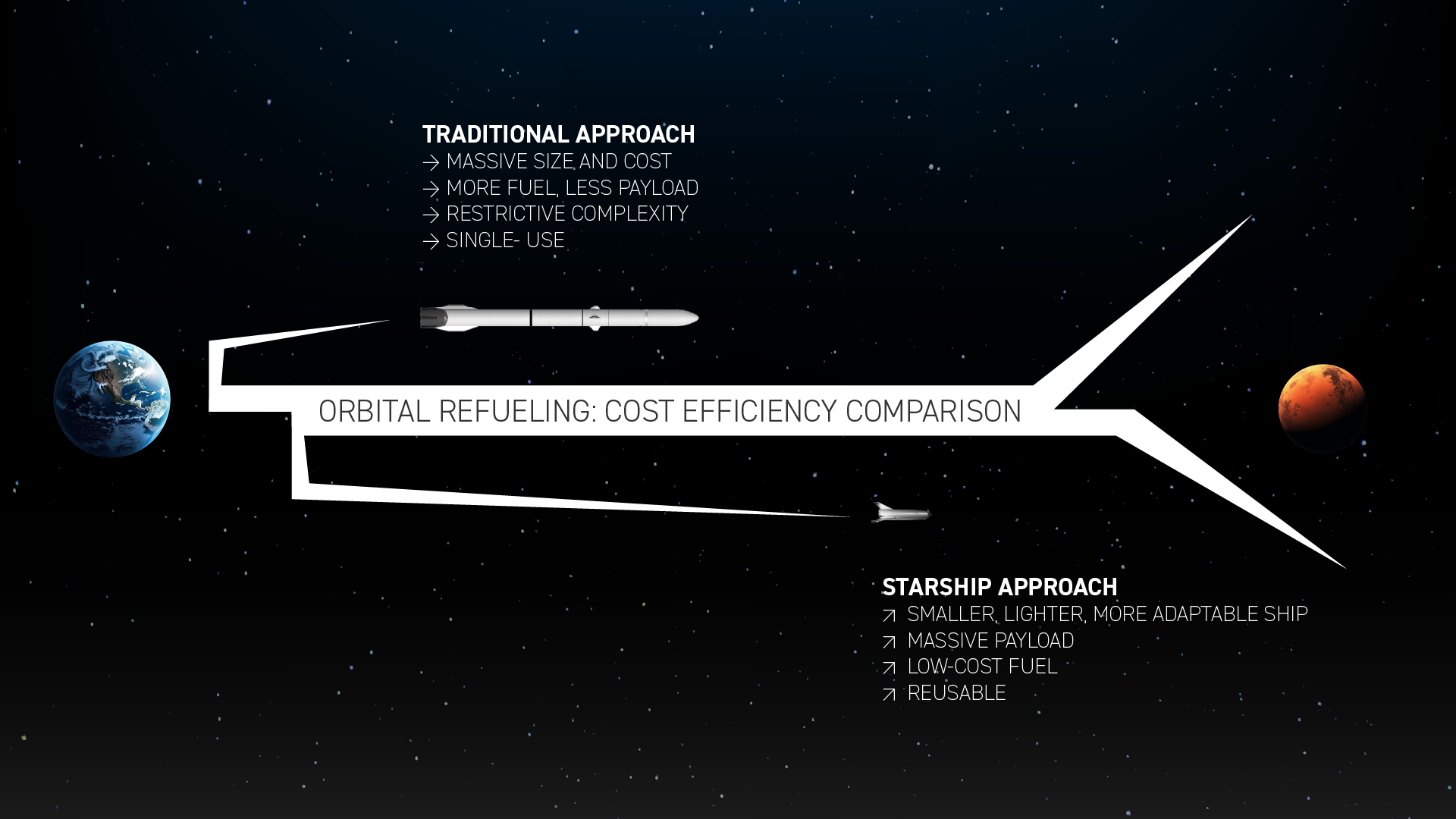
SpaceX needed visual communication tools for an emerging part of its Starship program: orbital refueling. The goal was to educate a broad audience — from the public to policymakers — on a concept that is technically simple but visually underexplained.
The brief called for visuals that could inform, excite, and scale into future content, all while aligning with SpaceX’s established aesthetic:
precise, minimal, engineered, and stark.
CHALLENGE
Design a graphic and narrative system that could:
– explain orbital refueling with absolute clarity
– maintain SpaceX’s visual tone
– translate engineering logic into accessible visuals
– operate as both educational material and future brand language
– work across slide decks, social assets, animations, and motion graphics

APPROACH
I created a visual system built around three design principles:
1. Singularity of Image
Every slide uses a single, iconic visual anchoring the message — mirroring SpaceX’s communication style, where clarity > decoration.
2. Cinematic Reduction
Black backgrounds, high-contrast silhouettes, clean typography, and simple orbital lines articulate complex operations without excess.
3. Engineering Narrative Arc
The stack explains orbital refueling as a sequence of inevitabilities — from current reality, to technical rationale, to future milestones.
DESIGN LOGIC
The system is built on cognitive compression — reducing every idea to a single unambiguous visual.
This matches SpaceX’s internal culture: direct, functional, elegant, and indifferent to ornament.
It treats orbital refueling not as a sci-fi fantasy, but as a practical engineering solution that unlocks interplanetary travel.
OUTCOME
The design demonstrated a communication framework capable of:
– educating the public
– supporting future SpaceX content
– reinforcing mission credibility
– inspiring non-technical audiences
– framing orbital refueling as the hinge of human expansion
It proved that complex aerospace concepts can be expressed with cinematic restraint and technical integrity — and that a clear visual language can turn an engineering milestone into a cultural narrative.
+
SPACEX SYSTEM COMPRESSION STUDY - ORBITAL REFUELING AS BRAND LOGIC
SpaceX logo arms reinterpreted as tanker + outbound Starship,
compressing orbital refueling into a 17-second visual system.
SpaceX logo arms reinterpreted as tanker + outbound Starship,
compressing orbital refueling into a 17-second visual system.