INDELIBLE PLANET -BRAND & MISSION IDENTITY
A HAND-DRAWN IDENTITY FOR A BMW-ALIGNED INNOVATION STUDIO — PART BRAND SYSTEM, PART VISUAL PHILOSOPHY.

BACKGROUND
Indelible Planet was created as an innovation studio operating upstream from traditional agencies, interfacing directly with BMW leadership on speculative mobility programs. The studio needed a visual identity that could signal originality, intelligence, and conceptual range — without sliding into agency clichés or startup minimalism.
At the same time, the studio’s early projects required full visual worlds: BMW mobility on Mars and a global ocean-sustainability initiative.
Branding the studio and branding the vision were inseparable.
CHALLENGE
Define an identity system that:
– stands apart from legacy agency aesthetics
– signals credibility to automotive leadership
– remains flexible enough to house speculative, high-concept BMW futures programs
– operates equally well in decks, rooms, workshops, and high-level presentations
– balances intellect with imagination
The system needed to be articulate enough for the C-suite, and strange enough for the future.


APPROACH
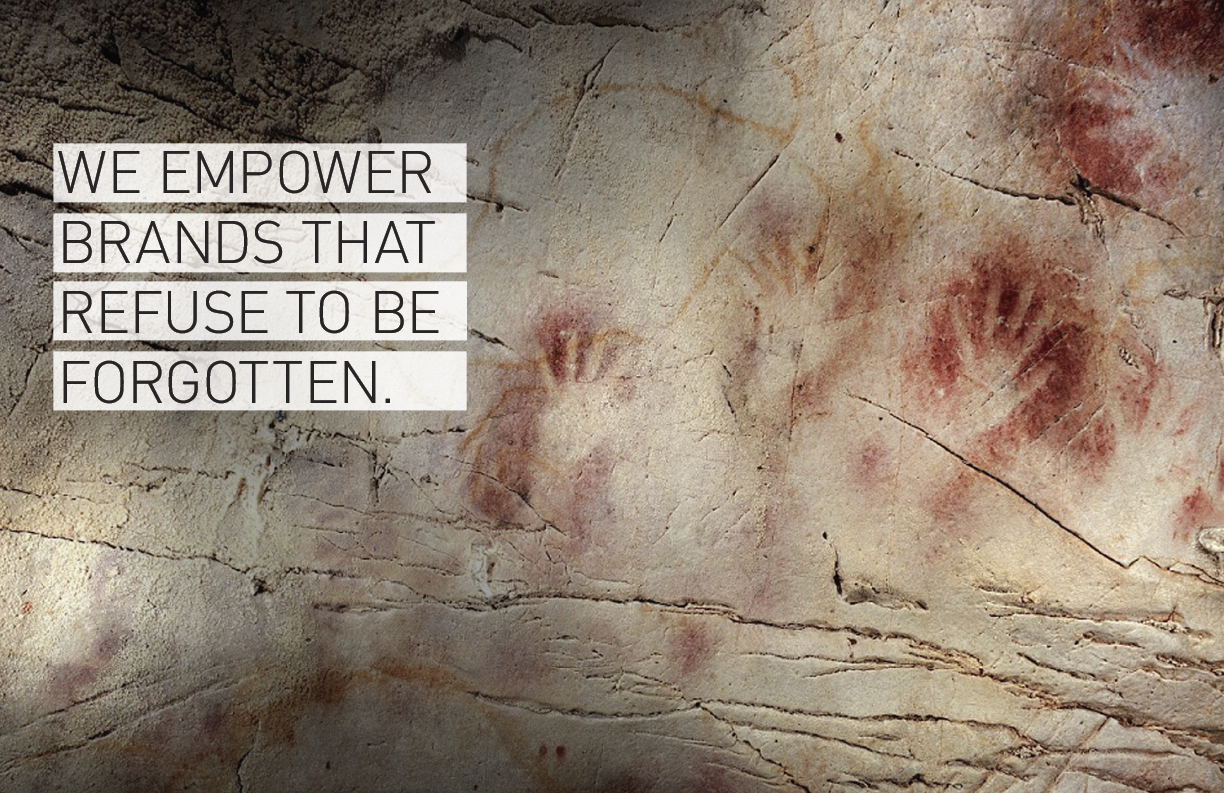
Instead of pulling from tech visual tropes, I built the identity from human mark-making — sketches, scratches, archetypal symbols — visual languages that predate modern branding.
Key components:
• Logo system
A hand-drawn mark inspired by Julian Schnabel’s layered visual grammar — rough, intuitive, confident.
• Icon set
A suite of hand-drawn symbols functioning as a semiotic toolkit.
Each icon sits between map, diagram, and myth — a reflection of the studio’s mandate to operate across imagination and strategy.
• Core keyart
A signature image: a horse suspended between sky and sea, inspired by Sonora Webster’s divines, in B&W.
A gold-burning circle functioning as an ouroboros — symbolizing cycles of reinvention.
DESIGN LOGIC
The IP identity rests on one principle:
Innovation requires a human signature.
Where most innovation studios lean on sterile futurism, IP’s identity asserts that imagination is an ancient human behavior — and that strategy gains power when expressed through marks that feel lived, intuitive, and non-mechanical.
This duality — hand-drawn intelligence inside a future-facing studio — became IP’s design position.


OUTCOME
The system made IP legible, distinct, and trustworthy — a studio defined not by aesthetics, but by visual thinking as strategy.