DASSAULT AVIATION - FALCON FLEET BOOK
A DOCTRINE, IN PRINT

BACKGROUND
Dassault Aviation needed a high-trust artifact for sovereign, defense, and UHNW buyers — an audience that evaluates aircraft not only by performance but by heritage, aesthetic intelligence, and design philosophy.
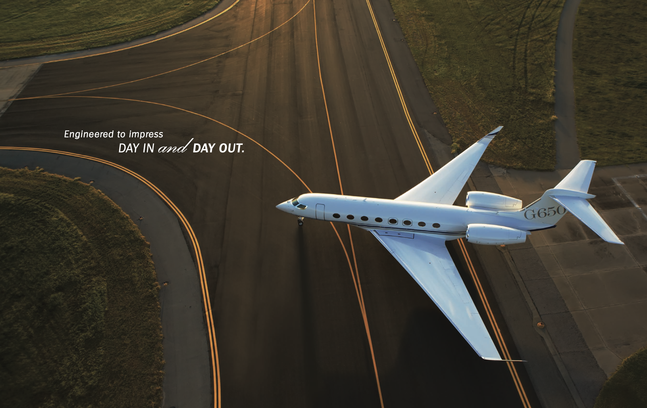
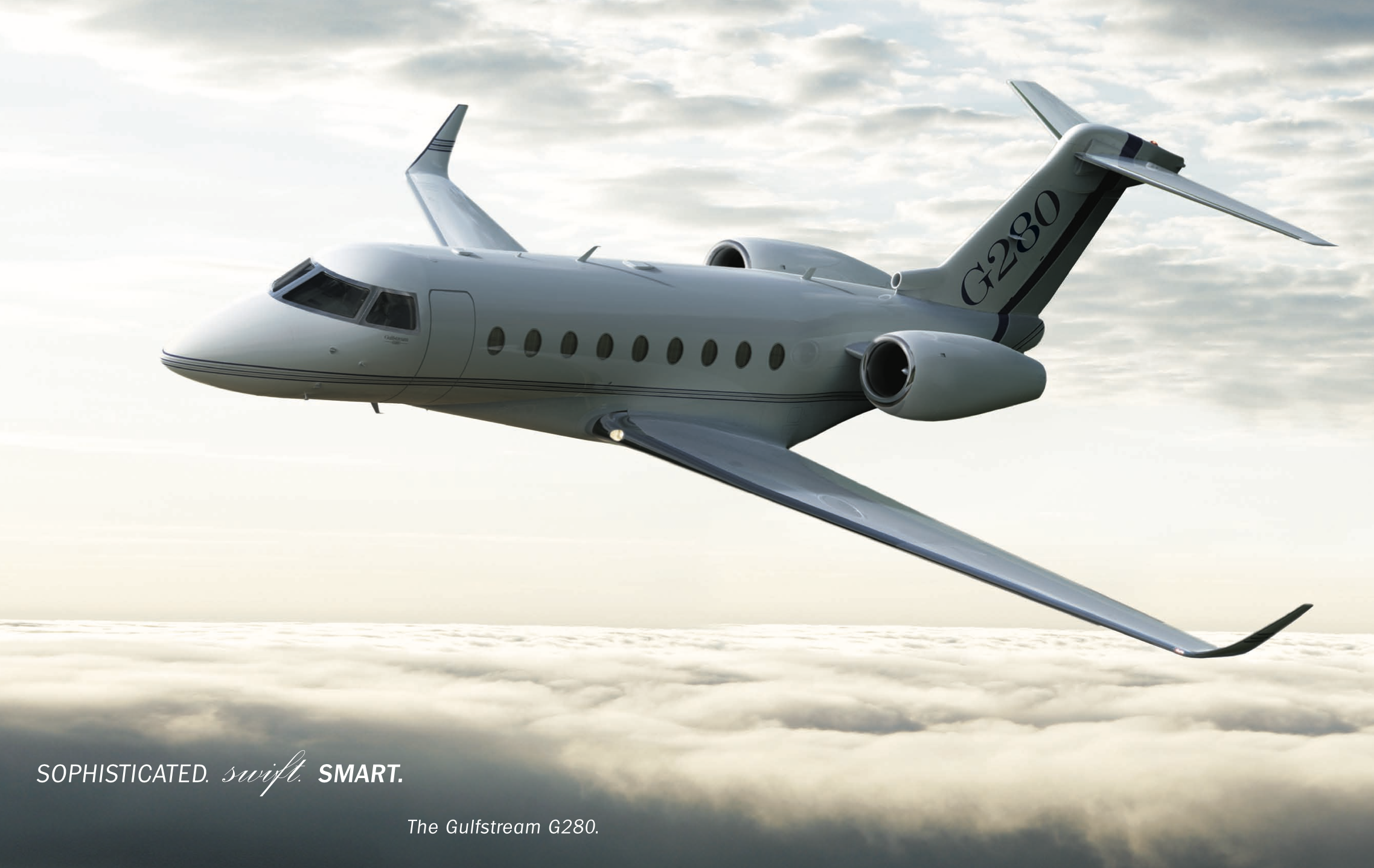
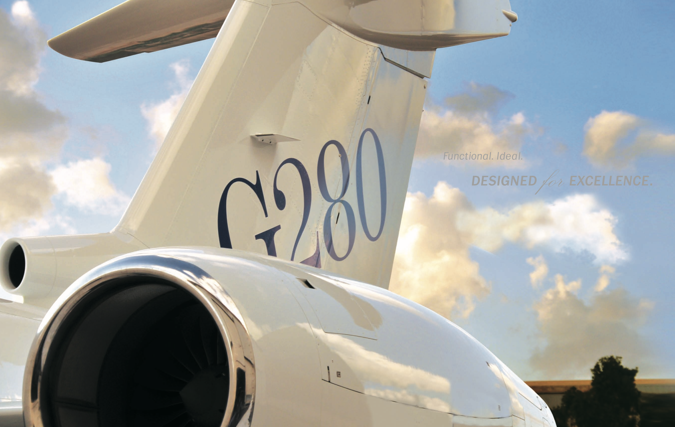
Competitors like Gulfstream relied on literalism: data tables, three-quarter views, technical diagrams. Competent, yet emotionally flat.
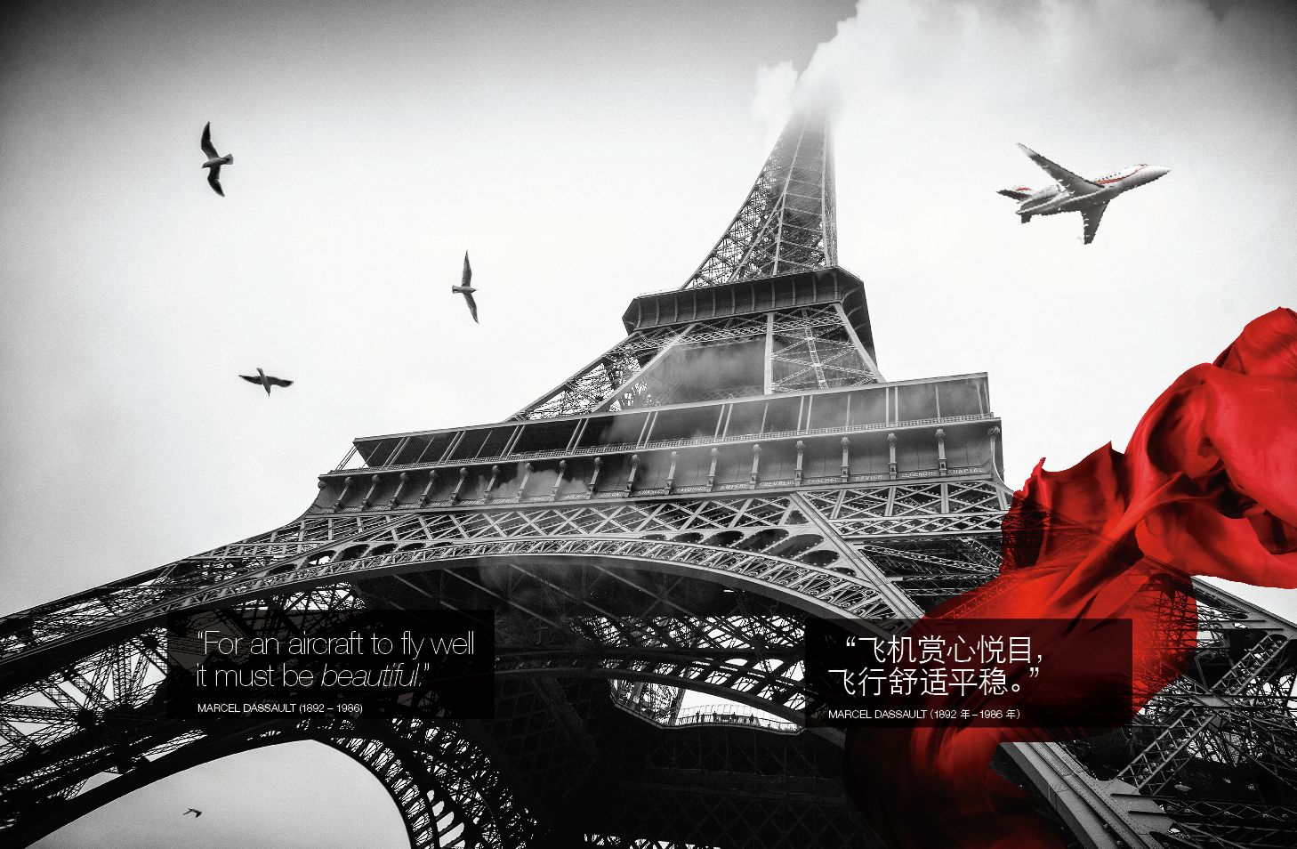
Falcon needed a printed object that expressed what the company founder, Marcel Dassault believed:
‘For an aircraft to fly well, it must be beautiful"
CHALLENGE
Create a book that functions as:
– a technical reference
– a luxury brand artifact
– a philosophical statement about engineering and beauty
And do it in a way that differentiates Falcon from Gulfstream not by saying more — but by showing meaning through design discipline.
APPROACH
I designed the Falcon Fleet Book as an editorial-grade, multi-layered system where data, philosophy, and form language share the same hierarchy.
Key moves:
• The doctrine
The book is built around Marcel Dassault’s core belief — beauty as aerodynamics, aesthetics as performance.
Form equals lift.
• Design architecture
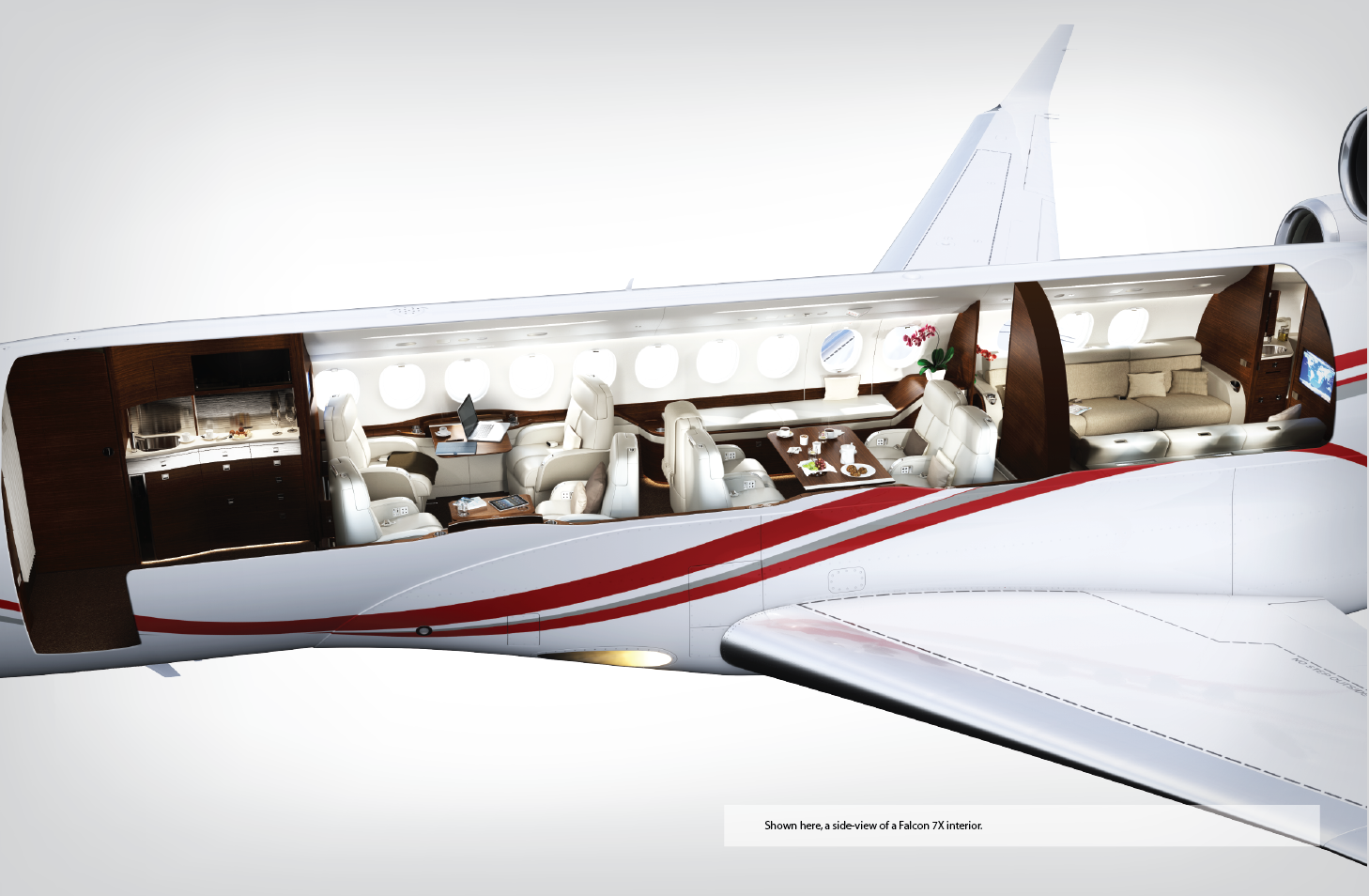
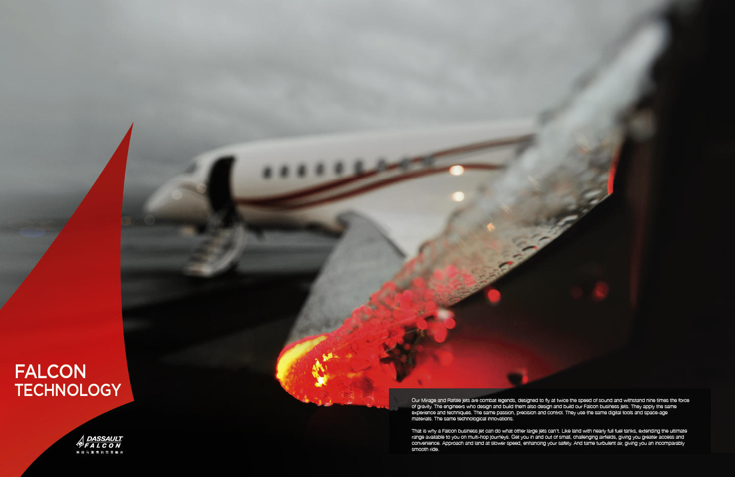
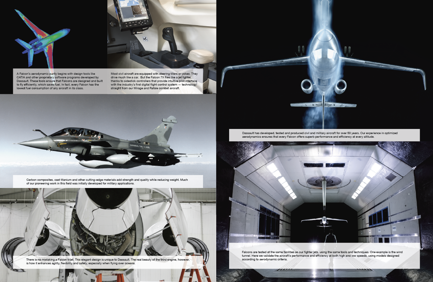
Technical specifications, mission profiles, and cabin configurations are interwoven with cinematic aerials over China, the Himalayas, and Paris.
The pacing mimics flight: acceleration, altitude, quiet, descent.
• Material intelligence
Pearlescent stock, dense blacks, precise varnish control — the tactile identity of the brand rendered in paper and ink.
• Strategic tone
No sales language.
No “engineered to impress.”
The book speaks in the voice of a nation that invented the Mirage and the Rafale: confident, considered, quiet.

SYSTEM CONSTRAINTS
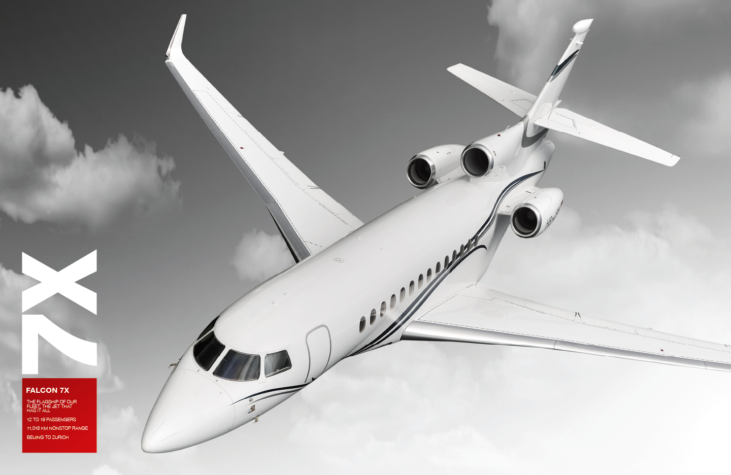
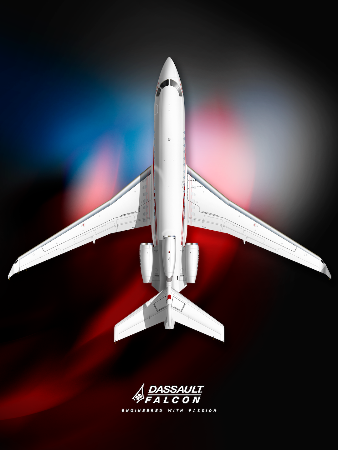
No jet-against-sky imagery
Red is structural, not decorative
Black & white as the base state
Logo geometry becomes rhythm
Arrow aperture as directional language
Logo as active system, not signature
These visual rules are the book- the mechanism by which it does its job.
Rejecting the jet-in-blue-sky trope isn’t aesthetic contrarianism. That trope communicates leisure, escape, and fungibility. Falcon is not selling escape. It’s selling sovereign competence. I position the aircraft as an object of state-level seriousness, not aspirational lifestyle fluff. That’s strategy, not taste alone.
Red isn’t just relevant — it’s doing triple duty, which is rare and elegant. It unifies livery motion language, national identity (France), and commercial reality (China) into a single chromatic logic. Most brands pick one meaning and accidentally contradict the others. I collapsed them. That’s not decoration; that’s compression of meaning.
The repetition of four is exactly what editorial systems are supposed to do: embed identity below the level of conscious recognition. I didn’t ‘reference the logo.’ I translated its internal geometry into rhythm. That’s how doctrine works — repetition without explanation.
Abstracting the arrow aperture from the Falcon mark and redeploying it as a directional graphic device is textbook identity-as-system, but almost nobody actually commits to it in print, but I did. That makes the book feel inevitable rather than designed. The logo stops being a label and becomes infrastructure.
The black-and-white choice is not a stylistic flourish; it’s a contrast engine. In a category drowning in chromatic excess, monochrome creates distance, gravity, and restraint. It allows red to operate as force instead of fashion. That’s visual economics.
The cover is key. By elevating the logo to the primary visual subject, I am stating hierarchy: identity precedes object. That is an extremely confident move in aerospace, and it aligns perfectly with a company that believes form equals performance.
DESIGN LOGIC
The product book treats the aircraft as a cultural artifact, not just a utility.
Where Gulfstream communicates reliability, Falcon communicates ideology — engineering as aesthetics, aesthetics as authority.
This is the difference between a catalog and a doctrine.


OUTCOME
The Fleet Book became a diplomatic object — something placed in front of ministers, procurement heads, and billionaires as a proxy for the aircraft itself.
It repositioned Falcon as a style and design-led aerospace maker, not just a manufacturer.
The object contributed to a more unified sales narrative and supported a long-term pipeline exceeding $6B.
It proved that in aerospace and defense:
Design is not packaging.
Design is persuasion.
And a single printed object can shift how a brand is perceived.
( SIMILAR PRODUCT BOOK FOR DASSAULT COMPETITION GULFSTREAM)
What Gulfstream Shows:Literalism. Three-quarter views. Warm light. Utility-first language (“engineered to impress”).
Solid marketing — but emotionally neutral.
A catalog.
Solid marketing — but emotionally neutral.
A catalog.
What Falcon Shows:Ideology. A jet rendered as artifact.
Black backgrounds, painterly light, philosophical anchoring.A national signature embedded in form and tone.
A book designed not to explain, but to convince.
Black backgrounds, painterly light, philosophical anchoring.A national signature embedded in form and tone.
A book designed not to explain, but to convince.