︎
CREATIVEDRIVEGLOBAL IDENTITY AND BRAND SYSTEM
BRAND ARCHITECTURE, PHILOSOPHY, VISUAL & SONIC SYSTEMS
(Creative Director, Brand Architecture)
BACKGROUND
CreativeDrive was scaling rapidly across five continents, operating as a hybrid of a technology company, CGI/ML studio, automation, and content at scale.
While the work and technology were strong, growth had fractured coherence. Teams lacked a shared language. Clients experienced execution without understanding authorship. The company had infrastructure, but no unifying system to explain what it was or how it created value.

CHALLENGE
Design a brand system capable of supporting global scale while enforcing clarity — one that could unify creativity, technology, and speed without collapsing into generic tech branding or agency ornamentation.
The central tension: CreativeDrive operated at the intersection of handcrafted creative work and automated content systems.
The brand needed to honor both without privileging one over the other.
![]()
![]()
Design a brand system capable of supporting global scale while enforcing clarity — one that could unify creativity, technology, and speed without collapsing into generic tech branding or agency ornamentation.
The central tension: CreativeDrive operated at the intersection of handcrafted creative work and automated content systems.
The brand needed to honor both without privileging one over the other.
APPROACH
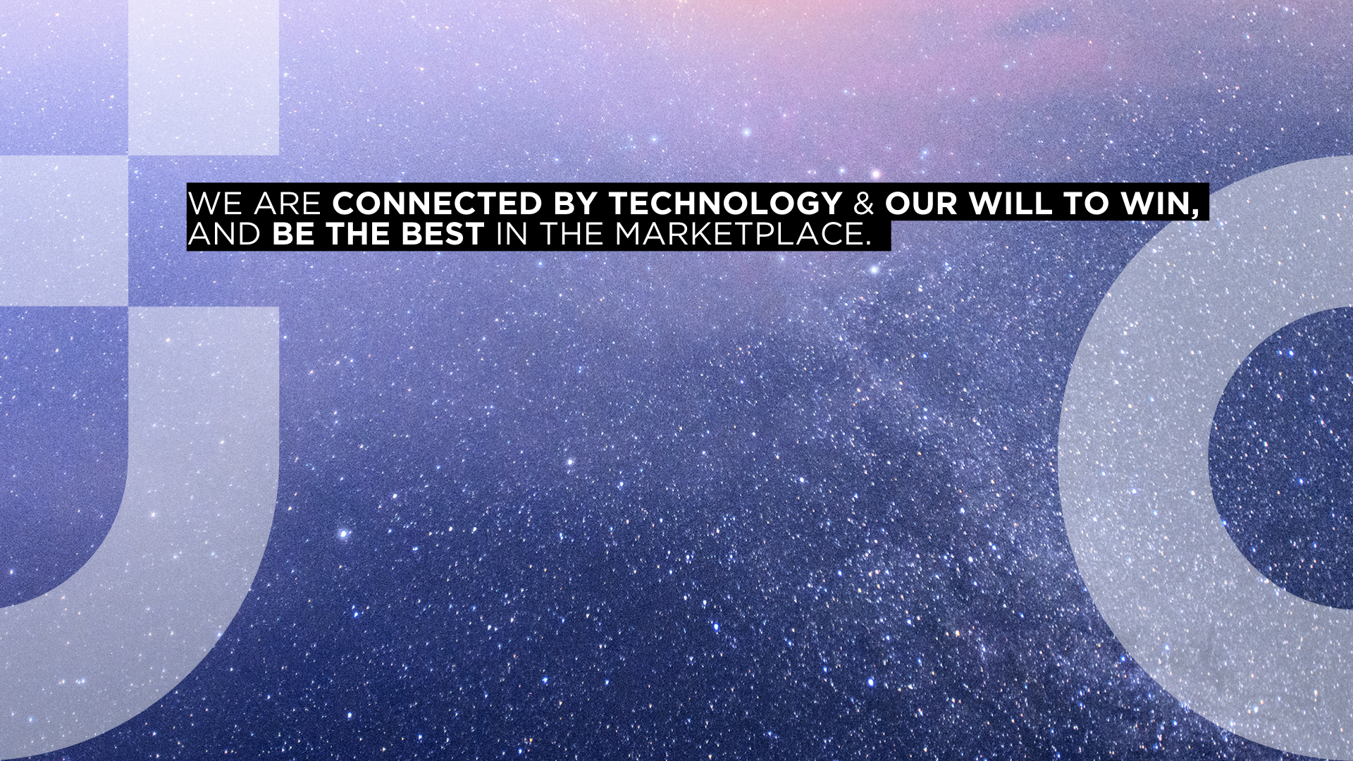
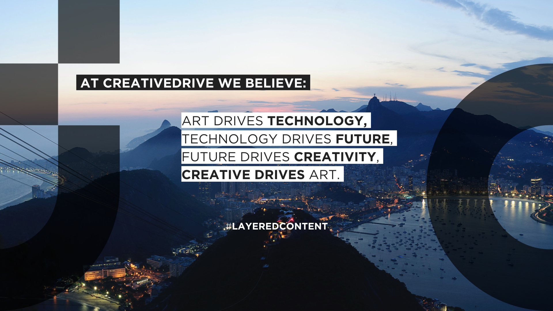
I authored a complete brand architecture designed to function as an operating system rather than a surface identity. The governing idea was "Creativity Perfected by Technology" — positioning the brand at the intersection of human craft and automated systems, where technology enables rather than replaces creative excellence.
From this principle, I designed a modular system comprising six integrated components:
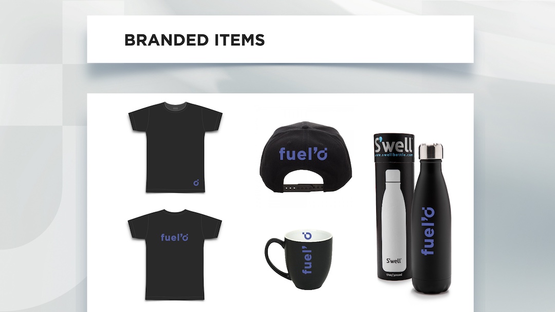
Visual Identity — A flexible mark and motion system adaptable across print, digital, product UI, and physical environments.
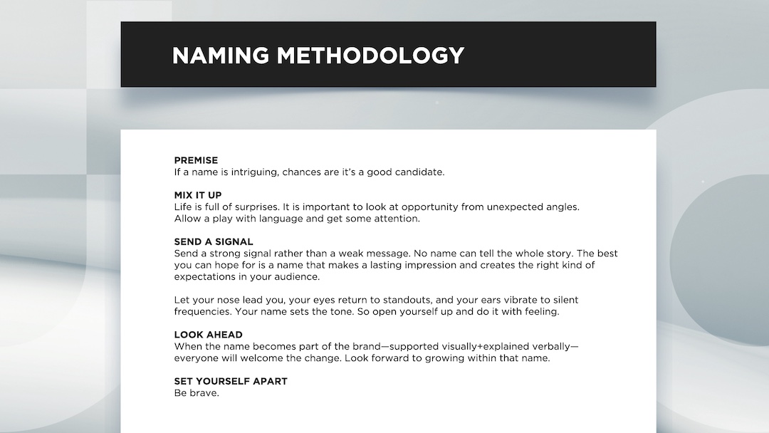
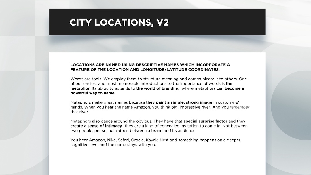
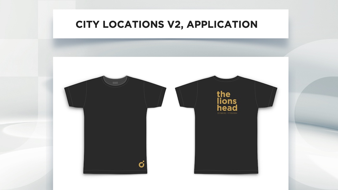
Naming Architecture — A dual-layer system (studio code + cultural signifier) allowing local offices to feel authored while remaining structurally unified.
Voice Framework — A tonal system engineered for clarity, wit, and consistency across cultures, platforms, and use cases.
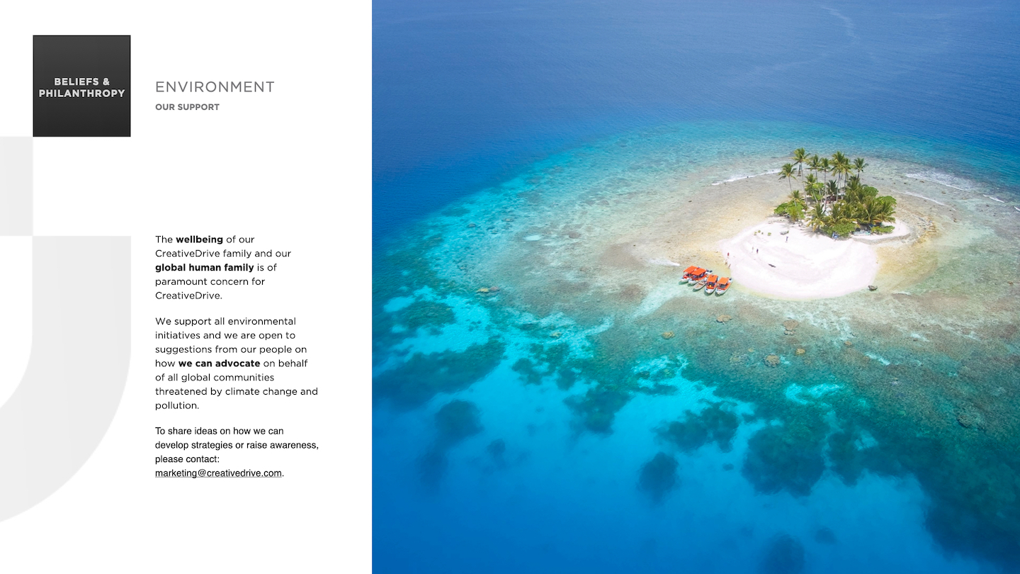
Environmental System — Spatial graphics, motto installations, and localized artwork making the identity operational inside the organization, not just visible externally.
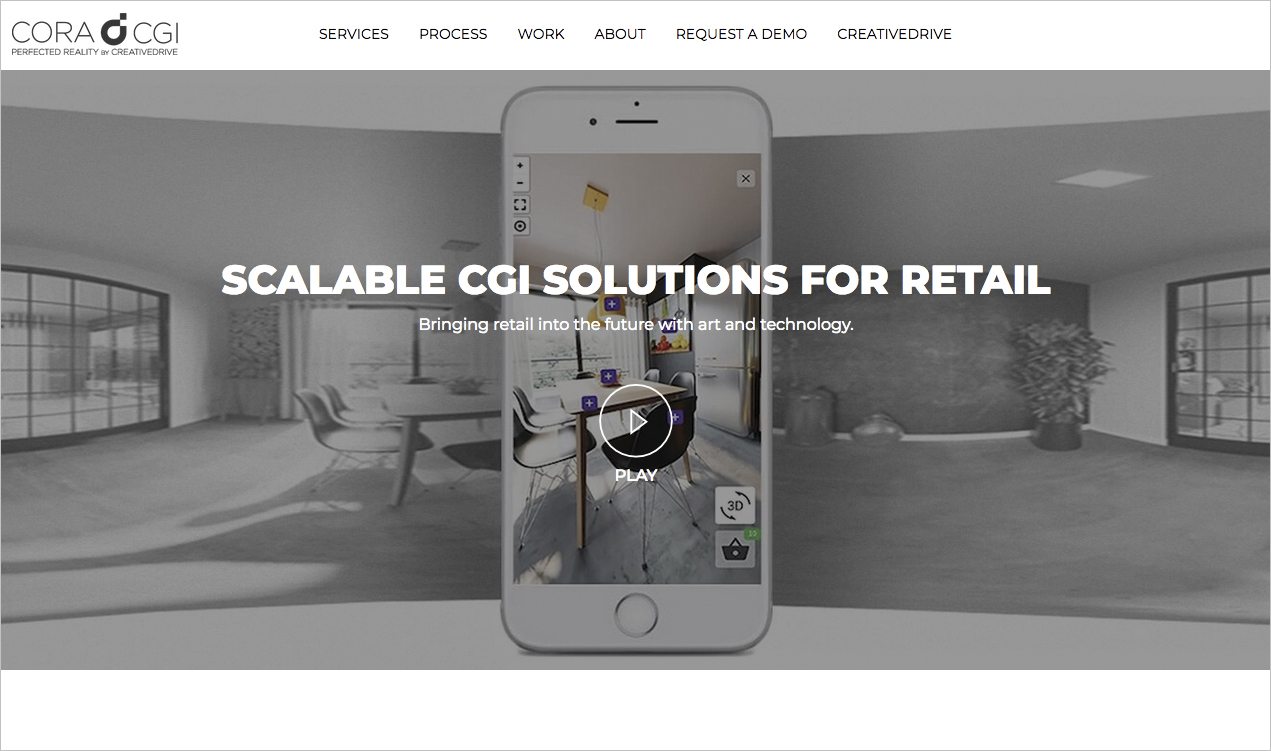
Sub-brand CORACGI — Visual system built on CreativeDrive identity.
Structural Logic — The pixel as the smallest unit of meaning, capable of scaling from handcrafted campaign work to automated content pipelines.
I authored a complete brand architecture designed to function as an operating system rather than a surface identity. The governing idea was "Creativity Perfected by Technology" — positioning the brand at the intersection of human craft and automated systems, where technology enables rather than replaces creative excellence.
From this principle, I designed a modular system comprising six integrated components:
Visual Identity — A flexible mark and motion system adaptable across print, digital, product UI, and physical environments.
Naming Architecture — A dual-layer system (studio code + cultural signifier) allowing local offices to feel authored while remaining structurally unified.
Voice Framework — A tonal system engineered for clarity, wit, and consistency across cultures, platforms, and use cases.
Environmental System — Spatial graphics, motto installations, and localized artwork making the identity operational inside the organization, not just visible externally.
Sub-brand CORACGI — Visual system built on CreativeDrive identity.
Structural Logic — The pixel as the smallest unit of meaning, capable of scaling from handcrafted campaign work to automated content pipelines.
OUTCOME
The system aligned global teams around a shared vocabulary, clarified CreativeDrive's authorship, and repositioned the company as a creative-technology organization rather than a production pipeline.
The identity scaled fluidly across products, studio environments, recruitment, editorial, and social — reducing complexity while increasing creative velocity.
![]()
![]()
![]()
The system aligned global teams around a shared vocabulary, clarified CreativeDrive's authorship, and repositioned the company as a creative-technology organization rather than a production pipeline.
The identity scaled fluidly across products, studio environments, recruitment, editorial, and social — reducing complexity while increasing creative velocity.


CREATIVEDRIVE SAAS BRAND
BRAND IN MOTION