NAMING ARCHITECTURE + IDENTITY SYSTEM
Modular Brand Language, Semantic Systems, Cultural Encoding
SITUATION
CREATIVEDRIVE NEEDED A COHESIVE YET FLEXIBLE NAMING SYSTEM THAT COULD:
- Unite a global network of creative studios
- Maintain corporate clarity while fostering boutique agency feel
- Scale effectively with company growth
- Create distinctive identities for locations, practices, and products
TASK
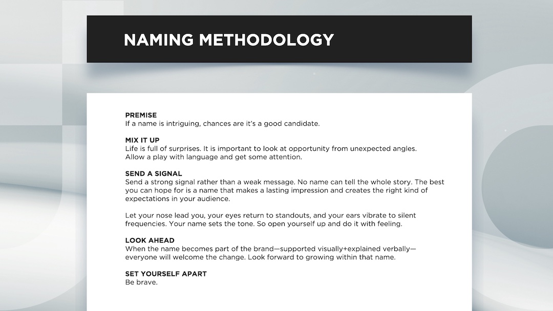
Create a scalable naming system that could unify CreativeDrive’s expanding global footprint - without sacrificing local personality or creative edge. The system had to align with the brand’s corporate identity, support cross-functional clarity, and flex across locations, service lines, and digital products - all while feeling boutique, not bureaucratic.
ACTION
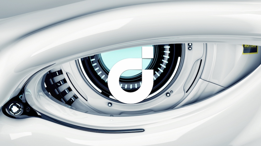
I developed an integrated naming architecture anchored by the brand's signature 'd' icon that worked across multiple touchpoints:
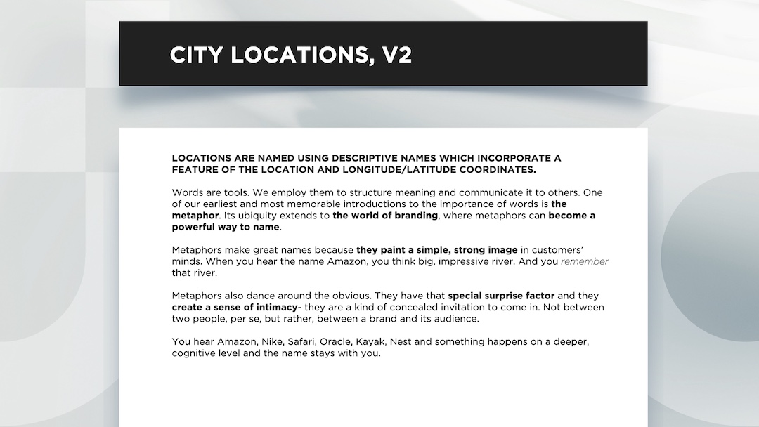
LOCATION NAMING
CREATED A DUAL NAMING SYSTEM COMBINING PRECISION WITH PERSONALITY:
Functional: Street number + icon (d55, d3209)
Memorable: Location-inspired names (d55 the water, d3209 the lion) This allowed each studio to operate as a boutique creative agency while maintaining clear corporate connection.
CREATIVEDRIVE NEEDED A COHESIVE YET FLEXIBLE NAMING SYSTEM THAT COULD:
- Unite a global network of creative studios
- Maintain corporate clarity while fostering boutique agency feel
- Scale effectively with company growth
- Create distinctive identities for locations, practices, and products
TASK
Create a scalable naming system that could unify CreativeDrive’s expanding global footprint - without sacrificing local personality or creative edge. The system had to align with the brand’s corporate identity, support cross-functional clarity, and flex across locations, service lines, and digital products - all while feeling boutique, not bureaucratic.
ACTION
I developed an integrated naming architecture anchored by the brand's signature 'd' icon that worked across multiple touchpoints:
LOCATION NAMING
CREATED A DUAL NAMING SYSTEM COMBINING PRECISION WITH PERSONALITY:
Functional: Street number + icon (d55, d3209)
Memorable: Location-inspired names (d55 the water, d3209 the lion) This allowed each studio to operate as a boutique creative agency while maintaining clear corporate connection.
PRACTICE NAMING
UNIFIED EIGHT GLOBAL PRACTICES UNDER THE 'D' SYSTEM:
plan’d (Strategy), create’d (Creative), d’igital (Interactive), etra’d’e (ecomm), d’lux (luxury/fashion), soun’d, culture’d (events+culture), d’iscovery (research/innovation)
PRODUCT NAMING
EXTENDED THE SYSTEM TO SAAS OFFERINGS:
Tune’d, View’d
RESULT
The new system turned CreativeDrive into a linguistically unified, culturally expressive brand.
It scaled across continents, departments, and product launches. And it helped employees, clients, and partners understand what CreativeDrive was - and where they belonged within it.


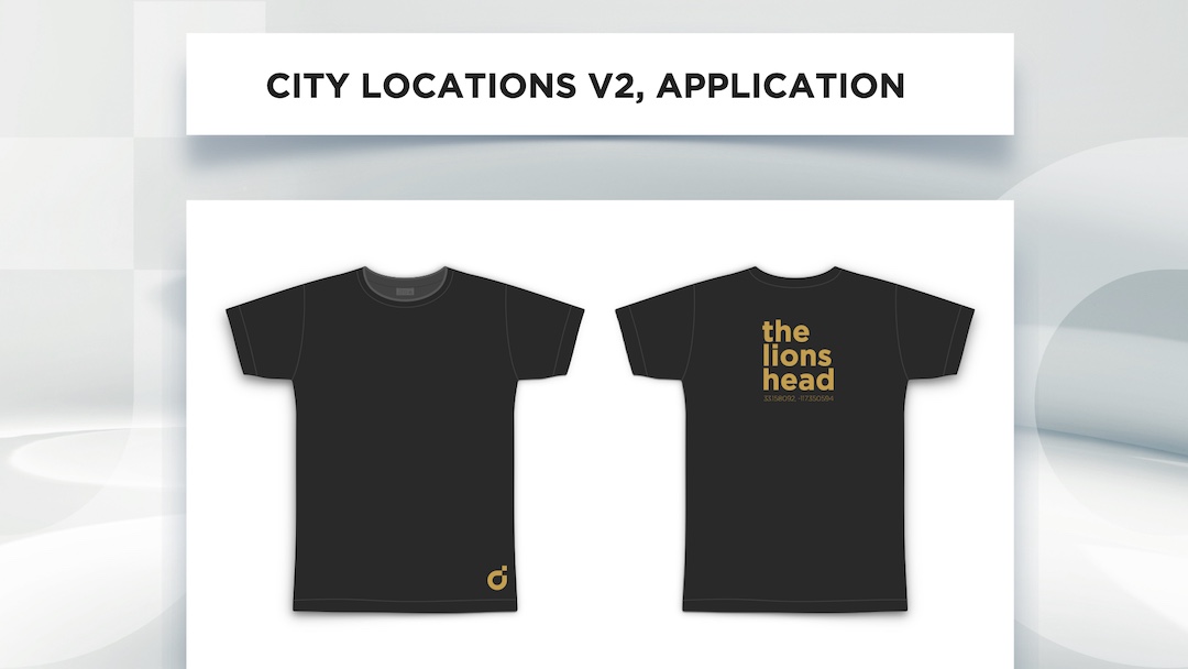


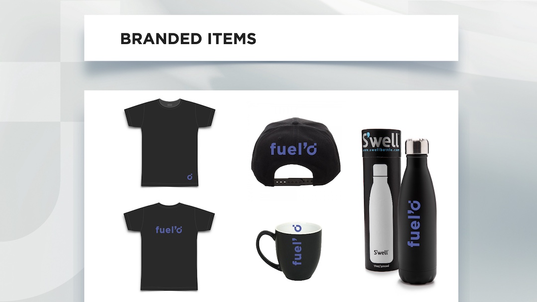


+ The naming conventions also lend themselves to very cool swag.
In essence, I created an insider effect - psychology at work. The t-shirt with "d3209" (with that stylized d) worked on multiple levels:
- Created curiosity - it looks like a code or secret message
- Gave employees a sense of belonging - they're "in the know"
- Sparked conversations - people want to ask about it
- Functioned as subtle but intriguing branding
- Made employees feel special - they're part of something exclusive