IP IDENTITY
Branding Indelible Planet: Art becomes strategy.
SITUATION
Indelible Planet (IP), a strategic studio created to serve BMW's board, needed a distinct identity - one that could stand apart from legacy agencies and telegraph creative intelligence to both C-suite clients and cultural collaborators.
The studio’s positioning required visual language that felt original, expressive, and unafraid of complexity.
TASK
Design a logo and identity system that could reflect IP’s core values - whimsy, innovation, and radical imagination - while maintaining the credibility required for executive audiences in automotive, tech, and defense.
ACTION
I rejected standard tech signifiers (clean lines, sterile minimalism) and built the system from a different philosophical base.
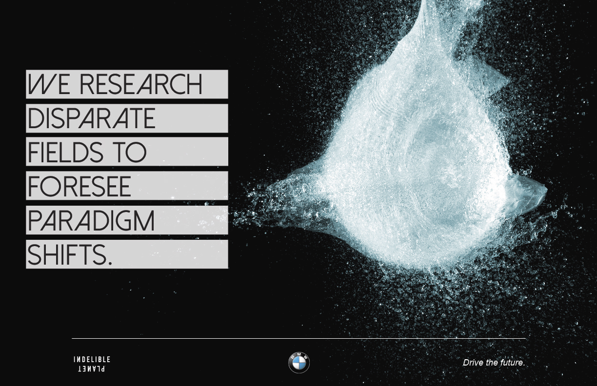
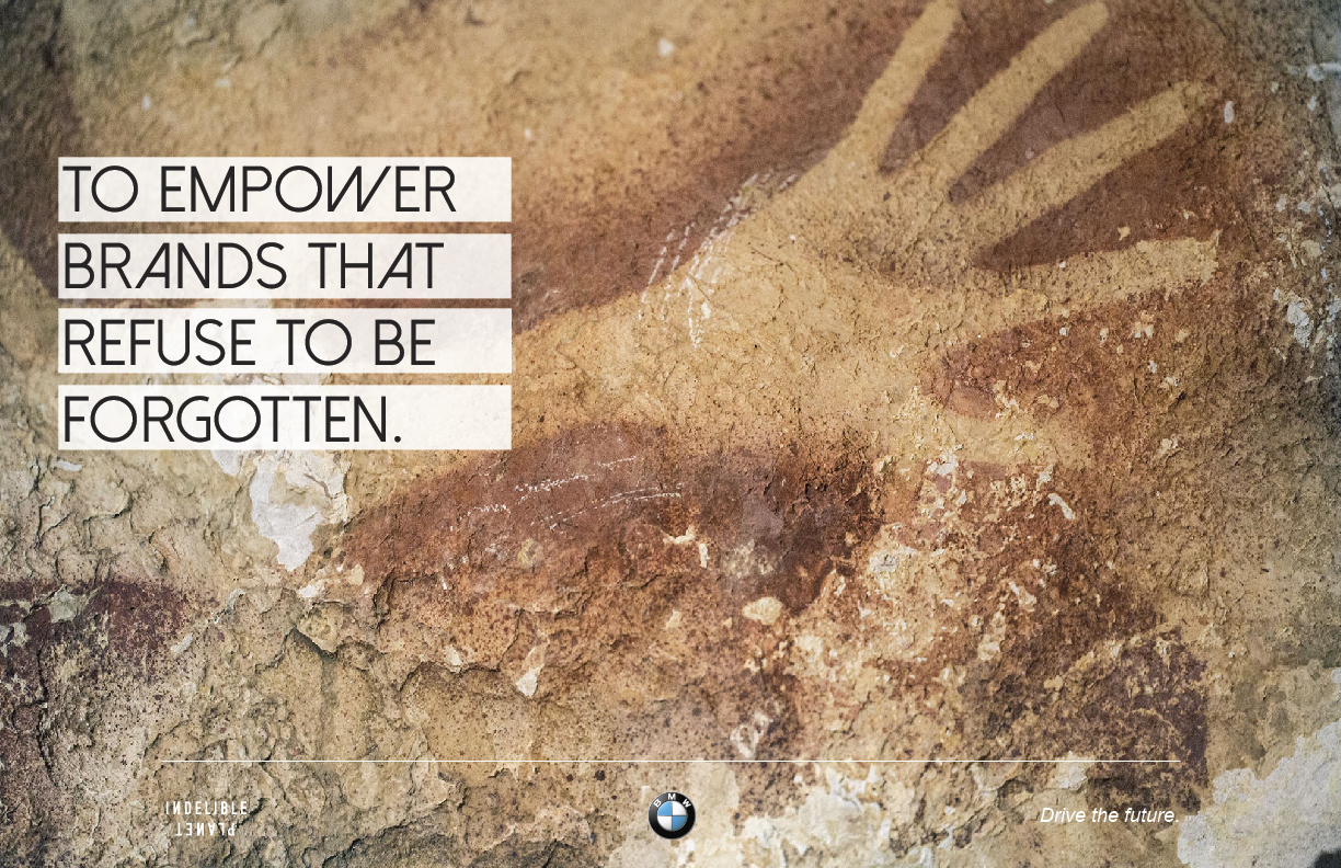
- Researched visual traditions from da Vinci’s sketches to prehistoric carvings - seeking forms that conveyed human curiosity across time
- Used artist Julian Schnabel’s layered design language as a launch point: rough, intuitive, precise in its looseness
- Crafted a logo that felt drawn, not built - to reflect IP’s role as an idea catalyst, not a conventional agency
- Developed a full identity system with flexible usage: from deck frameworks to concept boards and spatial applications
RESULT
Created a visual identity that disarmed the expected - and in doing so, earned trust. The system was adopted across all touchpoints and became a core signal of IP’s creative mandate: to challenge how visionary work looks, feels, and functions.
I rejected standard tech signifiers (clean lines, sterile minimalism) and built the system from a different philosophical base.
- Researched visual traditions from da Vinci’s sketches to prehistoric carvings - seeking forms that conveyed human curiosity across time
- Used artist Julian Schnabel’s layered design language as a launch point: rough, intuitive, precise in its looseness
- Crafted a logo that felt drawn, not built - to reflect IP’s role as an idea catalyst, not a conventional agency
- Developed a full identity system with flexible usage: from deck frameworks to concept boards and spatial applications
RESULT
Created a visual identity that disarmed the expected - and in doing so, earned trust. The system was adopted across all touchpoints and became a core signal of IP’s creative mandate: to challenge how visionary work looks, feels, and functions.
The aesthetic of the logo led to the creation of unique iconography, used in print and in digital:
KEYART IMAGE
I created a rich visual world, part reality, part future, part imagination in which bold ideas could live.
At the heart of the project was a central keyart image that shaped the entire branding philosophy. Inspired by Sonora Webster's daring horse dives, it invited the viewer to abandon the familiar and follow us into a new world of possibilities.
Suspended between heaven and sea, neither falling nor rising, frozen mid-flight, the horse became a symbol of an impossible leap, a moment of pure transformation.
It set the tone for a startup agency unafraid to transcend the boundaries of the common. Everything that followed - the strategy, the decks, the presentations - was a reflection of this ethos.

BRAND BOOK EXCERPTS